Thursday, 31 March 2016

My All Ages, All Sexes, All Races Editorial

Individual Images and Models Used


The four images I will be incorporating into my Mac collage are shown above. I am so happy with the range of models I decided to use because they all look so different. I am annoyed at myself for not being more adamant that my blonde model wore a black top; however when I put my collage together I will make sure that my blonde model's grey top does not show. I am also really happy with how the makeup looks together because I wanted the too youthful girls to wear more heavy makeup and the male and the older model to wear more natural makeup; I did this because I wanted the makeup each model was wearing to be suitable for them. 

My Mac Editorial Collage


In the editorial I wanted to highlight Mac's mission statement of All Ages, All Sexes, All Races because I think it is so important to never ostracise anyone, whether that be because of their skin colour or because of their age. Many high street brands do not cater for people with darker skin tones as they don't have any shades dark enough for them. It is also common for people to not be able to find their shade because their skin is too fair for the makeup available. Whereas Mac really do cater for everyone, whether you are a male looking for very natural makeup or a drag queen looking for very heavy and dramatic makeup. I wanted this editorial shoot to not only look beautiful by combining different ethnicities, ages and sexes, but also to portray the message that we are all in this world together and we should all appreciate and love each others' beauty, no matter what you look like. 

I am happy that I chose all white writing because it looks very strong against the black background and it reflects the colours of Mac's logo. I definitely wanted to include Mac's logo in my editorial so people know what brand it belongs to, but I also wanted to include Mac's mission statement of All Ages, All Sexes, All Races so make the message of the editorial loud and clear. 

I am so happy and excited with how this editorial shoot came out! I was nervous how each makeup look would look together and how each face would fit together but I think it looks great! I really like how all the skin tones contrast with each other, from the golden tan to the pink toned pale skin, showcasing all the different skin colours the Mac products provide for. All the models had very different face shapes so I wasn't able to line up every facial feature; however I like that it look more abstract. I like that I included every model in the eyes because I think that's one of the biggest differences with different ages and ethnicities. I also included every model in the lips because I gave them all a different lip colour to suit them and I liked the contrast between all the colours and shapes. The blonde model was wearing a grey top, which I was not happy about, so I edited it out to make the whole collage surrounded by black. I like that many 2016 spring/summer trends were included in this editorial collage because it keeps the editorial very on trend and current, which is what Mac is all about. 

I edited each image individually first to make them all look flawless before I started creating the collage. I used the technique of frequency separation to make all their skin look flawless; however I made sure not to do as much editing on the older model because I still wanted to see her wrinkles and more saggy skin. I tested out a few ways to edit all these images together before I worked out a way that would work best for me. I first tried layering all of the images and then cutting sections out of each image until all the images underneath were showing through; however this didn't work because all of my model's faces were different sizes and shapes so that features didn't match up. I next tried cutting sections out of each image separately and then positioning them onto a black background, I found that I could manipulate the sizes of the features and line them up more easily; however it was difficult to line each section up symmetrically because I was basically creating the shape of a face free handed. I finally decided to layer all of the images and make them as close to each other in size as possible. I then cut out sections from each image and positioned them on top of the top face, meaning I could manipulate the size and position of each section and I had a face to use as a template to follow. I made a plain black background to the image every now and again to see if the face was looking lined up. I didn't want all the features to be lined up perfectly or for the edges to line up because I wanted my collage to have a slightly messy and chaotic composition. I also didn't want all the sections to be the same size or shape, so I made some more square, some pointy, some larger etc. I am really happy with how the composition of the collage came out because each section matches up to the next seamlessly, leaving no black spaces. I didn't want all the sections to match up perfectly as I think that would look too forced, so I made each section slightly higher or lower to break up the lines, giving it a more abstract look. 

Monday, 28 March 2016

Makeup for my Older Model

Research into Mature Makeup Application

I wanted to do a makeup look that would appropriate for an older model in my Mac collage to show that Mac makeup is suitable for all ages. I have done makeup on slightly older clients before; however I wanted to do some research to find out some new tips and tricks to make it look as youthful and flattering as possible. I found a YouTube video by Lisa Eldridge called Glowing, Youthful Day Makeup Tutorial for Mature Skin and I learned many new tips from it.

ELDRIDGE, L., 2013. Glowing, Youthful Day MakeUp Tutorial For Mature Skin [viewed 28th March 2016]. 
Available from: https://www.youtube.com/watch?v=f-SZA1tkViU

Lisa Eldridge says how important it is to really work the product into the skin to make sure it covers every inch of the skin. If you use a thick layer of foundation then it is more likely to sit in the creases of the skin which would emphasise them; therefore it is important to use a thin and even layer all over the face and neck. Use a light and moisturising concealer, Eldridge suggests using Maybelline Wake Me Up concealer as it's light weight but medium coverage. You only need to use a very small amount and only apply it where there is darkness. Use a cream blush to give her face a dewy finish, adding youthful to her look. Lisa Eldridge used the Fluid Corrective Foundation by Vichy Dermablend to cover the model's cut on her face and any moles and the imperfections disappeared very quickly! This made me very intrigued by this product as it is perfect to cover acne or any other imperfections quickly. I found the product was sold at Boots for £18 so I am very tempted! She said how she felt when you're older you need more defining makeup around the eyes than when you're younger for a more flattering and youthful look. However she suggested doing this in a subtle way by smudging a bit of eyeliner into the upper lash line to make her lashes look thicker and to define the eyes. Lisa said she wouldn't recommend using metallics on more mature eye lids, so I may just stick with the bronzy coloured theme of my Mac collage instead of using unflattering metallics. Stay away from any harsh lines or taking the eye shadow down too far at the corners of the eye as it makes the eyes look droopy. She says to give the model a natural but defined eye brow so the eye brows don't look too heavy as that would drag them down. Keep the lips looking softly defined by using a lip liner but blending it as you go and give the model a natural colour.
BOOTS, 2016. Vichy Dermablend Corrective Foundation with SPF35 [viewed 28th March 2016]. 
Available from: http://www.boots.com/en/Vichy-Dermablend-
Corrective-Foundation-with-SPF35-30ml_1481875/
Inspiration Images


SS16 TopShop Unique Girls
MARCH, B., 2015. Spring/Summer 2016 hair and makeup trends [viewed 1st February 2016].
Available from: 
http://www.cosmopolitan.co.uk/beauty-hair/beauty-trends/g4142/spring-summer-2016-hair-makeup-trends/?slide=32
I was inspired by the very smudged out and soft smokey eye on the TopShop Unique models because I think the blended look would be very flattering on my mature model as there would be no harsh lines. I would not use the colour black on my model as I think it would look too heavy and harsh; however I will take inspiration from the smokey out look but use softer, more natural colours. I like how the eye brows look very full, but natural as there are no harsh lines because I think they look youthful. My model has very full eye brows so I want to just add some definition to them without making them look too heavy as I don't want them to weigh down the face.


CISOTTI, C., 2012. Bare-faced Beauties: As 47-year-old Brooke Shields steps out make-up free we reveal what other stars really look like au naturel [viewed 28th March 2016]. Available from: http://www.dailymail.co.uk/femail/article-2214584/As-47-year-old-Brooke-Shields-steps-make-free-reveal-stars-really-look-like-au-naturel.html 

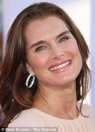
The image above is of 47 year old Brooke Shields at a red carpet event. I like that she has given her eyes definition, but without making them look too harsh or dark, giving her a naturally beautiful look. It looks like she has used a medium brown in the crease of the eye and then a darker brown smudged along the top lash line and along the outer edges of the lower lash line to give the eyes definition. The skin look very youthful as it look dewy and healthy with the rose blush. I definitely want to give my model dewy skin as it is a popular 2016 spring/summer trend and it is very youthful. I really like that the lips are a natural 'your lips but better' colour but that they are glossy because I think it look youthful and makes the lips look plump and luscious. Brook Shields has very full eye brows, just like my model, however it could be argued that her eye brows have been filled in slightly too heavily and therefore way the eyes down. When filling in my model's eye brows I will be cautious about not over filling them in. 

Face Chart 1
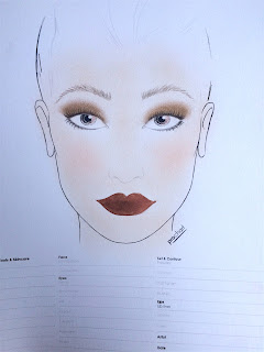
I chose to give my model dewy looking skin, once again, to give a fresh and youthful glow. I will only add powder under the eyes and on any other places where I either want to set the makeup or mattify it. I wanted to add a cream blush to give my model a natural flushed look and a dewy finish. I added some extra cream highlighter on the high points of the face to intensify the dewy finish; however I think I will stick with the cream blush as I want it to look very natural. I didn't add any bronzer as I wanted to stay slightly old fashioned with just the blush on the cheeks; however I think if I add a bit of bronzer it will give my model more of a healthy glow. I filled the eye brows in with a grey toned eye shadow to add definition, but I still kept them quite natural as I didn't want them to over power the look or weigh the eyes down. I applied a medium bronzy colour all over the lid and blended it out into the crease to give a soft, smokey look. I then added a slightly darker, matte brown eye shadow along the upper lash line and on the outer part of the lower lash line to give the eyes some definition and to make her eye lashes look thicker. I added mascara on the top and bottom eye lashes to open up her eyes. I gave my model a very natural lip colour, slightly darker than her natural lip colour and I added a gloss to give her luscious looking lips.

Face Chart 2
In this face chart I gave my model a very dewy finish to the skin with the use of illuminators and only powder where necessary because I wanted to give a very fresh and youthful look. I will make sure to only add the product where I need to and to not use too much to keep the look natural. I will add a cream blush to the apples and up the cheek bones to give a dewy finish, without using highlighter, to give a flush look. I will also add some bronzer round the perimeter of the face and under the cheek bones to give a sun kissed, healthy glow. I gave the model natural and slightly bushy looking eye brows as my model has very full eye brows already so I didn't want to make them look too heavy. I gave my model a bronzy smokey eye to stick with the bronzy/metallic theme of my Mac collage. I will put a gold on the eye lid and then a medium matte brown into the crease to add definition. I then added a slightly darker brown pencil along the upper lash line and outside of the lower lash line and smudged it out to give a soft, smokey look. I want to curl the model's eye lashes to open up the eyes and then add a natural coating of mascara. I finally gave my model a neutral pink lipstick that is very close to her natural lip colour and I added a gloss to give a youthful, plump lip look.

Testing Face Chart 2 Makeup
Before Makeup Application

This is how the makeup came out the first time I did it and I wasn't completely happy with it. I plucked my model's eye brows slightly to give her a slightly cleaner looking brow; however my model wanted to keep her eye brows slightly messy looking. I like how I lightly filled them in as they look very natural, but more even. I mixed an illuminator in with the foundation to give a dewy finish and I really like how it has given her a healthy looking glow. I applied some Bourjois Bronzing Mousse to the cheek bones and around the forehead; I made sure it looked as natural as possible but added some colour. I added some Accessorise cream blush in Rose to the cheeks with my fingers to give her a flushed look and I really like how natural the colour looks and how easily it melted into the skin; however I don't like how the sides of her nose also look pink as it almost creates leading lines towards her pink toned nose. I don't like how much redness is still visible in the face because I think it makes the blush look messy. I will therefore make sure to conceal the redness on either sides of the nose and on the nose. I added a concealer that was slightly lighter than the foundation under the eyes to brighten that area; however it went a grey colour because the under eyes were so dark. I will add a corrective concealer first next time to cancel out the blue under tones under her eyes. I don't particularly like the lip colour as I think it's too pink and I think a more neutral shade would be more flattering. I applied a rich gold on the eye lids and blended it into the crease, I then applied some dark brown eye shadow along the top and bottom lash line to give the eyes some definition and to make the lashes look thicker. I like how the eyes turned out, however I think it would be more flattering to have a brighter colour on the eye lids because I want to make her eyes look very bright and youthful. I am happy that I only put mascara on the top lashes because I think if I made the lower lash line look any darker it would weight the eyes down and made them look more droopy; however I need to curl her upper lashes slightly more to open the eyes up more. 


 Testing Makeup 2 (Final Look)

Equipment:
-Johnson's Makeup Be Gone Wipes
-Clean & Clear Dual Action Moisturiser
-Urban Decay Primer Potion
-Laura Mercier Translucent Powder
-Real Techniques Setting Brush
-theBalm Nude'tude Palette in Sassy, Selfish, Sophisticated
-Mac 217 Brush
-Silk Pro Eye Detailer Brush
-Eye lash curlers
-Maybelline The Colossal Go Extreme Waterproof Mascara
-Tweezers
-Rimmel Professional Eyebrow Pencil in Hazel
-L'Oreal True Match Foundation colours W.3 and W.1
-Nars Illuminator in Copacabana
-Real Techniques Contour Brush
-CoverGirl&Olay Simply Ageless Concealer in 210
-NYX Dark Circle Concealer Correcteur in Light
-Bare Minerals Concealer in Well-Rested
-Bourjois Bronzing Primer
-Style Master Fluffy Concealer Brush
-Accessorise Cream Blush in Rose
-Rimmel Lasting Finish Lip Liner in Tiramisu
-Rimmel Kate Moss Lipstick in 03
-Silk Pro Eye Detailer Brush
-Rimmel Oh My Glosh! Lip Gloss in Glossaholic

Step by step:
1. I first cleansed the face with the Johnson's Makeup Be Gone Wipes to remove any makeup or excess dirt on the face.
2. I next moisturised her face with the Clean & Clear Dual Action Moisturiser.
3. I first applied the Urban Decay Primer Potion all over her eye lids so that the eye shadow wouldn't crease. I gently blended this out with my finger.
4. I lightly dusted some Laura Mercier Translucent Powder all over the eye lids with the Real Techniques Setting Brush to set the primer so the eye shadows on top would blend more easily.
5. I applied the colour Sassy from the theBalm's Nude'tude Palette all over the lid and into the inner corner with the Mac 217 Brush to brighten the eyes. I blended this out into the crease.
6. I next lightly applied the colour Selfish from the same the theBalm Palette on the outer half of the lid to add a bit of dimension. I did this with the Mac 217 Brush.
7. I next took the colour Sophisticated from the same the theBalm Palette on the Silk Pro Eye Detailer Brush and lightly smudged that all along the upper lash line and on the outer half of the lower lash line. I didn't want this to look harsh so only used a light hand and I made sure I didn't drag the eye shadow too far down on the lower lash line as I wanted it to look subtle.
8. I curled the top lash line with some eye lash curlers.
9. I applied a light coat of Maybelline The Colossal Go Extreme Waterproof Mascara on the top and bottom eye lashes.
10. After asking the model for permission I plucked any hair in the eye brows I felt were too out of place; however I still wanted to keep the bushy look as I think it's youthful.
11. I filled in any sparse areas in the eye brows with the Rimmel Professional Eyebrow Pencil in Hazel and then brushed them out with a disposable mascara wand to remove any excess product and to push all the brow hairs in the right direction.
12. I mixed L'Oreal True Match Foundation colours W.3 and W.1 to match the model's skin colour and then added Nars Illuminator in Copacabana to add the dewy finish.
13. I applied this lightly all over the face with the Real Techniques Contour Brush, making sure to take it down the neck and onto the ears.
14. I took some CoverGirl&Olay Simply Ageless Concealer in 210 and applied it to the sides of the nose, down the centre of the nose and on the chin to cover any redness and to highlight slightly.
15. I took the NYX Dark Circle Concealer Correcteur in Light and lightly dabbed in on the dark areas under her eyes to cancel out the darkness.
16. I followed this with the same foundation mixture, applying it very lightly under the eyes, not disturbing any of the eye makeup.
17. I set the under eyes the Bare Minerals Concealer in Well-Rested to stop the product from creasing.
18. I used the Laura Mercier Translucent Setting Powder and the Real Techniques Setting Brush and applied some powder either sides of the nose and on the chin to get rid of any excess shine.
19. I applied a very light amount of Bourjois Bronzing Primer around the hair line, under the cheek bones and either sides of the nose to add some warmth to the skin and to contour the face slightly. I used the Style Master Fluffy Concealer Brush to do this.
20. I dabbed some Accessorise Cream Blush in Rose to the apples of the cheeks and blended it slightly backwards with my fingers to give a natural flush.
21. I lined the model's lips with the Rimmel Lasting Finish Lip Liner in Tiramisu to add definition.
22. I applied the Rimmel Kate Moss Lipstick in 03 all over the lips with Silk Pro Eye Detailer Brush.
23. I finally applied some Rimmel Oh My Glosh! Lip Gloss in Glossaholic.


I much prefer this makeup look to my previous practice. I still mixed the foundation with an illuminator to give a beautiful, healthy glow to the skin as I loved how it looked in my previous makeup test. I decided to apply the eye makeup before applying the concealer as I found that when I applied the eye shadow around the eyes it fell and made the conceal look more grey under the eyes. I also decided to use the same foundation under the eyes as I had used over the face as it was a lighter consistency so it wouldn't look as caky, and it will match the colour of the rest of her face seamlessly. I used a slightly orange concealer under her eyes to the darkest parts of her under eyes to cancel out the blue before applying a thin layer of the foundation on top. I applied some concealer either side of the nose and down the centre of the nose because I felt these areas were too red in my last makeup test so I wanted to cover these areas. I set the under eyes with a loose translucent powder to set the makeup and also either side of the nose and on the chin to get rid of any excess shine. I really like how I have cancelled out the redness in her face because it makes her look a lot brighter and fresh and it makes the pink blush stand out in a more flattering way. I kept the eye brows looking natural and full, just filling in any sparse areas. I applied a light white/gold colour to the eye lids and blended it out softly to brighten the eyes. I applied a small amount of a light shimmery grey onto the outer half of the upper eye lid to give the eyes some definition. I applied a slightly more grey toned brown along the top lash line and on the outer half of the lower lash line as I felt the brown I used before was too red toned and brought out the redness in her eyes slightly which I didn't think was very flattering. I curled the top eye lashes more and I really like how pretty the feathery eye lashes look as they really open up the eyes, making them look more doll-like and youthful. I gave the lips a stronger outline as I felt the lips before looked slightly blotchy and uneven. I also gave them a more nude/peachy look as I thought it was more natural because it didn't bring out any redness in her face. I finish off the lips with a gloss to make the lips look more plump and luscious.

My Final Image
I am so happy with how this image came out because I think my mature model looks youthful and fresh. I love how dewy the face and chest look because it gives her a healthy glow and makes her skin look plump and hydrated, and therefore more youthful. I also like that the dewy skin continues down the neck and onto the chest because it stops the makeup from looking like a mask on the face. I mixed the foundation I used on the face with some Johnson's Baby Oil to achieve the beautiful glow on her check and neck. I like that I only used minimal product on the skin because it looks flawless, but still light and natural. I like that I used a cream blush on her cheeks because they look naturally flushed, dewy and it blends so seamlessly into the skin. In my first practice I think I made the eyes look too dark which I felt made her eyes look smaller and more tired so I like that I made the eyes look very bright with the white shimmery eye shadow, but that I still added definition with a grey toned eye shadow around the lash line. I am really happy with the lip colour because it looks natural, but reflects the peachy tone in the cheeks which I think ties the look together beautifully. I love the glossy sheen on the lips because it continues the youthful glow and makes them look plumped up and luscious, which is a look Mac are very fond of. 


References:
ELDRIDGE, L., 2013. Glowing, Youthful Day Makeup Tutorial for Mature Skin [viewed 26th March 2016]. Available from: https://www.youtube.com/watch?v=f-SZA1tkViU

My Wash & Dry Advert

My Final Wash & Dry Advert


I am so happy with how this advert turned out, from the gel lights, to the styling, to the model choice! I was so happy with how the makeup and hair turned out and have written about how it went in my previous blog post titled 'Wash & Dry Makeup and Hair Look'. 

Lighting
My biggest concern when doing this photo shoot was the lighting set up as in my practice shoot I was not happy with how the lighting looked. I wasn't sure what colour I wanted the background to be and I wasn't happy with how the coloured gels were showing up on the model. However this time I made sure I did lots of research into using coloured gels with photography until I was happy I would confident enough when I got in the studio. I chose to do the background colour orange because I wanted it to represent the warmth of the summer sun surrounding the model. I did this by using an orange background and then using two lights of even power with spill kill heads on the light up the background. I decided to position a blue light coming from the left, positioned very high up and facing down at the model because I wanted it to represent the blue reflection off the water from the pool or the sea water. I wanted this to be high up so it could catch her face as she tilted it back and it would also contrast and meet in the middle with the red light on the other side. I decided to position the red gel light to the right and slightly in front of her and coming from a very low angle because I wanted to use a contrasting colour to blue and I thought the red would represent the high heat of the summer sun. I love how the blue and red light work together because the blue brightens up the front of the model, including her face, and then the red acts as a fill light and adds some warmth to the model. I didn't want either of these lights to be too strong because I didn't want the image to look tacky, but I am happy with I got the right balance within this image so make it look fun, but also professional. I used barn doors on the blue light because I didn't want any light to spill onto the background as I wanted the background to be perfectly orange. I found that the model's face was looking slightly dark and I wanted the makeup to be more visible, so I incorporated a soft box, with a low power, to come in on the left, in front of the model, to brighten up the face slightly more and I love how it did just that! It didn't interfere with the coloured lights, but just lightened it slightly. 

Prop and Model Positioning
I am so happy with how all the props are positioned because I think they balance each other out. I played around with how to position the props, with the model holding the ice cream and having her resting her legs on the inflatable balls; however this was my favourite. I like how she is holding the ice cream as if she is too glamorous for it because she looks very confident and in control. I like how I have positioned two smaller balls on the right of the main ball because they are all different sizes so it looks random, but also they balance out the ice cream so make the composition look more even. I am so happy I kept the colour scheme small because there is so much going on, I thought it could easily look messy. I considered having the model laughing and acting natural; however this is not Mac's style. Mac tend to have their models in a very fake position, as if they know they are posing for a photograph. I wanted her face to be very composed because I wanted her to look like a plastic doll. I like how the model is arching her back so much because it is very flattering on her figure, as it makes her waist look smaller and her behind look more curvy. She definitely looks like she is posing for the camera because she doesn't look particularly comfortable, so I really like that she looks almost like a barbie doll. I like that the advert almost looks like an advert for a themed barbie doll, as if she comes with these accessories. I didn't want my model to have eye contact with the camera because Mac's models in their collection adverts never do. I like that it means that you aren't necessarily drawn to the models eyes, but are instead drawn to the makeup and not the person wearing it. 

Styling
I love the styling for this shoot because it plays with fun, neon colours, but still looks glamorous. I like how I chose a swimsuit instead of a bikini because it looks a lot more conservative and professional, but the bright neon pink colours adds the youthfulness and fun to the look. I like that I only used block colours for the styling because it looks so clean and sharp; I think any pattern would have looked messy. I like that I chose very bold and contrasting colours for the swimsuit and shoes because it makes them both look bold and stand out. I also like that it encompasses the essence of Mac, that it's bold, bright and in your face. I like that I included high heeled pumps in this look because it adds a sense of sophistication to the look; whereas flat shoes or no shoes could have completely changed the look of the advert, making it look more fun and playful in a young and less mature way. 

Makeup/Hair
I am so happy I chose to keep the makeup very bold because I wanted it to be visible even if it was a full body shot. I like how the makeup has also been done in block colours because it looks very sharp and structured to reflect the bright block colours in the rest of the shoot. I love how the skin on her face and body both match up with a beautiful dewy glow because she looks like she has been laying out in the sun, getting a natural summer glow. I like that the dewy skin also almost makes the skin look plastic because it makes her look like a human doll, which is the look Mac goes for; dewy skin is also a popular 2016 spring/summer trend so it keeps the advert current! I like that I used blue on the eyes, along the eye liner, because it ties in the blue ice cream and the blue light to give more of an aquatic theme; blue eyes are also a predicted 2016 spring/summer trend. I like how glossy the lips look because they look so luscious and plump, which is a popular look for Mac; the glossy lips also continue the dewy/shiny plastic look. I love how the hair came out because it looks youthful and playful, but also sleek and sexy because I made the braids very tight and neat and I used hair oil to give it a wet-look. 

Editing/Text
I love how I edited the image because the mode's skin look so flawless and doll-like! I edited the skin more than I usually would when I edit because I wanted the model's skin to almost look like shiny plastic. Mac always edits their models to look like perfected dolls to I wanted to portray the same fake, dream-like look. I edited the model's body by distorting it slightly to make the model look slimmer and I love how natural the results are! I liked how the model looked before editing; however I wanted to make her look more model-like and closer to the weight of the models they use for Mac adverts. I chose to position the text in the middle of the image because this seemed to be the most common way that Mac displayed their text in their collection adverts and I wanted there to be some continuity. I chose to colour the text white because I wanted to give a clean look and I thought the white would stand out against the colourful, darker background. 

Sunday, 27 March 2016

Researching Magazines for my Editorials

I wanted to do some research into different magazines to decide which magazine I will target my editorial photo spread towards. I know I want my editorial to be quite avant-garde and dramatic, with strong lighting and loud makeup, so I wanted to find a magazine that would accommodate that.

i-D
CLAIRE, 2012. Snapshot: Twigs by Matthew Stone for i-D Magazine #320 [viewed 27th March 2016]. 
Available from: http://fashionbombdaily.com/snapshot-twigs-by-matthew-stone-for-i-d-magazine-320/
i-D started out as a basic magazine that would showcase punk-era London street style produced by people not in the fashion or magazine industry in 1980, but soon developed into a very popular and more professional, promoting the slogan of originate - don't imitate. i-D is passionate about constantly reinventing itself and producing material that will excite and inspire their readers. This magazine doesn't feel very high quality as it isn't a glossy magazine inside and the pages feel thin, making it feel slightly cheaper than Dazed and Love Club. There is a lot more writing inside the magazine than in Dazed or Love Club, taking away from the images and making some of the pages look too cluttered. i-D includes stories, quotes and interviews constantly throughout which makes it less of a purely fashion and culture magazine. There are some adverts for non fashion related things, such as IKEA, in the magazine which I think lowers the value of the magazine. If you compare this magazine with Dazed it feels a lot less luxurious as Dazed focuses only on editorials, whereas i-D has obvious adverts; I therefore don't want to design my Mac editorial for the magazine i-D.

Vogue
VOGUE. Adele in Spring's Fabulous Frocks [viewed 27th March 2016]. 
Available from: http://www.vogue.com/slideshow/13398057/adele-spring-fashion-march-2016-cover/#7
Vogue was originally published in 1892 in America and in 1909 the magazine was bought by Conde Naste Publisher which developed the magazine to focus more on women. In 1916 English Vogue was brought out, closely followed by French Vogue in 1920. When Vogue first started only illustrations and art were put on the cover; however in 1932 the first coloured photograph was used on the cover for American Vogue and since then the most famous photographers, including Rankin, Irwin Penn and Guy Burden have create image for the covers. Anna Wintour became Editor in Chief in 1988. She improved and developed the magazine to become the number one fashion magazine in the world, focusing on reflecting fashion trends and also inspiring new ones. It is now published in 17 countries, including Spain, Russia, Japan and Germany.

Vogue is a monthly glossy fashion magazine including high end fashion editorials such as Chanel, Giorgio Armani and Dolce&Gabbana and high end beauty editorials with brands such as Lancome, Clinique and Chanel. In about the first half of the magazine it focuses on only high end, luxurious fashion and beauty brands with very sophisticated and conservative editorial images. However as you get further into the magazine there are more adverts and written articles on fashion trends and top pics etc. The editorials seem to get slightly more risque and edgy as you get past the middle of the magazine with my experimental and abstract images. There are also celebrity and author interviews nearer the end of the magazine and stories about Vogue. As you get to the end there are many pages all about and advertising travel, with no beauty or fashion pages. Vogue focuses over all on fashion brands instead of beauty or makeup brands and most of the editorials are more sophisticated and less abstract; however I want my editorial images to incorporate bright colours and fun designs and I don't think that would be suitable for Vogue's possibly more classy audience.

Love Club
SHAHID, S., 2016. Lily-Rose Depp, 16, shows off her quirky side with colourful makeover as she lands her first major fashion magazine cover [viewed 27th March 2016]. Available from: http://www.dailymail.co.uk/tvshowbiz/article-3384014/Lily-Rose-Depp-16-shows-quirky-colourful-makeover-lands-major-fashion-magazine-cover.html
Love Club is a glossy fashion and beauty magazine, full of editorial images from upper class brands, to more edgy and experimental brands. The cartoon text on the covers is very bright and playful and also slightly childish as it looks like it has been coloured in by a child because it has lots of clashing colours a random patterns. This instantly gave me the impression the magazine was going to be fun and expressive, rather than the more sophisticated Vogue, for example. I couldn't find much information about the magazine which suggests it is fairly new; however it has the most brands in the magazine than any of the others I looked at so it is clearly highly regarded. Celebrities such as Kendal Jenner, Selena Gomez and Lily Rose Depp have starred on the covers, possibly targeting a younger target audience. There are very few adverts in this magazine, making it feel very expensive and there is hardly any writing, making it feel very fresh and luxurious. There are a big range of images throughout the magazine, from very sophisticated images from brands such as Polo Ralph Lauren, Emporio Armani and Chanel to very abstract and unique images by photographer Tim Walker. Some of the more avant-garde images are shown below.
WALKER, T., 2016. Tim Walker for LOVE Magazine Spring 2016 [viewed 27th March 2016]. 
Available from: http://www.thegorgeousdaily.com/tim-walker-for-love-magazine-spring-2016/

WALKER, T., 2016. Tim Walker for LOVE Magazine Spring 2016 [viewed 27th March 2016]. 
Available from: http://www.thegorgeousdaily.com/tim-walker-for-love-magazine-spring-2016/

WALKER, T., 2016. Tim Walker for LOVE Magazine Spring 2016 [viewed 27th March 2016]. 
Available from: http://www.thegorgeousdaily.com/tim-walker-for-love-magazine-spring-2016/

The images above show me that there would be no limitations to what images I could use for my editorial if I did choose this magazines because these are some of the strangest, but striking images I have ever seen in a magazine. This magazine would be a possible magazine I could choose; however I want to choose a magazine that is more focused on makeup as well as fashion, as I have found that the magazines I have looked into have mostly focused on fashion and only had a couple of beauty pages.


Dazed and Confused (Chosen Magazine)

I was drawn to Dazed and Confused because Rankin was one of the co-creators of the magazine, along with Jefferson Hack, which immediately caught my attention as he is such a highly regarded fashion photographer and constantly inspires me with his work. Dazed is a monthly British style magazine, launched in 1991, which is marketed as an alternative style and culture magazine. The magazine is very up to date with trends and includes lots of new talent with new and fresh ideas, making it very fashion forward. I like that the magazine is all about self expression and individuality as all the images display something completely different and new. Dazed includes a range of designers from Dior and Calvin Klein, to high street stores like River Island and TopShop. I love that there are no obvious adverts, with the product showing or lots of writing over the images because it gives a very raw and art feel, as it is all about the beautiful images. I like that the magazine feels heavy and thick because all the pages are shiny and of high quality. Dazed is the most influential independent fashion and cultural title in the world so I simply had to design my editorial for it!

Another thing that drew me to the magazine was the story of sheer hard work and determination that went behind building and creating such a diverse and original magazine. Rankin and Hack started designing their ideas whilst they were unemployed and had no experience in the industry. Dazed was the only magazine of its kind when it was first published and it still is; it contemporised the fashion and magazine industry. I like the excitement behind the magazine and the eagerness to see what's new and being developed.
DAZED DIGITAL, 2014. A year in fashion editorials [viewed 27th March 2016]. 
Available from: http://www.dazeddigital.com/fashion/article/18270/1/a-year-in-fashion-editorials
All the clothing and accessories in this editorial are Alexander McQueen AE13, styled by Robbie Spencer. The photography is by Richard Burbridge. This is a great example of how abstract the makeup and styling can be, as this this makeup look would not be seen in any main stream advertisements or editorials. I like how the very bold, black makeup contrast with the regal, feminine styling because it shocks the viewer. I don't think I will include clothing in my editorial because I want it to be all about the makeup. I like that you can be very imaginative when designing for this magazine because there are no boundaries with makeup or fashion. There are a variety of studio and location images and a variety

DAZED DIGITAL, 2013. Top Fashion Editorials 19/27 [viewed 27th March 2016]. 
Available from: http://www.dazeddigital.com/fashion/gallery/17101/18/top-fashion-editorials
I think this is the perfect example of an editorial from Dazed to show that nothing is too far outside the box. All the clothing in this editorial are by different designers including All Saints and Dior Haute Couture, and their is a big variety of clothing in the image. I like that there is so much going on in the photo because it really draws you in to have a look at all the aspects of the image. I like that there are a variety of model genders, ages and body types because it shows that Dazed is not just interested in the 'typical model' look with perfect looking, tall and skinny girls, as it makes it more relatable to the audience. The photography is by Jeff Bark and the styling is by Robbie Spencer. This editorial definitely inspired me to not restrict myself with anything and to have fun with the look!

Own Photo.
The focus in the majority of the editorials is the brand of clothing rather than makeup brands; however there are interesting and bold makeup looks incorporated into some of the fashion shoots so I think it would be a great place for Mac to promote itself to this younger, alternative audience. I bought the Spring 2016 edition and Mac have an editorial shoot included! It is promoting their AW16 trends, where they use cartoons places over each facial feature and all round the face to create a very bright, colour and graphic image. I like how much the bright colours used made the advert stand out as there was a lot of black and white imagery and faded colours in the other editorials. I also like that it is a closeup of the face because there are so many long body shots and busy backgrounds used in other images. I therefore want my image to be a close-up of the face because I want it to showcase the makeup and stand out; but also because I don't want the editorial to be a collaboration with another clothing brand as that would take the focus away from it.

I am so excited to start designing my editorial images that I think will suit the magazine Dazed and Confused, will reflect Mac and will include some 2016 Spring/Summer trends!

Resources:
DAZED DIGITAL, 1999. Dazed & Confused [viewed 27th March 2016]. Available from: http://www.dazeddigital.com/info/article/824/1/dazed-confused

WISEMAN, E., 2011. Still Dazed at 20: the gang who changed pop culture [viewed 27th March 2016]. Available from: http://www.theguardian.com/media/2011/nov/05/dazed-confused-gang-still-cool

I-D, 2016. about us [viewed 27th March 2016]. Available from: http://i-d.vice.com/en_gb/about

CONDE NAST. History [viewed 27th March 2016]. Available from: https://www.condenast.ru/en/portfolio/magazines/vogue/history/

CHAN, E. Vogue Cover Design History [viewed 27th March 2016]. Available from:  http://voguehistory.blogspot.co.uk/

SHULMAN, A., 2016. VOGUE, February 2016

NOAKES, T., 2016. DAZED, Vol IV Spring 2016

GRAND, K., 2016. LOVE CLUB, Spring/Summer 2016

JONES, T., 2016. i-D, Winter 2014

Saturday, 26 March 2016

Makeup for Male Model

For the male model I wasn't sure about what kind of makeup look to do. I feel like some guys that wear makeup are very confident with their makeup skills and so wear obvious makeup, like smokey eyes and a bold lip; however men in films and on red carpets tend to wear more natural looking makeup. I wasn't sure which look I wanted to do, so I found too inspiration images to look at.

GRIFFITHS, S., 2014. Eurovision 2014: The ones to watch out for [viewed 26th March 2016]. 
Available from: http://www.bbc.co.uk/news/entertainment-arts-27156985
The image above is of Conchita Wurst, also known as the bearded lady, who was Austria's 2014 Eurovision Song Contest entry. She wears a long brunette wig so give herself feminine, wavy hair and she wears very feminine makeup. Conchita wears makeup in a very obvious way, with bold smokey eyes and full coverage face makeup, making her look change her from a boy to a woman. This is a very unusual look and so not many people would be able to relate to it. I think this would be a very strong statement for Mac to put out an image with a transvestite with a beard because it is so controversial; however I don't think this kind of look would work well for an advert.

Face Chart 1

I took inspiration from Conchita Wurst's look when designing my first face chart. I didn't want the face makeup to look too heavy because I still wanted there to be some masculinity showing through. I contoured the face lightly with bronzer to give him some coloured to give a healthy look and then I added some blush to give a natural flush. I wanted to add some cream highlight to the high points of the face to give him a dewy complexion as I think it looks healthy and gives more dimension to the face. I wanted to keep the eye brows natural looking, only adding a tiny bit of product to sparse areas. I want to brush them upwards to make them look more full and bushy. I wanted to brush the beard hairs well to make the beard look groomed and then fill in any sparse areas with brown eye shadow or gel to make it look like beard hairs. I want the beard to look very sharp and clean to make him look well groomed. I wanted to give him a bronzy smokey eye to give his eyes a lot of definition and drama; however I think this will look too feminine. An advert is supposed to increase sales and make the consumer want to buy the new products. The consumer is supposed to be admirable of the person in the advert and therefore want to buy the possessions that they have, as if they are selling a lifestyle; however I don't think this would have the correct effect because of the low number of people that would be interested. I also think that if I used a more natural look for my male model, it would contrast more with the female models.


MINH, N., 2010. Makeup Tips from a Pro Part 2 - Photoshoot Makeup 
Application for Men and Women [viewed 26th March 2016]. 
Available from: http://fitlifestylemag.com/2010/11/makeup-tips-from-
a-pro-part-2-photoshoot-makeup-application-for-men-and-women/
The image above shows a male with more natural makeup on. I think this is the kind of makeup male actors would wear for appearances if they wanted to look very flawless, but still like themselves. I think this kind of makeup look would be more appropriate for my male model in my collage because it will give a bigger contrast with the female models and it will also reach a larger interested audience. I think it is becoming a lot more acceptable for men to wear natural makeup to help cover imperfections and so Mac would be targeting a new and growing audience. The male in the image above looks like he is wearing foundation and concealer and it looks like it has been set with powder as it looks quite matte. His facial hair may have been accentuated with some brown eye shadow to make it look fuller; however this has been kept quite natural. The male also looks suspiciously tanned so some fake tan may have been added to the look on his face and body. I have never done a makeup look like this before so I was eager to test it out for myself!

Face Chart 2
I wanted this makeup look to be more natural as I wanted the makeup look on the male to contrast with the female makeup. I decided to make the skin quite natural looking; however I do still want to apply foundation and concealer to give a flawless complexion. I wanted to give him a very healthy and dewy look so I want to apply a thin layer of foundation mixed with an illuminator to give a natural glow. I then want to conceal any imperfections including spots and under eye bags with concealer to give a flawless finish. I next wanted to contour the face with bronzer to give him definition and warmth, followed by blush to give him a natural flush and highlighter to give him a soft glow. I didn't want to add anything too dramatic on the face because I wanted to keep it relatively natural, so I didn't want the highlight to be glittery or the bronzer to be too dark. I then wanted to fill any sparse areas in the beard to make it look full and even. I want to use either a brown eye shadow or gel with a thin brush to replicate small hairs to give a natural look. I then only want to fill in the sparse areas of the eye brows to make them look more perfected; however I didn't want to fill them in too obviously. I am excited to try this makeup look out on my chosen model! 


Practising the Makeup Look

Equipment:
-Simple face cleanser
-Cotton pads
-Clean & Clear dual action moisturiser
-L'Oreal True Match foundation in 3.W and 1.W
-NARS Illuminator in Copacabana
-Real Techniques contour brush
-Cover Girl & Olay Simply Ageless concealer in 210
-Laura Mercier translucent powder
-Real Techniques setting brush
-Style Master fluffy concealer brush
-Bourjois Bronzing Primer
-Mac Cream Colour Base in Pearl
-Accessorize Cream Blush in Rose
-Disposable mascara wand
-Illamasqua small angled brush
-Illamasqua gel eyeliner in Infinity
-Vaseline
-Mac Russian Red lipstick

Step by step:
1. Cleanse the face with cotton pads and Simple face cleanser. 
2. Moisturise and hydrate the skin with Clean & Clear dual action moisturiser.
3. Mix L'Oreal True Match foundation in 3.W and 1.W on back of hand, to create a colour to match the models skin tone. Mix in some NARS illuminater copacabana into the foundation to give it a dewy finish. 
4. Blend this all over the face with the Real Techniques contour brush. Only use minimal product and a light hand to keep it natural. 
5. I next applied, Cover Girl & Olay SimplyAgeless concealer in 210 lightly underneath the eyes and on any other inperfections.
6. I set and mattified this with Laura Mercier translocent powder and Real Technique setting brush, under the eyes and round the nose. 
7. I took a Style Master fluffy concealer brush and Bourjois bronzing primer, and put that underneath the cheek bones, around the fore head and either side of the nose to contour and bronze the face. 
8. I next dabbed MAC's cream colour base in Pearl on the high points of the face. I then went over this with the NARS illuminater in copacabana, to intensify the dewy look. 
9. I took the Accessorize cream blush in rose, and likely dabbed this on the apples of the cheeks, with my fingers. 
10. I brushed through the eyebrows and facial hair with a diposible mascara wand. 
11. I took a small angled brush by Illamasqua and Illamasqua gel eyeliner in Infinity, and drew small strokes in the sparse areas of his facial hair. 
12. I applied some Vaseline to the lips and dabbed on the tiniest amount of Mac's Russian Red lipstick to give his lips some colour. 

I am happy with how the makeup turned out; however I don't think it looks natural enough. I like that I mixed the foundation with an illuminator because it gives a natural, fresh looking finish; however I think it would look better if I used a lighter foundation or mixed moisturiser in with the foundation to give an even more natural finish. I would then need to use concealer to cover up any imperfections showing through, like spots, as I think this is his biggest problem. I applied some highlighter to the his inner corners and on his eye lids to brighten the eyes; however I think this look too obvious and almost makes his eyes look like they're watering. I applied some lip balm and a touch of red lipstick to make his lips look moisturised and luscious, which I think worked well as it looks natural. The biggest difference between the before and after photo is his facial hair. I wanted to fill in the sparse areas of his facial hair but got a bit carried away! I wanted to use a brown eye shadow and a small angled brush; however I didn't find the eye shadow pigmented enough to make it look like lots of small hairs, so I decided to use a gel. I wanted to use a brown gel and a precise angled brush, but I only had a black gel eye liner available to me at that time so I used that. I really liked how it gave me a lot of precision and how I could create very sharp and thin lines so represent facial hairs. However I obviously didn't like how dramatic the hairs looked because they were black because it made it look very fake. I may try the same effect, but with a lighter hand and a brown colour. I will make sure not to get a warm toned brown as that will make his beard look ginger. I will need to research some videos on how professional makeup artists do male makeup looks.


Research in Male Grooming and Makeup Application
PIXIWOO, 2012. Male Grooming and Make-up [viewed 26th March 2016]. 
Available from: https://www.youtube.com/watch?v=U7TOUg9udfc

Face Chart 3

I searched some video tutorials on makeup artists creating a very natural makeup on men and found PixiWoo's very informative. Nicola Chapman does the makeup for this video. I noticed that she shaved the model's stubble off; however I want to keep the stubble on my model's face as I think it makes him look more manly and rugged and there will be a bigger contrast in my Mac collage. I noticed that she focused a lot on grooming the face which I hadn't really considered, like trimming the eye brows and plucking the eye brows. I will definitely keep these things in mind when practising the male makeup look again. Nicola also mentions that if your model has any hairs poking out from his nose then you should trim those with either trimmers or scissors to give a cleaner finish. I had said that my model's skin looked like he was wearing makeup so I will take Nicola's suggestion of adding moisturiser into the foundation to make it more sheer and natural looking. She reminds us to never forget to apply the same foundation on the ears as you want him to look very even and you don't want the ears to look red. She used an eye brows gel on the eye brows to make sure they stay looking well groomed, which is a step I think would improve my look. Another thing I will definitely keep in mind when doing the makeup again is the application of the bronzer. I applied bronzer where I would do on a female; however she says you apply it where ever the sun would naturally hit the face, meaning the forehead, tops of the cheek bones down the nose and on the chin.


Photoshoot

Equipment:
-Simple face cleanser
-Cotton pads
-Clean & Clear dual action moisturiser
-L'Oreal True Match foundation in 3.W and 1.W
-NARS Illuminator in Copacabana
-Real Techniques contour brush
-Cover Girl & Olay Simply Ageless concealer in 210
-Laura Mercier translucent powder
-Real Techniques setting brush
-Bourjois Bronzing Primer
-Scissors
-Disposable mascara wand
-Illamasqua small angled brush
-Anastasia Beverly Hills Dipbrow Pomade in Dark Brown
-Vaseline
-Mac Russian Red lipstick

Step by step:
1. Cleanse the face with cotton pads and Simple face cleanser. 
2. Moisturise and hydrate the skin, with Clean & Clear dual action moisturiser.
3. Mix L'Oreal True Match foundation in 3.W and 1.W on back of hand, to create a colour to match the models skin tone. Mix in some NARS illuminator in copacabana and Clean & Clear dual action moisturiser into the foundation to give it a dewy, sheer consistency.  
4. Blend this all over the face, ears, eye lids and down the neck with the Real Techniques contour brush. Only use minimal product and a light hand to keep it natural. 
5. I next applied Cover Girl & Olay SimplyAgeless concealer in 210 lightly underneath the eyes and on any other imperfections., just dabbing it on these areas with my finger. 
6. I lightly set and mattified this with Laura Mercier translocent powder and Real Technique setting brush, under the eyes, round the nose and in the centre of the forehead. 
7. I took the Real Techniques Contour brush and Bourjois bronzing primer and applied that where the sun would naturally hit. I applied it on the tops of the cheek bones and on the apples of the cheeks, blending it backwards. I applied it down the centre of the nose, along the top of the forehead and on the chin to give an over all bronzed look.
8. I brushed through the eyebrows and facial hair with a diposible mascara wand. 
9. I brushed the eye brow hairs upwards and trimmed any long eye brow hairs with small scissors to make them look more groomed. 
10. I took a small angled brush by Illamasqua and Anastasia Beverly Hills Dipbrow Pomade in Dark Brown, and drew small strokes in the sparse areas of his facial hair to look like small hairs. I tried to make this look as natural as possible. 
10. I applied some Vaseline to the lips and dabbed on the tiniest amount of Mac's Russian Red lipstick to give his lips some colour.

I am so happy with how the makeup look came out because it looks so natural! I really didn't like how my practice makeup look turned out because it was so obvious that he was wearing lots of makeup, whereas this look just makes him look very well groomed and put together. I think the placement of the bronzer made the biggest difference to the look because here I have placed the bronzer where the sun would naturally hit you so it looks very natural; whereas before I put the bronzer where you would to contour the face which left the face looking very pale and slightly gaunt. I only had to trim the eye brows slightly as they were already well groomed; however I did have to pluck some unwanted hairs to neaten them up slightly. I didn't want to make them look too perfect as I thought this would look too feminine. I didn't add any product to the eye brows because I thought they looked full enough and I didn't want to make them look too dark. I am so happy with how the facial hair looks because it looked so natural in person and in the final image. I didn't make the lines as perfect as before and I didn't join the moustache up with the beard because I thought it looked too fake. I also didn't like how dark it looked so I used a lighter colour product to give a more soft and natural look. I am really happy with how the skin came out because it looked so natural and light. I added moisturiser in with the foundation to make it more sheer and I really noticed the difference when applying it because it was so moisturising and light. I only applied the smallest amount of concealer under the eyes to brighten his eye bags and I blended it out with my finger to make it looks as natural as possible. Over all I am really happy with the makeup look and can't wait to incorporate it into my collage!