Monday, 29 February 2016

2016 Spring/Summer Fashion Trends

Underwear as Outerwear
Underwear as outerwear is a big 2016 spring/summer trend, particularly the slip dress, seen all fashion week. Givenchy showcased this trend with this beautiful, feminine slip dress worn as a dress. The pretty lace and girly sequins gave an effortless sexy, but fun look. Other designers that embraced this seductive trend were Celine, Emilio Pucci and Burberry Prorsum.
GLAMOUR, 2015. 20 looks that will define 2016 [viewed 29th February 2016]. 
Available from: http://www.glamourmagazine.co.uk/fashion/celebrity-fashion
/2015/10/best-spring-summer-2016-looks-and-trends
Pink
The colour pink will be very popular over 2016 spring/summer. It is a very feminine girly colour, however it can also be incorporated into a more punk/grungy look, as show cased by Nicholas Ghesquiere. This colour was seen everywhere in fashion week with brands such as TopShop Unique, Dolce&Gabbana, Gucci, Emporio Armani and many more!
BURNS, R., 2015. The new colour palette for Spring.Summer 2016 [viewed 29th February 2016]. Available from: http://textilecandy.blogspot.co.uk/2015/10/the-new-colour-palette-for-springsummer.html

Checked Patterns
The checked pattern has been brought back and re-vamped for 2016 spring/summer with light and flowing designs looking very popular. Victoria Beckham showcased this new trend with these breezy garments that look very light, comfortable and easy to wear. I like that this strong pattern has been made to look softer and more feminine with the choice of loose fabric. Other designers that included checked patterns in their 2016 spring/summer collections were Celine and Stella McCartney. 
LEAPER, C., 2016. The Spring 2016 Trend Report: Your Ultimate Guide To The New Fashion Season 
[viewed 29th February 2016]. Available from: http://www.marieclaire.co.uk/news/fashion/550957/ss16-fashion-trend-
report-the-best-women-s-fashion-trends-for-spring-2016.html
Clashing Colour
Vivid colours all incorporated into one outfit is a bold 2016 spring/summer trend. Some designers chose to showcase this through strong block colouring, such as Gucci, whereas some chose to create exciting patterns, such as Christopher Kane, where the colours were mixed up in a graphic jigsaw pattern. Other designers that used bright, clashing colours in their 2016 spring/summer collections were Balmain and Kit Neale.
LEAPER, C., 2016. The Spring 2016 Trend Report: Your Ultimate Guide To The New Fashion Season 
[viewed 29th February 2016]. Available from: http://www.marieclaire.co.uk/news/fashion/550957/ss16-fashion-trend-
report-the-best-women-s-fashion-trends-for-spring-2016.html
Ruffles
Ruffles were seen all over the catwalk at fashion week, all in different shapes, quantities and sizes. Michael Kors (middle) was one of my personal favourites as there is still a feminine and flattering structure to the garment, with a sinched in waist, but then you also get the larger, floaty ruffles down the skirt. Marques Almeida's model (right) looks swamped in the over sized ruffles, create a completely different, more grunge look. I like how ruffles can be so diversely incorporated into different looks.
LEAPER, C., 2016. The Spring 2016 Trend Report: Your Ultimate Guide To The New Fashion Season 
[viewed 29th February 2016]. Available from: http://www.marieclaire.co.uk/news/fashion/550957/ss16-fashion-trend-
report-the-best-women-s-fashion-trends-for-spring-2016.html

Graphic Stripes
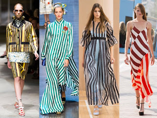
Almost every designer incorporated stripes into their 2016 spring/summer collection at fashion week, with all different shapes and colours. Prada (far left) show cased this trend in a statement skirt suit, with bold yellow and black stripes of different widths, giving a sophisticated bumble bee-like look. Roksanda (middle right) gave their stripes some wave through the lengths of the skirt to create a more feminine pattern and the graphic line were less vivid as others, with dark grey and pastel blues used. Other designers that included this stripy trend were Missoni, Dolce&Gabbana (middle left) and Jonathan Saunders (far right). 
LEAPER, C., 2016. The Spring 2016 Trend Report: Your Ultimate Guide To The New Fashion Season 
[viewed 29th February 2016]. Available from: http://www.marieclaire.co.uk/news/fashion/550957/ss16-fashion-trend-
report-the-best-women-s-fashion-trends-for-spring-2016.html
Mirrors/High Shine
Mirrors were cut up and incorporated into many designs in fashion week, including the mosaic effect created on Loewe's black jumper (left). Louis Vuitton (right) created a futuristic look with this shiny ruched dress to almost give a robot/metal look. Isabel Marant (middle) gave their model a high shine, gold bomber jacket for a glistening, cool look. This high shine trend was also seen in the makeup looks with metallic colours being very popular. 
LEAPER, C., 2016. The Spring 2016 Trend Report: Your Ultimate Guide To The New Fashion Season 
[viewed 29th February 2016]. Available from: http://www.marieclaire.co.uk/news/fashion/550957/ss16-fashion-trend-
report-the-best-women-s-fashion-trends-for-spring-2016.html


The 90s
The fashion from the 1990s was seen all over fashion week this season, with different staple pieces making a come back. Alexander Wang teamed a feminine silk-like dress with an oversized bomber jacket and cap (left), whilst Saint Laurent styled a shiny slip dress with black wellies and a statement, frilled coat (middle). The designer Chloe definitely took inspiration from the 1990s with model Edie Campbell sporting this velour matching tracksuit which were very popular amongst teens in the nineties.  
LEAPER, C., 2016. The Spring 2016 Trend Report: Your Ultimate Guide To The New Fashion Season 
[viewed 29th February 2016]. Available from: http://www.marieclaire.co.uk/news/fashion/550957/ss16-fashion-trend-
report-the-best-women-s-fashion-trends-for-spring-2016.html

Edie Campbell
FINNIGAN, K., 2015. Chloe's kaleidoscopic ode to the Ninties [viewed 29th February 2016]. 
Available from: http://www.telegraph.co.uk/fashion/paris-fashion-
week/chloe-spring-summer-2016-show-report/
Long Earrings
Shoulder length earrings made a big statement on the runway at fashion week, particularly clashing pairs. Designers were very experimental with the materials used from glass, to metal, to feathers, to plastic etc. Examples of this would be Celine (left) with different shaped metal designs and Loewe (right) with one side a slab of reflective glass and the other foiled looking metal. Many other designers included this new trend such as Oscar De La Renta, Gucci and Alexander McQueen. 
LEAPER, C., 2016. The Spring 2016 Trend Report: Your Ultimate Guide To The New Fashion Season 
[viewed 29th February 2016]. Available from: http://www.marieclaire.co.uk/news/fashion/550957/ss16-fashion-trend-
report-the-best-women-s-fashion-trends-for-spring-2016.html
Haute Slippers
Mule slippers can now become your new fashion accessory! Acne created these checked style mules for a bold and edgy look; whereas Balenciaga designed these feminine lace mules to give a romantic and soft look. 
LEAPER, C., 2016. The Spring 2016 Trend Report: Your Ultimate Guide To The New Fashion Season 
[viewed 29th February 2016]. Available from: http://www.marieclaire.co.uk/news/fashion/550957/ss16-fashion-trend-
report-the-best-women-s-fashion-trends-for-spring-2016.html

Resources:
LEAPER, C., 2016. The Spring 2016 Trend Report: Your Ultimate Guide To The New Fashion Season [viewed 29th February 2016]. Available from: http://www.marieclaire.co.uk/news/fashion/550957/ss16-fashion-trend-
report-the-best-women-s-fashion-trends-for-spring-2016.html

GLAMOUR, 2015. 20 looks that will define 2016 [viewed 29th February 2016]. 
Available from: http://www.glamourmagazine.co.uk/fashion/celebrity-fashion
/2015/10/best-spring-summer-2016-looks-and-trends

Wednesday, 24 February 2016

Mac's 5 Ps

Products

Mac sell a huge range of products for All Sexes, All Ages and All Races (mission statement), including retro matte lipsticks, glossy illuminators, pigmented eye shadows and full coverage foundations. They also sell products specifically for makeup artists to use to meet their creative needs in the Mac Pro section.

According to Mac's website, Mac's top selling products are listed below (I have only listed some of them):

Ruby Woo Lipstick
Mac's number one best selling product is Ruby Woo Lipstick! It is a matte formula which lasts well on your lips. The colour is a bright pillar box red. It is one of my personal favourites!
Mac Ruby Woo Lipstick
MAC, 2016. Lipstick [viewed 24th February 2016]. Available from: http://www.maccosmetics.co.uk/product/
shaded/168/310/Lipstick/index.tmpl
Viva Glam Ariana Grande Lipstick
This is a lipstick Ariana Grande create for Viva Glam. It is a dark plum matte shade.
Viva Glam Ariana Grande Lipstick
MAC, 2016. Most Desired [viewed 24th February 2016]. 
Available from: http://www.maccosmetics.com/bestsellers#mostdesired
Mineralised Skin Finish in Soft and Gentle
This is a beautiful baked highlighter for the face, with a shimmery finish. Add this to the high points of the face to create a glowing finish. I personally own this and it is one of my favourite highlighters because it really makes your cheekbones 'pop'.
Mineralised Skin Finish in Soft and Gentle
MAC, 2016. Best Sellers [viewed 24th February 2016]. 
Available from: http://www.maccosmetics.com/bestsellers
Studio Fix Fluid Foundation
This is a medium to full coverage foundation with a matte finish. It has SPF 15 in it and helps reduce the look of pores to give a smooth and perfected finish. I have tried this foundation and I really liked the coverage; however it felt very heavy on the skin which I didn't like.
Studio Fix Fluid Foundation
MAC, 2016. Best Sellers [viewed 24th February 2016]. 
Available from: http://www.maccosmetics.com/bestsellers
Prep + Primer Fix+
This is a light weight water mist with lots of added vitamins and minerals to help refresh and hydrate the face. You can use this before or after you apply makeup. If this is applied after makeup application it will help to settle any excess powder to give a more natural and dewy finish. I own and love this product! I use it not only as a finishing spray, but also to intensify pigments and eye shadow colours by wetting the brush first with Fix+.
Prep + Primer Fix+
MAC, 2016. Best Sellers [viewed 24th February 2016]. 
Available from: http://www.maccosmetics.com/bestsellers
Eye Shadow in Amber Lights
This is a very pigmented and bendable eye shadow in a shimmery bronzy gold shade. It can be used dry or wet depending on the intensity of finish you want. These eye shadows come in a wide range of colours and textures. 
Eye Shadow in Amber Lights
MAC, 2016. Best Sellers [viewed 24th February 2016]. 
Available from: http://www.maccosmetics.com/bestsellers

Packaging

The packaging for Mac is very sleek and sophisticated. All of the permanent products are simply packaged in black, either with the whole product being black or just the lids. There are no colours or patterns involved in the permanent range, unless it is showing a lip liner shade. All the brushes have a black handle, all the foundations have a black lid with mostly a clear body and the powders are either all black or are rimmed with black with a clear lid to show the product. The black packaging come in a small range of finishes, from shiny to matte. I think the packaging for the Mac lipsticks is the most iconic for the brand. They are shaped as a bullet and they are all black with a subtle shiny finish and they have a rim of silver under the lid with the Mac logo lining the rim in silver. All Mac products include the Mac logo with the same font, from foundations to brushes, to give them their signature look.
Examples of Mac Packaging
FARRELL, S., 2016. My MAC Cosmetics Kit Essentials [viewed 24th February 2016]. 
Available from: http://sharonthemakeupartist.com/mac-cosmetics-kit-essentials/

Mac Lipsticks
AMANDA, 2015. Swap it out Sunday- Goodbye MAC Lipstick [viewed 24th February 2016]. 
Available from: http://www.theorganicbunny.com/swap-it-out-sunday-goodbye-m-a-c-lipsticks/
The only time Mac will experiment with different colours and patterns on their packaging is when they bring out limited edition collections or VivaGlam collections. One of my favourite packaging designs would be Mac Wash and Dry Limited Edition Collection! I love the beautiful blend of colours to create an ombre effect and how the finish of the products is very glossy.
Wash and Dry Collection
EMILYISABELLA, 2015. Nail Art and Makeup [viewed 24th February 2016]. 
Available from: http://emilyisabella.tumblr.com/post/1182787
42988/love-the-new-maccosmetics-wash-and-dry

Presentation

Mac present themselves in a very sleek and professional way, but they are still seen as fun and experimental. Mac present themselves as a brand that wants to empower people and support everyone's individuality and creativity, especially through the way they look. The products are packaged in black, their staff wear all black and there stores have black furnishings, giving off a very bold, yet sophisticated image. I think the black represents confidence and strength which are two words I would use to describe Mac cosmetics. The stores are always very clean and tidy and have all their products displayed in an organised fashion which gives off a very professional image to its customers. The staff in store always have well executed makeup on and are well groomed which I think ensures the customers have confidence in them to trust their skills and opinions. In my experience, the staff in store are always very confident and chatty which makes the customers feel very comfortable, but it also gives off the message that if you buy Mac makeup you will have the sae confidence as they do.
Example of inside a Mac store
RETAILDESIGNBLOG, 2012. MAC Cosmetics Store by Pinkeye, Liege [viewed 24th February 2016]. 
Available from: http://retaildesignblog.net/2012/04/07/mac-cosmetics-store-by-pinkeye-liege/

Models Used
The models used in their adverts are usually in their mid 20s or younger and they have very doll-like faces with very perfected skin. The models almost look plastic in many adverts, which definitely doesn't give off a 'natural beauty' image. Mac is one of the only brands to use drag queens in their advertising which shows how they really do follow their mission statement of All Ages, All Races, All Sexes. Mac sponsored Ru Pal's Drag Race by providing them with makeup, showing that they support drag queens and therefore support individuality and creativity.
Ru Pal's Viva Glam Campaign
STERN, C., 2015. Move over Kendall! Caitlyn Jenner reportedly set to star in a beauty campaignfor MAC cosmetics - and lands a personal speaking agent [viewed 24th February 2016]. Available from: http://www.dailymail.co.uk/femail/article-3109669/Caitlyn-Jenner-reportedly-set-star-
campaign-MAC-Cosmetics-just-days-making-public-appearance-woman.html

Promotion

When Mac was first launched in 1984 by Frank Toskan and Frank Angelo, they relied purely on the high quality of their products and word of mouth to sell their products, so they didn't advertise or give out samples. However Mac do advertise more today, mostly in magazines and on their own website. Mac doesn't tend to advertise just one product, like other makeup brands do, but they instead advertise new collections. This means that the products aren't usually shown in the advert, but instead a look is created with the products from the new collection and an advert is created around the theme of the collection. However, an example of when the product is included in the advert would be Macs Wash and Dry collection. The three models are applying a lipstick which I assume is from the collection; however the packaging suggests otherwise as the packaging is not the packaging used for the collection; this may be because they thought it would look too fussy if the lipsticks were coloured as there is a lot going on already. The colours of each models' swim suit and accessories are all colours included in the collection's packaging which is a strong link. I like that the models look like they are sat in a laundry room, with the foam flooding from behind them because it reflects the collection's name of Wash and Dry.
Wash and Dry Advert
CFEDITOR, 2015. Make a Date with MAC Wash & Dry Collection [viewed 24th February 2016]. 
Available from: http://completefashion.org/make-a-date-with-m-a-c-wash-dry-collection-now-available-in-nigeria/

They also advertise on social media, such as FaceBook and Instagram with large followings and they interact with their customers to make them feel valued. Another way Mac promotes themselves is buy giving out new launches to beauty bloggers and beauty websites so that they can test out the new products and give their (hopefully positive) opinions on them. People are more likely to buy a product if someone they follow has used and enjoyed the product and beauty blogging has become very popular in recent years. An example of this would be when Carli Babel, a very popular beauty blogger with millions of followers, did a Mac Haul on her YouTube channel. This video has been viewed over a million times which shows that it has been successful in reaching a very large audience and therefore promoting itself to a large audience.
Carli Bybel's Mac Haul
CARLI BYBEL, 2015. MAC Haul! 2015 [viewed 24th February 2016]. 
Available from: https://www.youtube.com/watch?v=hEgJQIW-n8E
MAC cosmetics promote their brand in many more ways, such as celebrity endorsements, product placement in TV,  films and music videos, at Fashion Week etc.

Price Point

Mac products are definitely more expansive than high street brands; however they are not as expensive as some of the high end brands; however I would say it was veering towards being a high end brand because it is not sold in high street stores and it is more expansive than the lower end makeup brands. If you have a Mac Pro card then you get 40% off Mac products. To get a Mac Pro card you need to be a certified makeup artist, hair stylist or photographer. Some examples of pricing would be:
-Lipsticks are £15.50
-Foundations are £22-£29.50
-Eye shadow are £13
-Mascaras are £19


Resources:
AC, 2007. The MAC Cosmetics Story [viewed 24th February 2016]. Available from: http://marketingdope.blogspot.co.uk/2007/11/mac-cosmetics-story.html

CARLI BYBEL, 2015. MAC Haul! 2015 [viewed 24th February 2016]. 
Available from: https://www.youtube.com/watch?v=hEgJQIW-n8E

MAC, 2016. Official Site [viewed 24th February 2016]. Available from: http://www.maccosmetics.co.uk

Tuesday, 23 February 2016

Lighting the Back Drop

The front light that ligths the model is called the key light. This is also the light we're going to use when using the light meter. Only put the cell on the back drop lights as the key light doesn't need it on.

When you don't light up the back drop, it can look very grey, dark and uneven; therefore you need to create a white out is when you make the background completely white. To do this you need to add a light on either side of the back drop, with even power, to light up the background. Make sure both lights are the same and that they are the same difference from the model. The light needs to be going towards the back drop at a 45 degree angle. If the lights are too bright, there will be a flash back onto the model making the outline of the model fuzzy. If the lights aren't bright enough then you will still get shadows and discolouration, meaning a white out will not be achieved. 

You need to turn on the 'cell' switch so that the sensor on the light will flash when the key light goes off. When plugging in the sync lead to the light meter, you can plug it into the back ground light. You need to hold the light meter against the back drop so that you get the correct light meter reading. 

When there isn't much room in the studio put polyboards infront of the light so that the back drop lights don't go on the model. You need to make sure the f/ on the back drop is one stop higher than the f/ on the subject.


How to create a gradient 
Put just one light on the side of the back drop so that the light can go on one part and then fade to a darker colour on the other. You can use a floor stand if you want the light to be very low down, for example, if you wanted to create a gradient going upwards. 

Use barn doors to shape the light to stop the circle shape. Push the spill kill light shade. Into the barn doors to attach them. In the image below we used a red background and a small floor stand to get the light as low as possible. We pointed this up the back drop so that the bottom was brighter and then it faded to a darker red at the top. I really like how even the light looks and how flat the back drop looks. However there is some dark red at the bottom so I will need to make sure that I look out for this in future shoots.


Coloured gels
You can attach coloured gels onto the lights with gel holders. You can either light up the back drop or the model. When using coloured gels, always keep the key light so that it doesn't look too over the top. You can't use a light meter for this, it has to be experimental.

I had so much fun experimenting with coloured gels to create different effects and some example are shown below:
In the images below we used a white background and we put a coloured gel on the lights. We used a very short light stand to hold the coloured light and pointed the light up the back drop to create these coloured gradients. I really like how vibrant the colours look at the bottom, however the top of the images look quite grey. I think you would fix that by using a light on the top half with no coloured gel to make the top half look very bright and white.


In the images below we put a coloured gel over the light at the bottom so that we could create a gradient going upwards, as shown above. I then put a coloured gel over the light going onto the side of the model. We positioned the light at the side of the model just behind her so that the hair and side of the face was lit up. I really like how the two colours are very prominent and vibrant because it makes the image look very fun and bright. I think if I were to use this set up, I would make the colours more subtle to give a more professional look. I think I would have liked the images even more if the top of the images were completely white because the background looks quite dull and grey.

We created this image by accident but I really liked how it turned out! We kept the back drop exactly the same, by positioning the light very low down and pointing it upwards against the back drop. The blue light was then brought in front of the model, to the left, so that it completely lit up the model, making her look very blue! I think this effect looks very fun; however it is very dramatic so I think it would only be suitable for very specific photo shoots.

My Gareth Pugh Catwalk Look

Makeup
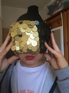
I am really happy with how well the glossy coins translated in this image. I like how there is no flash back, which I was concerned with and I like that you can see every individual coin as it adds texture and makes it clear what they are. I found that the flash in the studio caused some of the glue in between the coins to turn a purple/blue colour so I had to edit that out in PhotoShop to give a cleaner, more professional look. I liked that the black and gold coins didn't stop at exactly half way because then you would've only been able to see the black coins in this image as it is a side view. I applied foundation all over her face, all over her hand and all down her chest to make sure that any skin showing was all the same colour and texture, giving a seamless look. My mask kept falling down which meant that the red lipstick smudged slightly on the top lip! I didn't realise this until I came to edit the photos! This is definitely a lesson learned to always double check everything is perfect with the model because and whilst shooting.

I could not find a way to secure the mask on to the model's head with her holding it in place! I tried sticking elastic on the inside of the mask to use as a strap round the head; however the duck tape wouldn't hold the elastic in place and neither would a glue gun. The mask was so heavy because of the amount of coins on their that it was going to be difficult to get something strong enough to hold it. I next tried using duck tape to put over the mask and onto the tights. I did this to the side of the mask that wasn't facing the camera and it did keep the mask in place; however it looked very ugly and covered up the work I had done on the mask. As a last attempt I tried super gluing the mask to the tights; however as you can imagine this wasn't a good idea and the model found it too hot and uncomfortable. I therefore decided that it would be best for the model to hold the mask in place and I was pleasantly surprised with how it came out! I put the same foundation colour all over the model's hand that was showing to make sure that it was the same colour and texture as the face and body. I also asked my model to remove her nail polish as I didn't want the nails to look messy or distract attention away from the styling or makeup. I think the fact that the model is holding the mask makes the look very unique and it gives a mysterious element as if the model could remove the mask at any point to reveal her identity!

Hair
I am really happy with how the hair turned out! I like that the tight black material over her head looks very sleek and smooth because it makes the glossiness of the coins stand out. I also like that this covers the hair because I think the model's blonde hair would have looked too fussy and taken some of the attention away from the mask. This was inspired by Gareth Pugh's SS16 Fashion Film where his models' faces are completely covered in tight material to cover their identity and I liked that this meant the focus was on the collection and not the person wearing it. I wanted the hair to be in a very high ponytail and I wanted it to stand tall so I wrapped a strip of thick elastic round the hair band and secured it with a glue gun. I then added gold coins all around the elastic by first putting them all next to each other and then adding another layer to overlap them to cover any spaces. I really liked how this gave a three-dimensional look and how it tied in with the rest of the coin embellished look. I straightened my model's hair and then hair sprayed it to smooth away any fly-aways and I am happy with how slick and smooth the ponytail looked. I really liked how the golden colour of my model's hair tied in with the gold coins in the mask as it continued the small colour scheme.

Styling
I am so happy with how the jacket turned out! I had some problems with the coins falling off when putting the jacket on; however these were easily stuck back on so it didn't cause too much of a problem. I like that I only put the coins going round the collar because if I had put any more on I think it would have looked too over the top and would have taken too much attention away from the mask. I used duck tape to tape up my model's boobs to make them look more perky to give a more flattering a sexy look. SoHo is all about seduction so I wanted this to come across in the styling. I used a black leather belt to pull everything in at the waist to give a feminine and sexy look because I noticed that Gareth Pugh did this with almost every one of his looks. I used a leather jacket because I think leather represents power and confidence and I think Pugh wanted his models to look very strong and independent.

Photography
I wanted this image to look as though a photographer has taken a photo of a model walking down a catwalk. I therefore took the image from the side and slightly below the model as this is where the photographers would sit. I chose to use just one light and have it directly infant of the model, looking down at the model to reflect the harsh lighting of a catwalk. I used a snoot head on the light to create harsh lighting and because I wanted there to be some light on the background so it wasn't just one colour to make it look like a catwalk background. I am really happy with how sharp the image is and how it is perfectly exposed. I like that the model is not looking at the camera because in a catwalk show the model would be looking straight in front of her and not at any of the photographers.

Creating My Gareth Pugh Design

Making of the Masks

Equipment:
-two cardboard masks
-black glossy spray paint
-gold glossy spray paint
-1p coins
-glue gun

Step by step:
1. I first sprayed one mask completely gold and one mask completely black, making sure that they both had a glossy finish and no cardboard colour was showing through. 
2. I next sprayed half the coins gold and half the coins black, again making sure they were completely  covered. 
3. I used a glue gun to stick the coins all over both of the masks, with the gold going on top of the gold and then black on top of the black. I tried to make it so the coins completely covered the mask; however I sprayed the masks just to make sure the masks looked all one colour. I left one side of one of the masks free of coins as I knew the masks were going to cross over so they wouldn't be seen and may cause trouble when sticking the masks together.
4. I held the masks against my face to measure where I wanted them both to be positioned and I then stuck them together with a glue gun. I found that this wasn't particularly sturdy, but it held them together in place well enough for the mask to stay together temporarily. Below are images of how the mask looked when I had done all the above steps.
Side view.
Front view.
Side view.

Styling
I wanted to take inspiration from one of Gareth Pugh's SS16 catwalk looks because I wanted to see what the makeup and hair look would look like with his collection. I wanted to use leather in my outfit because I think it looks very strong, seductive and powerful; I like the structure and she that leather can create. I think leather can also be seen as rebellious which I think reflects Gareth Pugh's SoHo Bad Girls. Gold, black and red coins have been incorporated into the looks, either as necklaces, sleeves or collars, but also as whole pieces. I was inspired by the three looks below because they all incorporated leather and then relatively subtle coin decoration.
Collage of images made by me from
LONDONFASHIONWEEK, 2016. Gareth Pugh [viewed 12th February 2016].
Available from: http://www.londonfashionweek.co.uk/designers_profile.aspx?DesignerID=123&SeasonID=57
I was inspired by the leather jacket feel of the outfit on the left, the fact that the coins were on the collar in the middle look and then I liked the subtlety of the coins in the look on the right. I therefore decided to use a black, structured leather jacket and decorate the collar with gold coins. I decided to only put the coins round the outside of the collar because I didn't want the clothing to take attention away from my makeup and hair look in my final catwalk image. I sprayed all the coins with a metallic gold spray and then stuck them on individually with blue tack. I was hoping to stick them on with a glue gun; however they stayed on well enough with blue tack and I didn't want to ruin the jacket! I want the styling to look sexy so I don't want the model to wear anything underneath the leather jacket. 


Continuing the Look

1. To create the very tight material all over her head I used black tights. I pulled one leg over the model's head and then cut a hole at the top where I wanted the model's ponytail to come out. I then cut a line up to her nose so that the mouth could be seen and then tucked the loose parts up either side to create a smooth line round to the back of the neck.

2. I asked my model to put the mask on so I could see what it would look like with the black tights. I also gave my model a quick matte red lip so that I could get an idea of what the colours and shapes would look like together.

I was happy with how the mask was looking with the black tights on the head because I felt it gave more of a sleek look because I felt that if we saw the model's hair it would look slightly messy and there would be too many colours. My model had blonde hair with lots of highlights so I think it would have made the look too colourful, instead of keeping it very abstract and almost futuristic. I was inspired to put tight material over the model's head by Gareth Pugh's SS16 Fashion Film because their models covered their faces completely to hide their identity and I thought it looked really effective and made the film more about the fashion than the people wearing it; this is why I used a mask to cover the model's face. In my final shoot I will out through a high ponytail through the hole at the top and add coins around the hole to add decoration and to cover any rough edges. Her hair is blonde so I think it will bring more gold colours into the look and therefore emphasise the gold in the mask to give a very expensive and luxurious feel. I like that the coins are very shiny because it brings in the metallic 2016 spring/summer trend. I like that the lips are a matte red colour because they stand out against the gold and black colours and they follow the 2016 spring/summer trend of matte red lips. I also like that the red lips give the look a more sexy and fierce look as I think red lips represents confidence and seduction, which I think is what Gareth Pugh wanted his SoHo Bad Girls to have. When I shoot the look the model will have perfected skin to give a flawless look and she will be wearing styling that reflects Pugh's SS16 collection.

I am concerned with how I am actually going to attach the mask onto the model's head without her holding it. I may experiment with tying thick elastic round the back of the mask or even securing the mask with duck tape. This is what I am most nervous for with the shoot so hopefully I will be able to find a way around this.

Saturday, 20 February 2016

How to: Braiding

A braid is against the scalp, a plait is a free hanging plait.

Equipment (for all)
-hair elastics
-hair spray
-tail comb

5 Strand Plait
1. Section off the front two sections, drawing a straight line from just behind the ear to just behind the ear.
2. Split the rest of the hair in 5 even sections.
3. Take outside section over the one next to it and then under the next section. 
4. Take opposite outside section over the on next to it and under the one after that.
5. Repeat this until you secure it with an elastic.
I am happy with how this came out; however I think I could have made the sections more even. I struggled with knowing how to handle the hair in my hands because I kept feeling like I was letting go of hair that I needed and I felt like the plait kept getting too loose. If I were to do this hair style I would make sure that the hair elastics matched the hair colour to make them look more discreet.

8 Strand Plait
1. Starting with the 5 strand plait, plait the outside sections as normal, but each time you go down the hair and loop one side into the 5 strand plait.
(Always keep the hair coming forwards)
5 Strand Plait.
8 Strand Plait
The thing I found most difficult with this plait was how to position all the hair in my hands. I found it hard to hold all three strands and then open up a space to fit one of the strands through, so I found myself dropping pieces by accident and then having to reposition them. I also found it difficult to get the sections of hair through the other plait because I found the hair got tangled and looked frizzy if I didn't do it precisely enough. I found the more I did this look, the easier these things became; however I still need to do more practising before I become confident with this look. I like how it came out; however it looks slightly uneven because I think the sections of hair on the right were slightly bigger. I will need to check all sections are completely even next time.

11 Strand Plait
This is exactly the same as the 8 strand plait, apart from you plait on the other side. So take three even sections, plait as normal three times and then loop that strand under one of the outer sections of the 5 strand plait and repeat these steps.
11 Strand Plait
I think I did this side better than I did on the 8 strand plait because I made the sections more even with the ones in the 5 strand plait so it blended in more seamlessly. I found it easier on this side to hold all the sections of hair; however this may just be because I had practiced on the other side. I am happy with how this turned out, although I think it would have looked better on longer blonde hair because I would have been able to make it bigger and I think the highlights in blonde hair would make it look more detailed and pretty. If I were to do it again I might add some oil in the hair to make it smoother and to make sure it didn't get frizzy like it did slightly this time. 

Backwards plait
1. Do a plait that goes backwards, meaning the hair goes underneath each section.
I was very happy with how this came out because I thought the sections were even and the plait looked neat. I am confident with plaiting normally, so I didn't struggle with doing it backwards. 

Dutch braid
1. Start off by sectioning the hair into three even parts.
2. Do a normal plait and cross the hair over each other three times.
3. Start doing a french plait, but instead of taking the hair over each time, take the hair under instead to create a more three dimensional look.
4. Continue this until you run out of hair to add into the plait and then finish it off with a normal plait.
 I am really happy with how quickly I picked this technique up and how neat the front part looks and how tight the plait looks; however I missed out a section of hair just below the crown of the head which made the plait look misshapen. If I hadn't of missed this section out I would have been very happy with this type of braid.

Waterfall plait 
1. Start at a corner to the parting and put hair in three sections.
2. Plait as normal three times, then let the third section hang free.
3. This means you will be left with two sections, so pick up another one, above the plait, closer to the parting and use this as your third section.
4. Continue this pattern all the way to the end of the plait and then finish it off with a normal plait.
I am so happy with how this turned out as I had never done anything like it before! I found it confusing at first but quickly got the hang of it and I think it turned out very neat and pretty looking. I think my sections were even so that water fall looked very neat and I liked how tight I kept the top braid.

Ladder Braid
1. This is a follow on braid from the waterfall braid. You start off my splitting the section of hair below into three equal sections.
2. Start plaiting with these sections as normal for three cross overs and then add one of the falling sections from the above plait to the next section that will be crossed over.
3. Do this in either two strand cross over or three strand cross over intervals to make the ladders as close or far away as you want.
4. You continue this technique as far back as you want and then finish it off with a regular plait, securing it with a hair elastic.

I am really happy with how this came out, especially considering I had never done it before. I found it confusing to start off with because I thought it was a french plaits, but it was actually only a regular plait but adding the falling hair into it. I think the plait looks very neat and tight and the sections look very even.