Thursday, 18 February 2016

Photography - Macro Lenses

We used Macro lenses in class today to experiment with taking some close-up photos. If a camera has a Macro lens on it, then it will be able to focus on the subject more accurately close-up. We also used Prime lenses which are fixed with one number, so you can't zoom in and out. This is beneficial because it makes everything in that lens perfect for that lens size, meaning the photos will be of much better quality than a zoomable lens. When using a Macro lens it is important to use a tripod so that the camera is always in the correct position. We were advised to have the model sitting down so that they are always the same distance away from the camera so that the camera stays in perfect focus and the exposure is correct. 

When doing close-ups it is important that your lens is focused on the correct object, meaning it is sometimes better to set the camera on a tripod and focus it carefully manually. Below is an example of a normal lens verses a Macro lens and as you can see, when the normal lens took a close-up of the flower the background looks very visible and is distracting. However the close-up of the flower using the Macro lens the background is very blurred out and looks very far away, making the flower a clear focus. 
Normal lens vs Macro lens
NIKON. Macro: Background Selection [viewed 18th February 2016]. 
Available from: http://dslr.nikon-asia.com/amateur3/macro_print
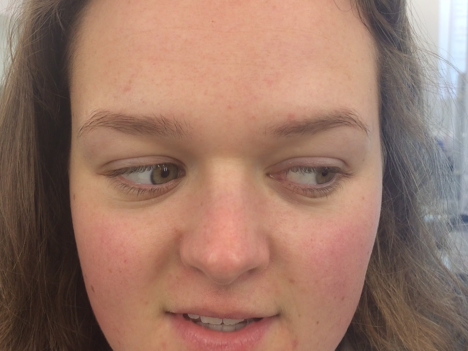
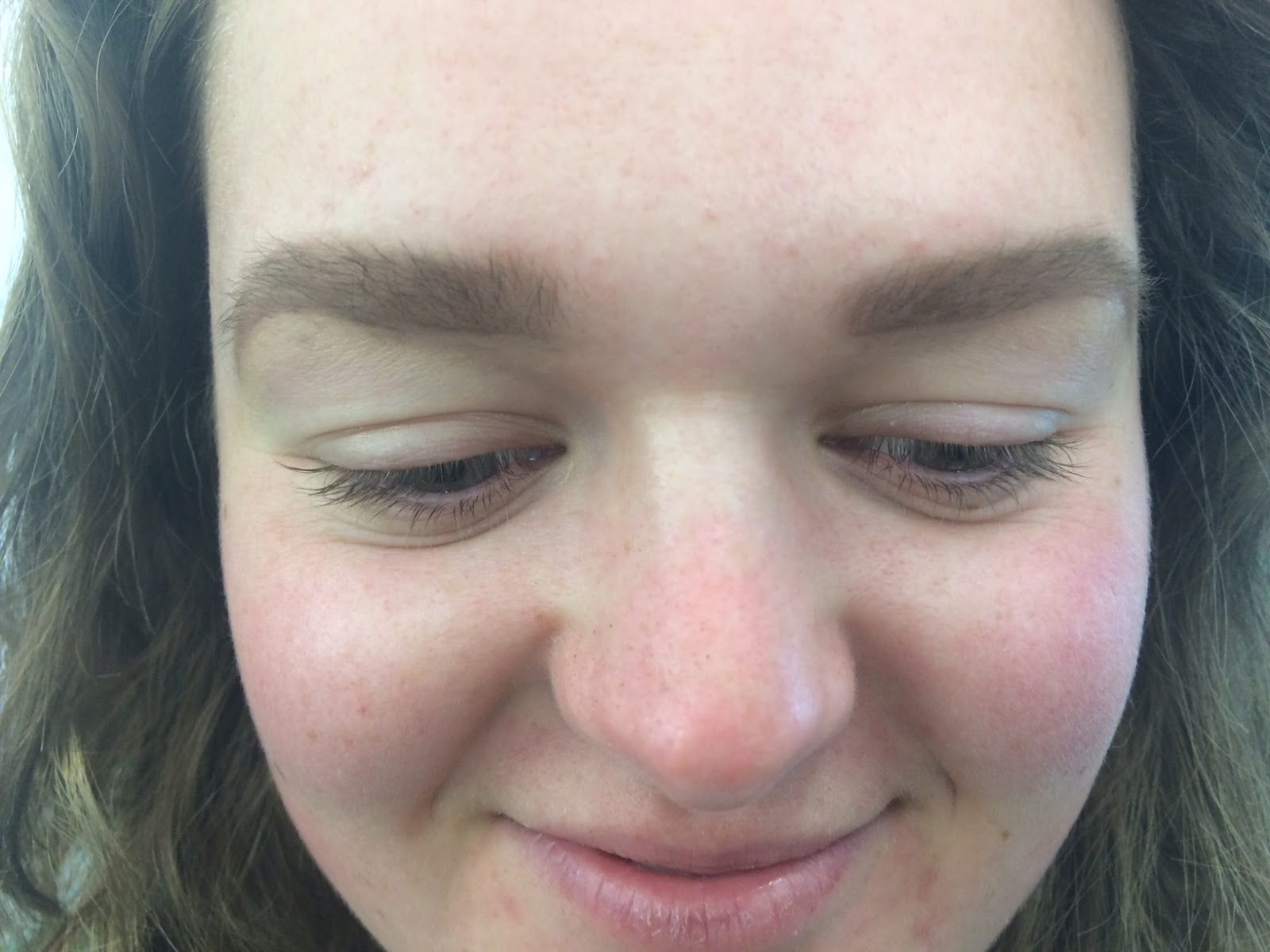
I took the image below with a Macro lens. I used a tripod to keep the camera in the exact please I wanted and so there was minimal camera shake. I had my model sit down so that she stayed in the same place; however because I was so zoomed in, I found that even if the model moved a tiny amount, she moved out of frame and out of focus. I also found that I had to be very careful with what the lens was focused on because it could change very easily; I therefore used manual focus so that I could make sure the right part of the image was in focus. I am really happy with how the images came out and I had fun experimenting with compositions and facial features. 


We were introduced to work stations where the camera was connected to a computer screen. This meant that the images you were taking came up big on the computer screen so that you could see them a lot more clearly. I found this very useful because because then everyone on set could look at the images easily and you could see more detail in the images when they were blown up bigger. An example of a work station connected to a camera is shown below and as you can see the images the woman is taking is coming up on the computer.
Example of a work station linked to a camera.
ROYALCOLLEGEOFART. Photography Facilities [viewed 18th February 2016]. 
Available from: http://www.rca.ac.uk/studying-at-the-rca/facilities/college-wide-facilities/photography-facilities/
More examples of images I took with a macro lens:


Resources:
ROYALCOLLEGEOFART. Photography Facilities [viewed 18th February 2016]. 
Available from: http://www.rca.ac.uk/studying-at-the-rca/facilities/college-wide-facilities/photography-facilities/

NIKON. Macro: Background Selection [viewed 18th February 2016]. 
Available from: http://dslr.nikon-asia.com/amateur3/macro_print

Wednesday, 17 February 2016

Experimenting with Eyeliner

Equipment:
-eye shadow primer (if oily eye lids)
-eyeliner
-eyeliner brush

Eye shape consultation:
My model's eyes were an average distance apart; I measured that I could fit one of her eyes in the middle of her eyes to check. Her eyes weren't slanted or droopy, instead they were an almond shape. This meant that I didn't have to do any corrective work with the eye liner shape; however her brow bone skin hung ever so slightly over her eye lids so I had to be careful when making sure the wings looked straight.

1. Natural/Everyday eyeliner look.
I asked the model to close her eyes and then made a very thin line along her lash line with short strokes of the brush. I then added a small wing at the corner of both eyes to elongate the eyes. I am happy with how the eye liner turned out because they look very smooth and even; however I would improve them by making the wings more even as I feel one of the wings flicks up more than the other.

2. Dramatic/Night time eyeliner look.
I made the eye liner thicker and the wings longer for this look to make more of a statement eyeliner that you would maybe wear to an event or night time occasion. I found that one of her eye lids was more visible than the other so I asked my model of she wanted me to make one thicker than the other or to just make them equal and them look slightly odd, and she wanted me to make them equal. I am happy with how they came out; however I prefer her right eye because the wing looks straighter. The eye liner on the right ey covered the eye lid completely which I found made the eye look smaller, however I think with eye shadow you wouldn't notice this as well. 

3. SS16 catwalk inspired eyeliner look.
For this eyeliner look I was inspired by Vionnet's SS16 catwalk look at Fashion Week, with the very bold, graphic eye liner look. I created a right angle in the inner corner, going straight up. I then drew a straight horizontal line across the eye to the outer corner. I then filled the whole shape in and creates a wing look on the outside and made it look like rough brush strokes to mimic the jagged corner of the Vionnet's look. I am really happy with how it came out; however I could have spent more time making the lines very straight and perfect looking to give it a more polished finish.
Violet's SS16 makeup look.
HARPERSBAZAAR, 2015. The Ultimate Paris Fashion Week SS16 Beauty Round Up [viewed 17th February 2016]. Available from: http://www.harpersbazaar.com.sg/16085/paris-fashion-week-ss16-beauty-round-up/


Tuesday, 16 February 2016

Experimenting with Eyebrow Shapes

In class today we were asked to do four eye brow pictures on three different people. The first image was to show how the eye brows looked before any makeup was applied. The second image showed how the client would like their eye brows doing. The third eye brow was to shown how you would recommend the client to wear their eye brows. The forth image was to show a catwalk inspired eye brow.

Client 1 - Anna
1. This is how my model's eye brows looked with no makeup on. They were well groomed and had a defined shape; however they look sparse in places and may need lengthening slightly. My model already had her base on so I didn't remove her makeup before as she wanted her base to still be on.

2. I first asked my model what she wanted her eye brows to look like and she said she wanted them to look defined, dark and slightly longer than naturally. I used a dark brown eye shadow and small angled brush to give them a defined and sharp edge. I first outlined the bottom of the eye brow, then the top so that I could get a clearer indication of where I wanted her eye brows to be. I then filled them in with short, light strokes, getting lighter as I got to the middle. I then cleaned the under neath of the eye brows with concealer to cover any small hairs or eye shadow mistakes. My feedback on the eye brows was that she wanted them to be brought in slightly more and she wanted them a bit more defined.

3. I felt that the eye brows she wanted were slightly too intense and so I wanted to soften them. I used a much lighter hand when filling in the eye brows because I wanted them to look slightly softer. I used concealer underneath the eye brows to make the underneath look more defined as I didn't want them to look bushy or messy, even though I wanted a natural finish. They eye brows look a lot lighter in colour which I think suit her light brown hair. I am really happy with how these came out.

Mui Mui SS16
KETKIN, S., 2015. Every Haute Hair and Makeup Look From London, Milan and Paris [viewed 16th February 2016]. Available from:  http://www.popsugar.com.au/beauty/Spring-2016-Fashion-Week-Hair-Makeup-38523697
4. For my last image I was inspired by the model's eye brows in Mui Mui's SS16 catwalk look. I filled the eye brows in to look very strong in the centre and then I faded them out towards the end. I am not a massive fan of this look as I feel like it just looks like I forgot to fill in the rest of her eye brows; however I think they would have looked better if I had used a black eye shadow to show a strong contrast between the centre parts and the ends. 

Client 2 - Nensi
1. This is how my model's eye brows looked with no makeup on. They were relatively well groomed and had a defined shape; however they look sparse in places and some stray hair needed to be covered with concealer. My model didn't have any makeup on so I used a button pad with cleanser on it to remove any excess makeup or dirt.

2.  My client said she wanted her eye brows to look natural and so only wanted me to fill in her sparse areas. I used a small angled brush and some dark brown eye shadow and created light brush strokes to fill in any sparse areas. I didn't outline the eye brows as she said she wanted them to look slightly very soft looking.

3. This is how I would recommend Nensi to do her eye brows. I think that she should make them look more defined and strong to match her dark hair and to frame her face. I outlined her eye brows on the top and bottom to make them look more prominent. I then filled them in with a slightly more heavy hand to make them look darker. I used concealer and a small flat brush to clean up the bottom of the eye brows. I really like how they came out and think they suit her face and hair a lot better.

MARCH, B., 2015. Spring/Summer 2016 hair and makeup trends [viewed 1st February 2016].
Available from: 
http://www.cosmopolitan.co.uk/beauty-hair/beauty-trends/g4142/spring-summer-2016-hair-makeup-trends/?slide=29

4. I was inspired by Christopher Kane's SS16 makeup look with the very bold and bushy eye brows. I added a lot of product to the eye brows and then brushed the eye brow hairs up. I wanted to make them look as bushy as the cat walk inspiration; however I found her eye brow hair weren't long enough. If I were to do this look again I would add some eye brow gel to make the brow hair stay in place.

Client - Harriet
1. This is how my model's eye brows looked with no makeup on. They weren't well groomed and didn't have a particularly defined shape, they look sparse in places and may need lengthening slightly. My model didn't have any makeup on so I removed any excess makeup or dirt on the face with a cleansing wipe.

2. My model wanted her eye brows to look very natural and soft so I used a medium brown eye shadow and used very light and soft brush strokes to give a very natural look and light look. I very gently underlined the eye brows to give the eye brows a bit more definition, but still keeping the top part soft.

3. I suggested that she made her eye brows slightly more dark and defined. I used the same medium brown eye shadow to fill in her eye brows and I under lined them slightly more to make them look more defined. I used some light concealer on a small flat brush to clean up under her eye brows to cover any sparse hairs or fall out to give them a polished look.

MARCH, B., 2015. Spring/Summer 2016 hair and makeup trends [viewed 1st February 2016].
Available from: 
http://www.cosmopolitan.co.uk/beauty-hair/beauty-trends/g4142/spring-summer-2016-hair-makeup-trends/?slide=29

4. I used the image above of Christopher Kane's SS16 makeup with the very bold and bushy eye brows. I used the same medium brown eye shadow, but didn't give her as sharp an outline as before. I then took a disposable mascara wand and brushed all the hairs up. I am happy with how bushy they look; however if I were to do this look again I would have set the brow hair with eye brow gel to keep them in place.

Monday, 15 February 2016

Finalising my Face and Hair Charts

Just as I was doing my face charts for my designs for Gareth Pugh's SS16 collection, I realised that I hadn't included any makeup in my designs! I therefore adapted the look so that I could include more SS16 makeup trends. I also wanted to improve my designs because I felt they looked too much like knights and I didn't think the tights over the whole head would work as the face would have looked too flat. I really wanted to include more coins into my design as they were a main feature in Pugh's collection. I also wanted to include some hair and makeup 2016 spring/summer trends to keep the look relevant. I wanted to also make the look a bit circus/fairytale like as Pugh described SoHo as being in Disney land. 

Face Chart

Phantom of the Opera
JACKSON, M., 2009. Andrew Lloyd Webber: Michael Jackson wanted to appear in 
Phantom of the Opera' [viewed 15th February 2016]. Available from: 
http://www.telegraph.co.uk/culture/music/michael-jackson/5664341/Andrew-
Lloyd-Webber-Michael-Jackson-wanted-to-appear-in-Phantom-of-the-Opera.html
I was inspired by the white mask worn by the Phantom of the Opera when watching the film. I really liked how the mask didn't cover the whole face and I liked how it almost had a clown look about it. I decided that instead of covering glasses with coins, I would cover a mask with coins which only covered half the face. I felt like this would make more of an impact than glasses and I thought the glasses would look too much like part of the collection. I wanted to bring the circus element into the look with a mask, but I didn't want the mask to cover the whole face as I wanted to use makeup on the face and I thought it would look too attention grabbing with the whole face covered in coins. I also didn't want to put coins all over the face as some of Pugh's outfits didn't even have coins in them so I thought the coins all over the face look would be too over powering. I knew that I wanted to keep within the small colour scheme of black, gold, red and white and then I was inspired to do two different colours on each side of the face by the Phantom of the Opera, so I just needed to decide what colours to use. I knew I wanted to make the lips red as it worked with my colour scheme, it is a SS16 makeup trend, but also because it looks very powerful and seductive, which are both aspects I think Pugh wanted to show in his SoHo Bad Girls. 

I decided to do some experiments with the different colour combinations; however I knew I didn't want white as I thought it would look too stark so I just experimented with the others. I had already decided that I wanted to use black tights over the head from my previous hair charts so I added them in this experiment. I only roughly ripped the masks in half to save time but it gave me the general picture of what it would look like. 

I first tried gold and red. I liked that the red would match the lip; however I wanted the red lip to stand out and I felt they wouldn't if a big part of the mask was also red. I really liked the finish of the gold spray because it looked metallic which I thought would make the coins look very sparkly and this metallic finish is a 2016 spring/summer trend. Another thing I didn't like with this colour combination was that the black tights over the head would look very disjointed from the masks, meaning I felt the black could work better as it would be more fluid looking. 


I then tried the red and black. I liked how the black mask blended in slightly with the black of the hair design; however I again didn't like that the red took attention away from the red lips. I also felt like the black and red combination looked too dark and not fun enough.

I finally tried the black and gold which turned out to be my favourite. I like that the metallic finish to the gold coins are a predicted 2016 spring/summer trend. I like how much of a contrast the dark black and bright gold had and I liked how these colours contrasted with the bright red lip. I liked that the gold represented wealth and the black represented poverty because this is something Pugh showed in his collection with the contrast between the rich furs and cheap looking PVC. I liked that the black mask blended in with the black hair design because it made the look more fluid and combined. I liked that the black and gold added a sense of glamour to the look to reflect the seductive feel to SoHo, but also that the people in SoHo want to dress to impress. 

I wanted to add some black kohl liner to the water line to make the eyes look more seductive and to make them stand out from under the mask; this is a predicted spring/summer 2016 trend. I didn't want to make the skin dewy because I felt like the shiny coins and bright red lips looked very dramatic already and I thought it would reflect the matte red lips; I therefore decided to keep the skin matte. I am really excited about this design and I can't wait to experiment with everything! 

Hair Chart
My hair chart is shown below. I wanted to keep the hair very similar to my last design I had made previously, with the black tights over the face; however this time I would have to cut around the face because I want the lower part of the face to be showing with the lips. I also don't want the tights to come down as far down the neck because I want the neck to look bare from the front, as if it carries on from the face. I kept the high ponytail the same, with it coming out of the tights material, because I liked how it didn't draw too much attention away from the face and how it looked very slick and neat. I decided to add some coins around the hair band because I thought it would tie the makeup and hair look together and I also thought it would cover up the hole in the material if it didn't look very neat! I thought it would work if I put the black and gold coins the opposite sides to the mask colours, so half the coins are black and half are gold. The ponytail will then be very straight but not wet-look because I think it would look too slick when the SoHo Bad Girls are supposed to have the vibe that they're going out.

Designing my Initial Face Charts for Gareth Pugh's Collection

I was inspired by the image below of Beyonce in her 'Diva' music video where she wears these statement glasses with shiny tassels running down from the rim. I loved how the tassels moved when she walked as it added movement and drama. I feel like these glasses are very diva-like because they are clearly being worn for fashion purposes and not practical ones. This would work perfectly with Gareth Pugh's very strong collection where he calls the models SoHo Bad Girls because, to me, that means the girls are rebellious and cool. I was also inspired by some of the brands that had their models wear sunglasses down the catwalk for their SS16 collections, including PPQ and Zeno.
AC, 2009. BLESS Duo Fringe Glasses /Beyonce 'Diva' Glasses [viewed 15th February 2016]. 
Available from: https://1ac1.wordpress.com/2009/03/19/bless-duo-fringe-glassesbeyonce-diva-glasses/
I was inspired by Balmain's very sleek ponytail look for their SS16 Fashion Week collection, which was designed by Sam McKnight. I loved how the very tight high ponytail made the models look very fierce and powerful and how the ponytail almost gave the models a face lift but pulling up the eye brows. I like how they used gel to give a very smooth and glossy finish as it ties in the 2016 spring/summer trend of wet-look hair and it makes the hair look very sleek and clean, with no baby hairs showing. Hair extensions were used in this look to give the models very long and thick ponytails which I liked because then all the models would have the same looking hair which I think looks neater and more seamless. The ponytails were wrapped up in paper before the girls went on because Sam McKnight wanted the ponytail to be perfectly straight, without any kinks in it. I like how some hair was wrapped around the hair band securing the ponytail because it gave a more seamless and perfected look and it also made the ponytail sit even higher. I want to incorporate this hair style into my look for Gareth Pugh's collection because I think it reflects his Bad Girl vibe with this fierce, slick ponytail.
MARCH, B., 2015. Spring/Summer 2016 hair and makeup trends [viewed 15th February 2016].
Available from: 
http://www.cosmopolitan.co.uk/beauty-hair/beauty-trends/g4142/spring-summer-2016-hair-makeup-trends/?slide=9
SHAPOURI, B., 2015. The High Ponytails at the Balmain Spring 2016 Will Rock Your World [viewed 15th February 2016]. Available from: http://www.glamour.com/lipstick/blogs/girls-in-the-beauty-department/2015/10/balmain-ponytail-spring-2016-paris
SHAPOURI, B., 2015. The High Ponytails at the Balmain Spring 2016 Will Rock Your World [viewed 15th February 2016]. Available from: http://www.glamour.com/lipstick/blogs/girls-in-the-beauty-department/2015/10/balmain-ponytail-spring-2016-paris
Another aspect I wanted to incorporate into my look was the fact that you can be whoever you want to be in SoHo; you can escape being who people possibly expect you to be. I wanted to cover the model's faces so that they were unidentifiable to represent how people are possibly moulding into one person in today's society so that I could portray the importance of individuality. I also felt that this would put more focus on the clothes and not the people wearing them. I was inspired by Gareth Pugh's SS16 Fashion Film, directed by Ruth Hogben because some of the models completely covered their faces with a tight black material and I thought it gave a really powerful message of creating your own identity. I think the black head look would contrast perfectly with the gold 1p coin glasses to make then stand out. I haven't decided what colours I definitely want to do all these different aspects in; however I think I have the basic shape of what I want.
Screenshot from Gareth Pugh's SS16 Fashion Film
SHOWSTUDIO, 2015. Gareth Pugh S/S 16 - Fashion Film by Ruth Hogben [viewed 12th February 2016]. 
Available from: https://www.youtube.com/watch?v=TzRHnRx7NoQ

I decided to incorporate my face charts and hair charts together because the makeup looks are all combined with the hair and there isn't much detail on the face. I also thought it would be useful to see what the hair and makeup would look like together, instead of guessing if they will match.

Face/Hair Chart 1
For my first chart I incorporated all of the aspects above that I had been inspired by and I pieced them together to create a new look. I decided to use a black material, probably tights, to cover the face completely so that the model is unidentifiable; this was inspired by the models styling in Gareth Pugh's SS16 Fashion Film. I chose the colour black because it's very mysterious and can be seen as threatening which I can image Pugh's Bad Girls being like. I then decided to add square shaped glasses, just like the tasseled glasses seen on Beyonce in her Diva music video. I added 1p coins all over the glasses and I wanted them to sparkle and move just like they did on Pugh's pieces so I will try and just attach them loosely to the glasses so that aren't so flat. I decided to keep the 1p coins their natural colour of a deep copper because I wanted to give a slight punk look. I felt like the decorated glasses would make the models look like divas who wear glasses to look good and not for any sort of practical reason. The 1p coins would act as the 2016 spring/summer trend of metallics, keeping the look very up to date. I kept the mask and the glasses within the colour scheme of black, red, white and gold because I didn't want to distract from the clothing too much. I then wanted to incorporate the high ponytail so I decided to cut a hole in the black material for the ponytail to come out of. I think I will use some gel or a lot of hairspray on the ponytail because I wanted to give it a wet-look finish to make it look ore sleek and seductive; this is also a 2016 spring/summer trend. In the sketch of the look above, she look almost like a knight but I can't image it looking like that in person; I clearly need to work on my drawing skills! 


Gareth Pugh Interview

I watched an interview of Gareth Pugh by Vogue Paris and he was saying how he wanted this collection to be very fun and he wanted it to reflect the feel of a Saturday night out in SoHo. He grew up in SoHo and was educated there so has fallen in love with the place so he almost wanted to express his love for the city through his collection. He also said that he wanted to show how there is a lot of wealth, but also a lot of poverty which I think he shows through using luxury furs and leathers and then the more tacky looking PVC. He said he felt like SoHo was like DisneyLand, but that it's loosing that so he wanted to show what SoHo is about. After watching this interview I realised that Pugh wanted the collection to have much more of a fun vibe to celebrate his love for SoHo and I feel like the look above it too punk-like and dark for it to be seen as fun. I therefore decided to experiment with the coloured that I used to make the look more fun and exciting.

VOGUE PARIS, 2015. Fashion Week: Interview backstage avec Gareth Pugh [viewed 15th February 2016]. 
Available from: https://www.youtube.com/watch?v=On9cDELedb0

Face/Hair Chart 2
I really liked the idea I designed above; however after watching the interview with Gareth Pugh, above, I wanted to make my design more fun and brightly coloured. He said in the interview that he wanted the collection to be more fun than his previous collections and he wanted it to reflect a Saturday night out in SoHo. He also describes SoHo as Disney Land which made me think of a fantasy world where you forget about everything in your day-to-day life; he also says he's excited by the energy London has so he wanted to portray this in his collection. I decided to make the material over the head red instead of black because I felt that the black was too morbid and serious looking, when instead I was aiming for a more creative and energetic to reflect Gareth Pugh's energy towards the collection. I then decided to make the sunglasses a round shape because I felt the square glasses were too dive-like and I wanted to create a more fun and quirky look. I will again stick coins onto the sunglasses to reflect the 1p coins used in the collection and to add some sparkle and glamour to the look. I then wanted to keep the hair exactly the same, with a long straight ponytail coming out of a hole in the material, because I liked how slick and neat it looked as I didn't want the hair to look too fussy against the bold face look.


Resources:
SHAPOURI, B., 2015. The High Ponytails at the Balmain Spring 2016 Will Rock Your World [viewed 15th February 2016]. Available from: http://www.glamour.com/lipstick/blogs/girls-in-the-beauty-department/2015/10/balmain-ponytail-spring-2016-paris

Friday, 12 February 2016

Playing Around with Ideas for Gareth Pugh's Look

I knew I wanted to do something very avant-garde with this look to reflect Gareth Pugh's very bold and loud collection. I also knew that I wanted to keep the makeup look within the colour scheme of red, blue, white and gold as those were the colours used in his collection. The collection was inspired by SoHo so I want to incorporate aspects of SoHo in the look and when I think of SoHo I think of the bright lights from strip clubs and gay bars so I would love to somehow include lights into my look. Another aspect I would like to include in my look would be coins as coins are seen in many of his looks and there were coins running either side of the runway at the show so I think they are a very strong motif and would be fun to experiment with. One of the popular 2016 spring/summer trends was metallics, which I think I could incorporate perfectly if I decided to use coins in my look.

The coins that were used in Gareth Pugh's collection were 1p coins. The coins were incorporated into many of his looks, for example below they are all hanging from a collar. These same 1p coins were also used to run along either side of the runway.
DREZEN, C., 2016. SS16 Details 14/15 [viewed 12th February 2016]. 
Available from: http://www.dazeddigital.com/fashion/gallery/20739/13/ss16-details
I wanted to do something about hidden identity in this look and I thought masks would be the perfect way to do this. However I also thought about what people actually do sometimes to cover their identity and I thought of sunglasses straight away. People use sunglasses to either disguise who they are or if they want to cover up their face to conceal a night out etc. I would either cover the glasses in 1p coins or I would somehow incorporate LED light into the glasses. I found this image below of some glasses that were decorated with LED lights on Amazon and I chose the colour yellow to reflect the motif of gold coins. I really like how these look; however the runway would have to be dark for them to show up which could cause problems and when I took my catwalk photo it would be difficult to light and show the lights on the glasses at the same time.

LED light glasses.
LERWAY, 2016. Lerway Neon EI Wire LED Light Up Shutter.. ..Outdoor Activities [viewed 12th February 2016]. Available from: http://www.amazon.co.uk/Lerway-Controller-Clubbing-Wayfarer-Activities/dp/B00RK1M59G/
ref=sr_1_10?ie=UTF8&qid=1455272484&sr=8-10&keywords=led+light+glasses

Gareth Pugh's SS16 Fashion Film
SHOWSTUDIO, 2015. Gareth Pugh S/S 16 - Fashion Film by Ruth Hogben [viewed 12th February 2016]. 
Available from: https://www.youtube.com/watch?v=TzRHnRx7NoQ

I decided to watch Gareth Pugh's fashion film about his SS16 collection to gain inspiration for the catwalk look I will be designing because I felt like the catwalk show and the fashion film should have links and should compliment each other as almost one piece. Gareth Pugh collaborated with film maker Ruth Hogben to create this provocative film. The fashion film is set in SoHo as the collection itself was inspired by SoHo, as Gareth Pugh says "For me Soho’s a little bit like Disneyland or a fairground, it’s about fantasy or escapism, you can go there and be somebody else". I noticed that all the models' faces were completely covered up, wither with a black cover or a coin-covered mask. Gareth Pugh made is clear that he loves SoHo but I think this fashion film is his way of reaching out to people that SoHo needs to be saved. The girls in the fashion film were described as SoHo Bad Girls which I like because the girls look very rebellious and mysterious, with there covered identities and bold clothing. I also want to reflect this in my hair and makeup designs. I really like the contrast between the high fashion and the cheap 1p coins because it reflects the struggle between creativity and cost. 

The first model in the fashion film, styled by Katie Shillingford, was dressed in a body suit covered in black/dark grey coins. Her whole head was completely covered with these same black coins and I loved how they sparkled in the light. She looked almost insect-like as she wrapped her legs round and spun on the pole, possibly representing the seedy side to SoHo. The black of the outfit suggests a morbid feel, which could reflect Pugh's feeling towards SoHo's deterioration. There are closeups where you can see that she is wearing a mesh bodysuit and then the coins have been individually sown on so that they can still moves freely and therefore create the sparkling effect. I will consider this when designing my look as I want to create the same sparkle and movement in my look. The second model has her face, again, covered completely in coins; however this time they are a rich red. This red could reflect the pain in Pugh heart of SoHo's downfall or it could represent the richness that SoHo potentially has to offer. This model is wearing a short-sleeved mini dress which is covered in red coins. I like how there is not a start-stop aspect the the coins, but that they continue all up the neck to join the face to the clothing. 

Girl 1
SHOWSTUDIO, 2015. Gareth Pugh S/S 16 - Fashion Film by Ruth Hogben [viewed 12th February 2016]. 
Available from: https://www.youtube.com/watch?v=TzRHnRx7NoQ

 Girl 2
SHOWSTUDIO, 2015. Gareth Pugh S/S 16 - Fashion Film by Ruth Hogben [viewed 12th February 2016]. 
Available from: https://www.youtube.com/watch?v=TzRHnRx7NoQ
The two other girls that stood out to me where the girls who had black tight black material pulled over their heads. This gave a less dramatic look because they weren't completely covered in coins; however the all black look could also be seen as more of a statement because it is such a harsh colour. I think this would be used if the outfit didn't have any other coins on the outfit or if it would look better without the coins, for example the black head cover looks great on Girl 3 because she is wearing long black gloves and black tights so the black ties in with each other.
Girl 3
SHOWSTUDIO, 2015. Gareth Pugh S/S 16 - Fashion Film by Ruth Hogben [viewed 12th February 2016]. 
Available from: https://www.youtube.com/watch?v=TzRHnRx7NoQ

Girl 4
SHOWSTUDIO, 2015. Gareth Pugh S/S 16 - Fashion Film by Ruth Hogben [viewed 12th February 2016]. 
Available from: https://www.youtube.com/watch?v=TzRHnRx7NoQ
I noticed in the catwalk show and in the fashion film that all the girls wear slightly different makeup and have slightly different hair to suit whatever outfit they're wearing. This makes sense because some of the outfits look more clown inspired, whereas some of the outfits look more punk inspired. I therefore think I will select a section of clothing from Gareth Pugh's SS16 collection and design a hair and makeup look for that selection. The selection of styled clothing I will be designing my look for is shown below:

Collage of images made by me from
LONDONFASHIONWEEK, 2016. Gareth Pugh [viewed 12th February 2016].
Available from: http://www.londonfashionweek.co.uk/designers_profile.aspx?DesignerID=123&SeasonID=57

All of the designs above have coins included in there looks and there either in gold, red or black. All of the top row include leather or PVC material in the design which give them a rock or punk kind of feel. All the outfits look very powerful, with strong, tailored shapes and block colours. All the designs also have a seductive feel as they are quite revealing, either being low cut or very short. If I hadn't already seen the very fun and crazy looking makeup and hair designs for this collection, I would think that it would have been more stylish, sleek and powerful looking. I will therefore design looks that give off the same feeling of empowerment and confidence. I will create a design that would be worn by the models above and then the other outfits in Pugh's collection would be modified slightly as they don't have any coins in their looks.


Resources:
SHOWSTUDIO, 2016. Gareth Pugh S/S 16 [viewed 12th February 2016]. Available from: http://showstudio.com/project/gareth_pugh_s_s_16

SHOWSTUDIO, 2015. Gareth Pugh S/S 16 - Fashion Film by Ruth Hogben [viewed 12th February 2016]. Available from: https://www.youtube.com/watch?v=TzRHnRx7NoQ

LONDONFASHIONWEEK, 2016. Gareth Pugh [viewed 12th February 2016]. Available from: http://www.londonfashionweek.co.uk/designers_profile.aspx?designerID=123

Thursday, 11 February 2016

Chignon with hair accessories

Equipment:
-tail comb
-brush
-hair elastic
-hair grips
-hair pins
-hair spray
-hair accessories

Step by step:
1. Create a side parting and then section off the front two sections, taking a line from the back of the ear to the back of the ear.
2. Brush the back section back, comb all the hair into a low ponytail and secure it with a hand elastic tightly.
3. Back comb the top of the ponytail hair gently and then curl the hair over towards the head to create almost a tunnel shape.
4. Secure the 'tunnel' at the top of the curl, with one on either side.
5. Start pulling the hair outwards from the middle until the chignon is closed up completely.
6. Use the pins like chop sticks and take the pin along the hair going outwards and then turn it under itself and go towards the middle. 
7. Twist the front two sections and take them back so that the twisted hair going on top of the chignon. 

Below is a photo of the hair look with out any accessories.


I love how neat the hair look it because I think it would be perfect for wedding hair or 'going out' hair. I found this hair style very quick and easy to do; however I still think it looks like a lot of effort and time was put into it. I really like how the hair looks when it is twisted back into the chignon because the colours in her hair really make it stand out. I like how I backcombed the hair slightly before I put it into a chignon because it gave it more body and fullness; however I think I could have taken longer when creating the shape of the chignon because it isn't completely symmetrical, although it is pretty close! I like how the twisted hair wraps over the chignon because it adds a pretty and feminine detail. The front of the hair style looks very slick which could work well for an older lady or for an event where the hair needs to be very neat; however I don't think it suits my model and I think a messier look would work better, to give her more volume. 

8. I then added some jewels to make it look more catwalk or more suitable to go out in the evening.


I like how you can make this very simple hair style look a lot more glamorous or dressed up by adding accessories. I added this statement necklace to the top of the chignon by placing it on top and then tucking the ends in with hair pins. I like that this instantly makes the look more suitable for going out to dinner or an event. However if you added a veil or white pearls it would be perfect for a wedding hair look.


I took the hair accessories out and made the look a lot more messy and I really liked how it came out. It looked a lot more modern and suitable for a younger woman to where. I think this hair look would now be suitable for a more relaxed event, as well as a more posh one. I really like how the loose hair round the face framed the face and how elegant, yet trendy it looks falling and swooping to the back at the side of her face. I love how versatile this hair look is and I can definitely see myself using it in the future!