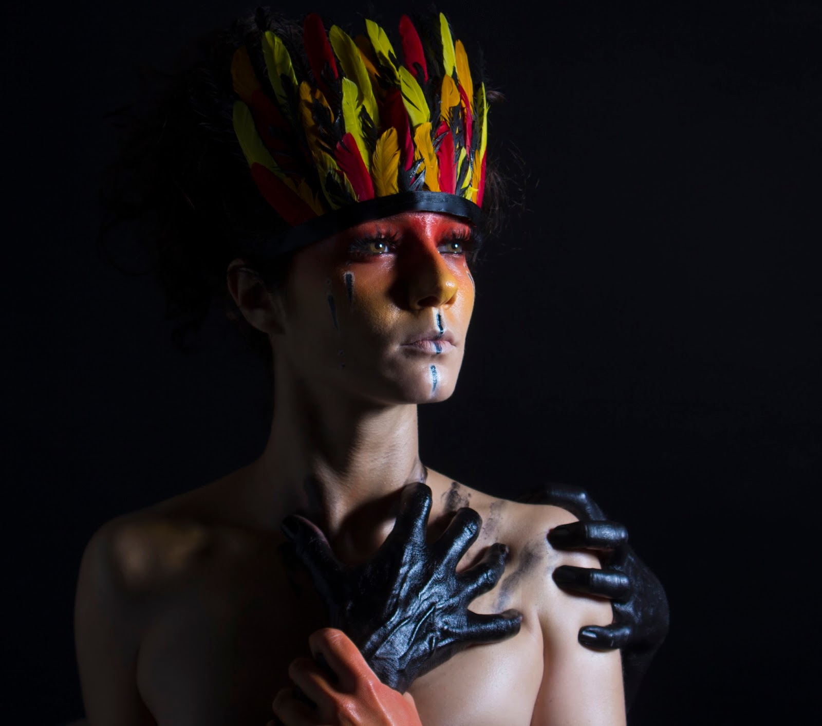
Makeup/Hair
I am really happy with how the makeup turned out because the colours look very vibrant and the black hands make a bold statement. I really like how the red, orange and yellow colours blend into each other so seamlessly because there are no joining lines to distract the eye. I was concerned that the Supra colour on the skin would pick up all her imperfections on the skin; however I found that easy to solve in PhotoShop to make the skin look more flawless, but still dewy. I made sure to add some body oil to the chest and neck to give the face and body a continuous dewy finish which I like as it makes all the skin look as one, instead of having a dewy face and a matte body which would make the face look like a mask. I like how plump and youthful the skin looks with the dewy finish. Dewy /glowing skin is also a popular 2016 spring/summer trend so the advert looks more up to date. I am really happy I chose to add big bold eyelashes to the eyes and black in the waterline because the eyes really stand out against the colourful makeup, making her look very powerful and strong. I like that I added the white and black stripes to the face across the lips and on the cheeks because it added a fun detail to the makeup look and made it more tribal themed as I was inspired by the Indonesian Tribal makeup. You can see the eye brows slightly from underneath the feather crown so I am happy I didn't fill them in because I think they would have made the look more messy as only a small amount of eye brow is showing. I am so happy with how the feather crown came out because I was concerned it would look too pristine and tacky looking. However I ruffled up the feathers slightly and I think this helped give it a more natural look. I wanted the feathers to be very perfect bright colours because Mac often include very fake and almost cartoon-like props in their editorials so I wanted to reflect this with the block coloured feathers. I am happy I chose to use black ribbon for the bottom of the feather crown because it reflects the shiny black hands and dewy skin; I think it would have looked too flat if it was matte. I love how black and shiny the hands are because they look so sinister and evil looking. I like that I asked my model and the model with the black hands to actually pull and push on each other because you can really see the strain in the hands with the bones and veins looking prominent. I love that you can see the veins and bones in the black hands because they look so much more creepy, like old witch hands. I like that all the hands are completely covered in black because it gives a seamless look. I asked my model with the black hands to make some claw marks on the model which I think look very effect as it makes it look like the black hands have been clawing away at the model's chest to stay attached; it also gives the image movement as you can see where the hands have been. I like the strong contrast between the black hands and the bright colours on the model's hands because it makes them both stand out and I like that the colouring on the hand reflects the colouring on the face because it makes it clear who the hand belongs to and it ties the image together. The hair isn't very visible in this image because of the harsh lighting; however I am happy that all the hair was taken off the face and off the feather crown because it give the face a clean look and doesn't create any unwanted shadows across the face.
Lighting/Background/Model Positioning
I love how dark and dramatic this lighting set up looks! I decided to use a soft box to the right of the model so that the light caught only half of her face and body and casted a dark shadow over the rest of it. I positioned this slightly in front of the model so the light would lightly touch the opposite shoulder; however I wanted it to be a clear contrast. I initially tried to use a spill kill light head because I wanted harsh lighting; however this light was very unflattering on the model's skin as it picked all her imperfections. I therefore used a soft box because it would create softer lighting, but still have the dramatic shadows. I didn't want all the detail of the left side of the face to get lost so I positioned a white poly board to the left of the model to bounce some of the light from the soft box back onto the model. I really like how this reflected the light so that some of the detailing in her neck and shoulder because it gives the model more definition. I love how the harsh light emphasises things like her collar bones, shoulders and the details in the hands because it makes the model look slimmer and it gives a lot of depth to the image. I decided I wanted the background to be completely black because I wanted the black hands to look as though they are coming out of nowhere and that they could suddenly creep up on you without you realising. I like the mystery having a black background has because you have no idea what is lurking in the background.

Editing/Text
My model's imperfections were intensified because of the dewy skin and dramatic side lighting so I had to use the Clone Tool a lot in PhotoShop to remove any unwanted imperfections to smooth the skin and make it look more perfect. I also used the technique called Frequency Separation where on one layer you only edit the texture of the image and then the other on effects the colouring. I therefore tried to even the skin tone out in certain areas such as the neck and under the eyes. I then smoothed out the texture of certain areas on the texture layer with the Clone Tool such as the neck, and all over the face. I didn't want the skin to look too fake, even though I wanted it to look as perfect as possible because I think over edited image can look very unprofessional and tacky. I darkened the feather crown slightly because I thought the feather looked too bright and vibrant against the more soft colours on the face and I found that this made the makeup look muted which I didn't want. I found that when I darkened the feathers the makeup stood out more meaning the feathers didn't take so much focus, but instead complimented the makeup. I found a Mac logo that had no background with a high resolution on the internet so I first made the text white and then pasted it onto the image. I didn't want the text to be too big because I wanted the image to be the main focus of the over editorial; however I still wanted to include the logo to make it clear what brand the editorial was. I positioned this in the bottom corner of the image so that it didn't distract from the image as much as possible.
No comments:
Post a Comment