Sunday, 17 April 2016

Makeup Inspiration for Editorial 2

This makeup look is going to be a lot more understated than my other editorial look to represent how she has been forced to conform to society. I want the same colour scheme to be used for this look to compliment the other editorial look, meaning I will be using the warm colours red, orange and yellow primarily.
Editorial Image 1
My first editorial image is my biggest inspiration makeup wise because I want both the makeup looks to compliment each other; I will therefore use the same warm colour scheme. I don't want to include a war theme to this makeup look because I want the model to be being dragged into conforming with society's idea of what she should be looking like. Whereas I wanted the model in my first editorial to be wearing war paint to represent her going to war with society and breaking free from their constraints. I love how the red has blended beautifully into the orange and then into the yellow because it looks so seamless, so I think I will create a soft blended look to reflect this. I want this look to be a lot more natural and simple than my first look because I want it to show the model has already conformed to society, whereas the first editorial is trying to break free from it.

LIVINGLY, 2010. Couture Spring 2010 - Valentino [viewed 17th April 2016]. 
Available from: http://www.livingly.com/runway/Couture+Spring
+2010/Valentino/Backstage/Xjnv1Q05X7X
I really like this makeup look because of the very smoked out lower lash line. I like that the blended out lower lash line reflects how the first editorial look had colour in an ombre effect all down her face because it will make them look more connected. I want the look to be similar to what people expect people to wear on their face because I want the image to represent how she is conforming to society; however I still want it to have an interesting and unique look as it is for an editorial spread. I really like how the eye shadow on the lid has been blended right up to her eye brows as it makes it look more smoked out and editorial looking. I don't want to use any dark colours on my model because I think the hands surrounding her and the shadows will be very dark and I want the makeup to stand out against that darkness. I will incorporate red, orange and yellow eye shadow in the look and I think these colours would work well in a very smoked out look like this as they blend into each other so seamlessly. I don't like that the model has bleached out eye brows because I want my model to look as though she is conforming to what society says, meaning I want her eye brows to look more natural.

Face Chart 1

For this face chart I was inspired by the very smoked out lash line and how the eye shadow went up to her eye brow in the image above. I decided to blend orange on the eye lid and into the crease; however I want this to look very light as if it is just a tint of orange because I want the main focus to be on the lower lash line. I want to blend this orange colour into the inner part of the eye brow to give it a more edgy look, but I want the blending to look seamless. I made the inner corner a yellow colour with the point of the tear duct white to make the eyes look very bright; however this may make the model look too awake and positive which isn't the emotion I want the model to be giving. Instead I think I will either not colour the inner corner or make it slightly darker to give the model a more sombre look. I applied red along the lower lash line and then blended it down into orange to give a very smoked out look. I like that this almost pulls her eye downwards, making her look tired and more sad. I like how this also reflects the ombre from red to yellow used in the first editorial look as it makes them more connected. I gave my model very dewy skin as this is a big SS16 trend and I wanted the model to look youthful; however I am concerned this will make the overall image look too shiny as the black hands will be shiny too. I therefore think I want the model's face to be more matte to contrast with the shiny hands and to make her look more depressed and drained. I gave the model a matte nude lip because I wanted the eyes to be the main focus and I like that the nude lip doesn't add any warm colours to the look, giving her a slightly gaunt and ill look. To accentuate the gaunt and tired look I will contour her cheek bones with a grey toned bronzer to make her cheeks look more sunken in. 


FASHIONGONEROGUE, 2013. Kamille Poses for Liv Friis-Larsen [viewed 17th April 2016]. 
Available from: http://www.fashiongonerogue.com/kamille-poses-for-liv-friis-larsen/
I was drawn to this look because the yellow round the eyes gives the model a very innocent and vulnerable look. I like how only one colour has been used on the eyes because it gives a simplistic and fresh look. I don't want my model to have dark colours on her eye because I want her makeup to contrast with the black hands surrounding her so I think this yellow look would would well to add a pop of bright colour to the image. I am concerned that this look would not work on my model as she is blonde so the yellow may be unflattering against her hair so maybe either an orange or a red colour added to this would be more flattering. I like how fresh and youthful the skin look with very light contouring and blush and then a dewy finish. I don't want my model to have very defined cheek bones or strong blush because I want her to look very soft and vulnerable so I think intense cheek bones would give too much of a confident and powerful look. I like that you can see the model's bare shoulders because it, again, adds to her vulnerable look, as if she has got nothing to cover her or protect her from the constraints of society. I like that the model isn't wearing any mascara because it keeps the eyes looking bright and awake, without the black of the mascara weighing them down. 

Face Chart 2

In this face chart I wanted the makeup to be a lot softer and youthful looking. I was inspired by the light eye makeup above to create the yellow eye look; however I added a bit of orange into the crease and on the outer half of the lower lash line to give the eye more definition. I would achieve this by first applying the yellow eye shadow all over the eye lids, along the lower lash line and up to the eye brows to give a bright wash of yellow. I then would go in with the orange and very lightly apply it through the crease and outer lower lash line so that the colour wasn't too intense. I didn't want the eyes to be very dark as I wanted the model to look youthful and innocent to represent how easily lead she could be by society. I didn't add any mascara to the eyes to keep them looking fresh and awake and I like that my model's eye lashes will blend in with the eye shadow as they are blonde. I added the tiniest bit of bronzer to the cheekbones to give the face some soft definition and I added a peachy blush to compliment with orange tones on the eyes. I will add some cream highlighter to the high points of her face to give a youthful glow, but I don't want it to be too intense as the black hands will also be shiny looking and I don't want there to be too much shine. I will give the model a nude lip so that the eyes are the makeup focus and I don't want her lips to look very bold as I think that will make the makeup look more dramatic and sexual looking, when I want the model to look more vulnerable and weak. 

YOUNG, M., 2014. Fiery Fruity Beauty Editorials [viewed 17th April 2016]. 
Available from: http://www.trendhunter.com/trends/uce-magazine-burned-earth
I love how warm and glowy this makeup looks, with the sunset tones, because it looks to sexy and enticing. I love how red has been used on the eyes, but in a soft way because the rich colours are still there but they are very blended out to create a smoked out effect. I like how the red has been blended up to the inner part of the eye brow, instead of the more commonly positioning crease colour, because it it adds a more editorial look and makes it look more smokey. I like that the red is then balance out on the lower lash line and how it is smoked out to give a softer look. I think I will blend this red even further down on her lower lash line to reflect the ombre red colour in the first editorial look and also because it will bring her eyes down to make them look more tired and sombre. I like how yellow has been positioned in the inner corner in a triangle shape because it look very precise and elongates her eyes to a sexy cat eye shape. I like that this yellow hasn't been blended too far because I don't want it to look messy as this image needs to represent how the model has been restricted by society as to what is acceptable or not. I also like that yellow has been put on the lid because it brightens up the eye look to save it from looking too dull and mysterious. I like that only a bit of mascara has been used because it puts all the focus on the eye shadow and keeps the eyes looking bright. The model has bleached eye brows which I think looks fun in this shoot; however I want my model to have natural looking eye brows to show she has been constrained by society. I like the dewy skin because it looks very youthful; however I don't want the skin to look too shiny as I want the shiny black hands to almost take focus away from the face so I want them to be the shiniest. I like that the lips are orange and not nude in this look because I think it balances out the look; however I don't want my model's lips to be as glossy because I think it makes the lips stand out too much and look too plump and luscious. However this has inspired me to try and slightly orange toned lip to compliment the warm sunset tones, without making the lines really sharp and attention grabbing.

Face Chart 3 (Chosen Design)

This is my favourite face chart because it incorporates all over the sunset colours the first editorial does, it makes the model's features stand out, but not so much that the model looks confident and powerful. I decided to first blend yellow eye shadow on the lid and into the crease of the eye as a base colour and to brighten the eye look. I then blended red into the inner part of the crease and up to the eye brow to give an editorial smokey look. I then blended some red eye shadow along the lower lash line to balance out the red on the eye lids and to give a smokey look. I blended the red eye shadow quite far down and then blended it out with orange because I wanted to reflect the ombre effect in the first editorial look and I wanted the eyes to look drawn down and tried to reflect how drained she feels from being constrained. I was inspired to not add any mascara to the eye lashes by the second inspiration image I looked at because I wanted the eyes to look very bright and I liked that her blonde eye lashes would blend in to the yellow eye shadow slightly to give a soft look. I also like how much this would contrast with the very bold, black eye lashes of the first editorial model to show how much more confident and powerful the first model feels after breaking free from the constraints of society. I contoured the cheek bones very lightly to give a soft, youthful look and then added some peach toned blush to the cheeks to compliment the sunset tones of the eyes. I decided I wanted to set the face with powder and then add highlight only wear I wanted it to that I could control the shine and so the face didn't look too wet against the shiny black hands. I will fill the eye brows in very lightly with eye shadow to make them look soft and natural as to make them look as 'normal' as possible. I then decided to dab some pale orange lipstick all over the lips and then add a slightly darker orange on top to give a soft orange lip look with no harsh lines or intense colours. I am really happy with how this look on the face chart so I can't want to test it out on my model!

Hair Look for Editorial 2

The hair isn't going to be very prominent in the final editorial image so I am not too worried about a very precise design; however I it will depend on how much of the hair is shown depending on how much of the hair comes on the face. My model's hair is blonde so it will show up more against the black background and will get caught by the light more than dark hair would, so I think I want to keep the hair off the face to keep it looking very neat and to put all the focus on the makeup look.

Hair Chart 1
MARCH, B., 2015. Spring/Summer 2016 hair and makeup trends [viewed 17th April 2016].
Available from: 
http://www.cosmopolitan.co.uk/beauty-hair/beauty-trends/g4142/spring-summer-2016-hair-makeup-trends/?slide=39

I was first inspired by the House of Holland for fashion week because the hair looked very natural and loose, which I thought made the model's look very laid back. I think this would would with my concept because I don't want my model to have her hair styled in an interesting and unique way because she is representing people conforming to society so I thought leaving the model's hair down and natural would show this effectively. However I think this may make the look slightly messy if the hair is just loose over the face because it will catch the light and cast unwanted shadows over the face. Also I don't want the hair to be particularly visible because it will distract from the makeup and I want the makeup to look very clean and neat to contrast with the black hands. I will therefore look into hairstyle that would take the hair off the face.


Hair Chart 2
MARCH, B., 2015. Spring/Summer 2016 hair and makeup trends [viewed 17th April 2016].
Available from: 
http://www.cosmopolitan.co.uk/beauty-hair/beauty-trends/g4142/spring-summer-2016-hair-makeup-trends/?slide=9

I wanted the hair completely off the face so that the face was clear of any distractions and so there would be no unsightly shadows on the face. I thought this hair style above would work well because the hair is in a tight, high ponytail, which would pull the face taught to make it look like someone was pulling at it so she couldn't break loose. I like that this would leave room for the black hand to be positioned over the face as the hair would lie flat, and I like that there would be no stray hairs that would get picked up by the lighting, making the image look messy. However I am concerned that the tight hair would look too severe and give the model too much of a strong and sexy look, rather than a more relaxed look. I will therefore chose a hair style where the hair is pulled off the face, but where the hair isn't being pulled so tightly.


Hair Chart 3
MARCH, B., 2015. Spring/Summer 2016 hair and makeup trends [viewed 17th April 2016].
Available from: 
http://www.cosmopolitan.co.uk/beauty-hair/beauty-trends/g4142/spring-summer-2016-hair-makeup-trends/?slide=14

I was inspired by this look because all the hair has been scraped off the face backwards. I like this because I think it will make the image look neat and the makeup show up more prominently. I won't be able to add a quiff to this style because I want some black hands to be coming from over her head and I also think a quiff would be too alternative for someone who is being constrained by society to look a certain way. I like that this hairstyle is very sleek but that the hair is also down because it adds a relaxed feel about the look. I will add gel to the hair to give it a wet look, which is a SS16 trend, to give the hair a slightly glossy finish and to keep the hair in place.

Saturday, 16 April 2016

Editorial Look 2 Inspiration

I wanted to add another image to my editorial story, but I wanted this look to have more natural makeup. The story of my first editorial image is that the model is breaking free from society and people telling her she has to look a certain way. Therefore I wanted this image to be the section of the story before the girl is able to break free. I want to create an image to represent a girl being constrained or restricted by society. I love how I used black hands to represent the negative pressure society puts on people, so I wanted to include either the same black hands or another part of someone's body to represent the same thing; however in this image society will be winning and therefore more dominant.

Inspiration Images
LOVETT, A., 2014. Fantasy Illustration by Aaron Lovett [viewed 16th April 2016]. 
Available from: http://designyoutrust.com/2014/12/fantasy-illustrations-by-aaron-lovett/
I was really inspired by this fantasy illustration by Aaron Lovett because the black hands truly look like they are engulfing the skull and taking full control of it. The skull looks completely trapped and unable to escape which is the emotion I want my image to reflect. I like how the skull looks like it is screaming out for help because it shows how much he is being controlled and wants to break free; however I think I will choose to give my model a less dramatic facial expression because Mac doesn't tend to give their model's exaggerated facial expressions, but more dazed and blank instead. Mac cosmetics represent their models as dolls with little to no facial expression, so I will try to make the actions of the hands show the emotion rather than the face itself. I want the hands to be grabbing at the face and pulling it back into the darkness to represent how society pulls people in to look a certain way. I also really like how dark the lighting is because it creates mystery and uncertainty as to what is lurking in the background. My other editorial image has quite strong lighting, with dark shadows covering some of the face, so I wanted to reflect that in this image, but make it even darker as this is the more traumatic image.

SKUMVILLAGE, 2014. DLCRZ [viewed 16th April 2016].
Available from: http://angeladelacruz.tumblr.com/

I was inspired by the simplicity of this image, with only one model used and black makeup. I like how, instead of using black hands, black hands prints have been used to represent them. I like that the whole neck is black and covered because I think it represents the hand strangling the girl and then the clear hand print over the face represents how the hand is holding her back and covering what she wants to express. I think I will experiment with using painted black human hands and also black hand prints on my model to make it look like she is surrounded by controlling hands. I want my image to have a black background because I want it so represent the fear of the unknown and I want the black hands to look like they are coming out of nowhere. I think this grey background brightens the image too much and shows too much of the background so it is obvious there is nothing lurking in the background. I like that the model has strong eye makeup; however I want my model's makeup to be natural looking to show that she has been forced to conform to what society expect people to look like. I like the lighting in this image because it is darker round the perimeter of her face and brighter in the middle; however I want my lighting to be darker and more intense to represent the fear and desperation of the model.
NELSON, J. Nora Vai [viewed 16th April 2016]. 
Available from: http://www.jamienelson.com/edgy-makeup/images/
futuristic-black-glove-beauty-with-model-nora-vai/
I was so inspired by the hand positioning in this image! I love how the hands surrounding the neck of the model look as though they are about to close and completely cover her face because I think it represents how much pressure people feeling to look certain way. I also love how the lighting has been set up so the light is facing upwards under the hands to create shadows of fingers coming up her face as it makes it look like there are more hands surrounding her. In this image gloves have been attached to the collar of the model's top to create this effect; however I will use real human hands because I like the detail seen in the hands and I like that they can be easily moved and positioned how I want them. I also really like the hands coming in from the top because the hands look like they are completely engulfing the model's face. If I were to replicate these hand positionings I would make the top hands black as well to make it look like she feeling the pressure of society surrounding her. This would also mean that the model's hands could be used because I want to do a close up of her face so the arms going round the outside won't be seen, making it look like a random pair of hands. I am so excited to start experimenting with these hand positions and the lighting so create a very dramatic and emotional image to compliment my other editorial look.

KINGCREATIVE, 2012. Post 20518930880 [viewed 16th April 2016]. 
Available from: http://kingcreative.tumblr.com/post/20518930880
I was inspired by the very dramatic lighting in this image. I like how the background is completely black because is adds mystery to the image as you have no idea what is lurking in the background; it also means that the dark shadows on the model completely blend into the background, meaning you are able to create interesting shapes with the body and face. I want the background to be completely black in my editorial image because I want the black hands to look like they are coming out of nowhere and I want the background to reflect the background of my other editorial image that is completely blacked out. I specifically like this lighting because there are some highlights to emphasise certain parts of her body; however there is also a big range of shadow intensities which gives the image a lot of depth. In my other editorial image I used a reflector so that the side of her face not in light still had detail showing and wasn't completely blacked out. I will do the same for this image; however I do want this image to be darker over all to give is a more sinister feel. Another aspect that caught my eye with this image was that the fingers had caught the light so that they cast a shadow on her side to look like elongated fingers. I want to include some shadows of fingers on the face to make it look like the hands were completely surrounding her face all over so there is no way she can escape. 

How to: Finger Waves

Method 1
Equipment:
-Hair gel
-Water in spray bottle
-Tail comb
-Hair clips

Step by step:
1. Run hair gel and water from the root to the ends so that all the hair is saturated.
2. Use your fingers and a comb to smooth the hair to comb the hair backwards.
3. Use smaller end of comb the hair, hold on the top of the hair with your fingers flat against the head.
4. Comb the hair backwards just underneath and push the hair upwards.
5. Place the fingers on the ridge and then comb the hair underneath the other way.
6. Continue to use this technique in a line down the head, taking the hair the opposite way each time to create a continuous wave. 
7. Use a hair dryer to dry the hair so that the waves set completely.
8. Carefully take the hair grips out so that the waves stay in place.
I am really happy with how this came out, especially as it was my first time! I found it confusing at first when I was writing my notes down; however once I tried it for myself a couple of times I got more confident with the technique. I found it more difficult the further I got down the hair and I think that's because I started to make them tighter which made it more fiddly. I am really happy with the top three curves, but I think the waves further down look more messy because all the hair isn't going in the sae direction. Another thing I found difficult was doing the waves in a specific sections because I felt I couldn't control how much hair I included in each wave; this is why I didn't include the front strip of hair. I also didn't know how big I wanted the section to be so I initially left the hair down next to where I was waving it; however I soon realised this wasn't a good idea as the sections of hair did not look even. I therefore sectioned off the sections of hair I didn't want to include in my wave so that the sections were neat and straight. I used hair grips to secure the waves to hold them in place; however this is because I didn't have any bigger hair clips. I noticed that the hair grips left marks in the hair so hair clips wold have worked a lot better.


Method 2
Equipment:
-Hair gel
-Water in spray bottle
-Tail comb
-Hair clips

Step by step:
1.  Run hair gel and water from the root to the ends so that all the hair is saturated.
2. Comb the hair to make sure it is smooth and knot free.
3. Place your fingers on the top of hair to hold in place, comb hair going backwards.
4. Place your finger at the point where you want the hair to turn back the other wave to create the wave and place the hair grip on the at this point.
5.  Keep your finger where the hair grip is and comb the hair going forwards, towards the face.
6. Place your finger where you want the next wave to be and place a hair grip there.
7. Continue this wave technique down the hair to create continuous waves. 
8. Use a hair dryer to dry the hair so that the hair sets in the wave shape.
9. Remove the hair grips from the hair carefully so that hair stays in the same shape.
I am happy with how the technique turned out; it isn't as dramatic as the first method. It is very quick and easy to do and gives you soft waves. I like how smooth the hair looks and how it is all flowing the wave neatly; I manipulated these waves with the comb to make them look smoother. I used hair grips instead of hair clips because I didn't have any with me; however the hair grips left marks in the hair so I will definitely use hair clips next time to avoid this happening again. I could have combed the bottom of the hair to give a more clean finished look so I would style the ends of the hair if I was doing a full look. 

Method 3
Equipment:
-Curling tongs
-Pin tail comb
-Hair grips

Step by step:
1. Make sure the hair is completely dry and put it in a middle or side parting.
2. Comb the hair upwards in a wide section starting at the parting, use the tong to curl the hair horizontal to the head and away from the parting.
3. Secure each curl with a hair grip so it is clipped out of the way and sets in the curled shape.
4. Continue to do this down the head in a straight line, making sure they are all the same size.
5. Once the hair has all cooled down and set, brush the curls together with a comb to create one big section.
6. Manipulate the front of the hair with the pin tail comb so that it looks like soft finger waves. 
I was confident with curling each section and I think they looked neat and even; however when it came to combing the curls together and positioning them I started to struggle slightly. I brushed the curls together lightly and made sure to smooth the ends together with my fingers to stop any frizzing which I was happy with. It took me a long time to understand how to manipulate the hair and I think that was because I was trying to fight the natural wave of the hair instead of working with how it naturally fell. However I am really happy with how it turned out because the wave looks so soft and pretty at the front, framing the face beautifully. The bottom part of the hair wanted to flick outwards which I didn't like so I held it down in this photo. If I were to fix this I would either curl the bottom part separately or try to add hair spray to help it set hanging down slightly more. 

Wednesday, 13 April 2016

Practicing Makeup Look for Advert 2

Equipment:
-Johnson's Baby Lotion
-L'Oreal True Match Foundation in W1
-Nars Illuminator in Copacabana
-Real Techniques Contour Brush
-Maybelline Age Rewind Concealer in Light
-Rimmel Stay Matte Powder in Transparent
-Real Techniques Setting Brush
-Urban Decay Eye Shadow in Faint
-Illamasqua Angled Brush
-Benefit Hoola Bronzer
-Zoeva Luxe Sheer Cheek Brush
-Mary Luminizer Highlighter
-Urban Decay Primer Potion
-Sleek Ultra Mattes V1 Palette
-Zoeva Luxe Soft Crease Brush
-Bare Minerals Shimmer Eyeshadow in Azure
-Urban Decay Flat Brush
-Mac Fix+
-Max Factor Wild Shadow Pot in Sapphire Rage
-Zoeva Luxe Petite Crease Brush
-Zoeva Pencil Brush
-Glitter Splash glitter in Tropical Lime
-Rimmel 24 Hour Supercurler Mascara
-Duo Lash Glue
-Ardell Demi Wispies
-the theBalm Nude Tude Eyeshadow Palette

Step by step:
1. I first applied Johnson's Baby Lotion to the skin to hydrate the skin. 
2. I applied a mixture of L'Oreal True Match Foundation in W1 and Nars Illuminator in Copacabana all over the face and down the neck with the Real Techniques Contour Brush. 
3. I next applied the Maybelline Age Rewind Concealer in Light under the eyes in a triangle shape, in the centre of the forehead, down the nose, on the cupids bow and on the chin to highlight and conceal those areas. I applied this on any imperfections too with my fingers. 
4. I powdered under the eyes with the Rimmel Stay Matte Powder in Transparent and the Real Techniques Setting Brush on any other areas I want to be matte, like either side of the nose. 
5. I applied some Urban Decay Eye Shadow in Faint to the sparse areas of the eye brows with the Illamasqua Angled Brush. 
6. I lightly contoured the cheek bones with Benefit Hoola Bronzer with the Zoeva Luxe Sheer Cheek Brush under the cheek bones, on the temples and either side of the nose. 
7. I applied the Mary Luminizer Highlighter to the tops of the cheek bones, down the nose, on the cupids bow and lightly on the forehead. I did this with the Real Techniques Setting Brush. 
8. I applied some Urban Decay Primer Potion to the eye lids to prevent the eye shadow from creasing. 
9. I powdered over the top of the primer with Rimmel Stay Matte Powder in Transparent and the Real Techniques Setting Brush so that the powder eye shadows blend more seamlessly on top. 

Look 1 (darker version)
10. I first blended the lightest blue eye shadow from the Sleek Ultra Mattes V1 Palette into the crease as a transition colour. 
11. I next added the Bare Minerals Shimmer Eyeshadow in Azure on the eye lid with the Urban Decay Flat Brush sprayed with Mac Fix+. 
12. I then blended Max Factor Wild Shadow Pot in Sapphire Rage into the crease and on the outer third of the eye lid and inner third. I did this with the Zoeva Luxe Petite Crease Brush for precision. 
13. I then darkened the crease and inner and outer thirds of the eye with dark blue eye shadow in the Sleek Ultra Mattes V2 and the Zoeva Pencil Brush. I also applied this colour to the outer and inner third of the lower lash line with the same brush. 
14. I applied the Bare Minerals Shimmer Eyeshadow in Azure with the Zoeva Pencil brush to the centre of the lower lash line and blended the colours together. 
15. I then dabbed some Glitter Splash glitter in Tropical Lime on the eye lid to disperse the glitter lightly so that the blue Bare Minerals Eyeshadow would still show through. 
16. I applied a coat of Rimmel 24 Hour Supercurler Mascara to the top and bottom eye lashes. 
17. I added the Ardell Demi Wispies to the upper lash line with Duo Lash Glue. 
18. I applied the colour Sassy from the theBalm Nude Tude Eyeshadow Palette to the inner corner and on the brow bone with the Zoeva Pencil Brush. 
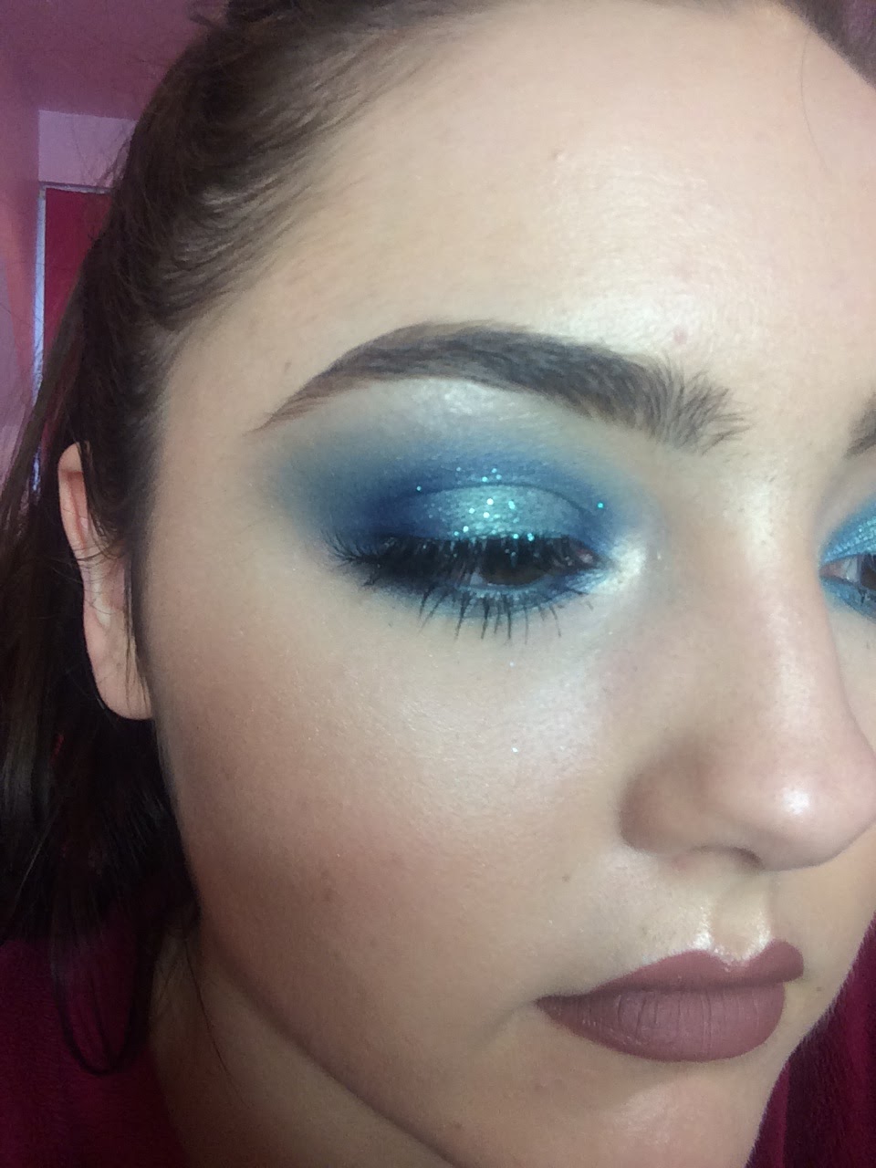
I am happy with how this eye look came out because the eyes look very bold and dramatic; however I don't think I want the eye makeup for this advert to be so intense and dark as I want it to be very bright and summery. I also think the blue glitter will be too much for this look because I want it to look very effortless and possibly day appropriate for Mac's customers to relate to. The look is going to be just a headshot so the eye shadow look will be very clear, so I don't think the glitter would look very clean and summery looking. I will therefore not apply any glitter to my final eye look.

Look 2 (Chosen)
10. I first blended the lightest blue eye shadow from the Sleek Ultra Mattes V1 Palette into the crease as a transition colour with the Zoeva Luxe Soft Crease Brush. 
11. I next added the Bare Minerals Shimmer Eyeshadow in Azure on the eye lid with the Urban Decay Flat Brush sprayed with Mac Fix+. 
12. I then blended Max Factor Wild Shadow Pot in Sapphire Rage into the crease and on the outer third of the eye lid and inner third. I did this with the Zoeva Luxe Petite Crease Brush for precision. 
13. I applied Max Factpr Wild Shadow Pot in Sapphire Rage to the inner and outer third of the lower lash line with the Zoeva Pencil Brush. 
14. I applied the Bare Minerals Shimmer Eyeshadow in Azure with the Zoeva Pencil Brush to the centre of the lower lash line and blended the colours together. 
15. I applied a coat of Rimmel 24 Hour Supercurler Mascara to the top and bottom eye lashes. 
16. I added the Ardell Demi Wispies to the upper lash line with Duo Lash Glue. 
17. I applied the colour Sassy from the theBalm Nude Tude Eyeshadow Palette to the inner corner and on the brow bone with the Zoeva Pencil Brush. 

I much prefer this eye makeup look to the previous because the two blue eye shadow blend into each other seamlessly to create a bright, summery look. I think this looks more effortless than the look above and more youthful and I think the bright eye makeup will look gorgeous in contrast with my model's deep skin tone. I love how intense the Bare Minerals Eyeshadow looks when applied with a wet flat brush because the pigments are intensified and made more vibrant and metallic looking. I am happy I added an eye shadow primer so that the eye shadow stays exactly where I put it and doesn't melt and crease under the warm studio lights. I like that the skin isn't dewy looking all over because that can sometimes be unflattering so I added powder to any areas I wanted to reduce the shine, like under the eyes and the side of the nose so I only highlighter the high points of the face. I also didn't want all the skin to have a dewy finish because I wanted the metallic eye shadows to stand out and I thought the sheen of the skin would take some emphasis off the sheen on the eyes. I will give my model a matte nude lip, so I will take a selection of nude colours and try them on when I get to the shoot to find the perfect colour. I want to warm up the crease slightly to make it blend it with the skin more seamlessly and to make the look more bronzy, so I will add a warm transition shade into the crease instead of the light blue. 

Sunday, 10 April 2016

Advert 2 Makeup & Hair Inspiration & Designs

Makeup Inspiration

I wanted this advert to incorporate at least one of the popular 2016 spring/summer makeup trends, which include blue eye makeup, dewy skin, red lips and metallic colours, to make the advert very on trend and current. I want this advert to advertise a range of new blue eye shadows for summer 2016. Blue eye makeup is one of the biggest 2016 spring/summer trends so I wanted to give the Mac customers a whole range of new blue eye shadows with different finishes to play with!

AMAY, J., 2015. 10 Best Beauty Looks from the New York Fashion Week Spring 2016 Runways [viewed 10th April 2016]. 
Available from: http://www.thefashionspot.com/beauty/642177-nyfw-spring-2016-best-beauty-hair-makeup-nails/#/slide/3
Path McGrath created this beautiful blue smokey eye on the Diane Von Furstenberg models for 2016 Fashion Week. I love how bright and shimmering the blue were and how much they made the eyes stand out. It looks like a light wash of brown was blended through the crease as a transition colour and then a turquoise/green colour was blended all round the eyes and up into the crease. I slightly darker blue has then been blended along the upper lash line and slightly along the lower lash line. I really like how bright and summery this makeup look is with the vibrant, but light blue and turquoise colours. I like how dewy the skin looks because it gives a healthy glow. The skin also looks very natural, with not much heavy products used. The under eyes haven't been overly highlighted and the cheeks have been bronzed, giving a sun kissed, summer glow. The eye brows are very neatly shaped, but still natural looking with each individual hairs visible. The model could just be wearing lip balm on the lips because they look so natural but have a slightly sheen to them. I want this makeup look to be focused on the eyes so a nude or natural lip colour would work perfectly for my Mac advert. I really like this whole makeup looked and have definitely been inspired to create my own!

RANKIN, 2016. Beauty [viewed 10th April 2016]. 
Available from: http://rankin.co.uk/beauty/5815-106-049_f3/
I was also inspired by this makeup look in Rankin's beauty shoot. I like how dramatic and vibrant the blue smokey eye is and how even blue eyeliner has been used. When I first looked at this image I thought the eye lids were so shiny that the light was bouncing off them; however when I looked closely I realised that the 'reflection' was in fact a white line drawn over the eye shadow. I like this effect; however I think I will concentrate on creating a beautifully blended smokey eye that Mac would be proud to advertise. I do really like the slightly darker blue colours so I may use darker blues in the crease or around the lash line to add more definition to the eyes. I like that a deep burgundy has been used on the lips because it makes the look more seductive and dramatic looking; however I want all the focus to be on the eye makeup and I think the lips may take too much focus away from them. I want my model to look very summery; however I also want to show case the dark shades in the collection. A rosy blush has been used on the cheeks in this look which gives the model a more flushed and youthful look; however I want my model to look very sun kissed and glowy so I will focus more on using bronzer and highlighter to achieve that look. 

Face Chart 1
For this first look I was mostly inspired by Path McGrath's makeup look for the Diane Von Furstenberg models for 2016 Fashion Week. I love how the makeup look was very summery and bright, with no dark colours on the eyes of big fake eye lashes. I liked that the makeup looked very effortless as the skin looked very dewy and fresh so no powder was used which could make it look too heavy. I want my model to have very glowing skin because I think it gives dimension to the face and looks like she has a natural glow. I made the eye brows look very natural so I didn't add much product to them, only wear there are sparse areas. I didn't add any blush to this look, only bronzer, because I want my model to have a sun kissed glow, instead of a flushed look. I gave my model a peachy nude lip because I wanted to continue the warm, neutral tones throughout the face so that the bright coloured eye would steal all the focus. I wanted to add some green, turquoise tones in the eye shadow because I wanted it to look very summery and almost represent the turquoise ocean colours. I really like this whole look; however I think I want the eyes to be slightly more dramatic and intricate as it will be all about the eye makeup, and my model has a very dark skin tone so I don't think this lighter eye would be very flattering. 

Face Chart 2
CHUNG, G., 2015. Kim Kardashian Uses Over $1,200 Worth of Beauty Products: See the Complete List of Makeup [viewed 10th April 2016]. 
Available from: http://www.celebuzz.com/2015-08-14/kim-kardashian-makeup-beauty-products-master-list-tutorial/
I was inspired by this blue smokey eye on Kim Kardashian by her makeup artist Mario Dedivanovic for this face chart. I liked how the royal blue stood out dramatically against her darker skin tone and how they are both such warm toned colours. Her eyes have been tight lined with a black eye liner; however I wouldn't want to do this as I want the makeup look to still be summery, even if I do want it to be more dramatic. I like that the eye makeup isn't particularly complicated looking because it looks like the same colour has been blended all round her eyes and blended out in the crease. I also like that dramatic eye lashes have been used; however I didn't include dramatic eye lashes in my face chart as I didn't want the eye lashes to hide too much of the eye shadow. I gave my model a harsh contour with a much darker brown eye shadow; however I will need to be careful with what colour brown I use as I don't want the cheeks to look muddy. I didn't want to add blush to this look because I wanted all the colour to be on the eyes and I wanted her to look very warm and sun kissed. I want the skin to look dewy and glowing because I think it looks healthy and flattering. I gave my model a peachy nude colour lip because I wanted to continue the warm tones all over the face, but I didn't want the lips to be pink as I wanted all the colours on the eyes. 

Face Chart 3 (Chosen Look)
This is my chosen makeup look! I took inspiration from Kim Kardashian's eye makeup with the beautiful royal blue colour all round the eyes; however I was also inspired by the makeup look in Rankin's beauty shoot with the spot light eye look. I wanted the eyes to really stand out against the otherwise neutral tones on the face and I wanted the eyes to have dimension and blends of different colours. I was inspired to create this spot light blue makeup look with a darker royal blue on the inner and outer thirds of the eye lids and also on the inner and outer thirds of the lower lash line. I then want to add a metallic or shimmery lighter blue colour to go on the middle third of the eye lid and lower lash line to create a highlight in the middle of the eye. I would then lightly blend the darker blue precisely into the crease and then blend it out softly with the lighter blue. I may add a blue eye liner in the water line to make the look more smokey; however I don't want the eye to look too dark as I still want it to look summery. I will add some feathery fake eye lashes as I want the lashes to look long and wispy, but I don't want them to cover too much of the detailed eye shadow. I will add mascara on the upper and lower lashes to make them very black and defined. I want the eye brows to be natural looking, but defined because I want them to frame the bright eye; however I don't want them to look too dark or heavy. I want the face to be very bronzed looking so I will just use bronzer in the contours of the face to contour the face slightly and add warmth. I will then add a golden highlight to give my model a beautiful sun kissed glow. I don't want to add any blush or a pink toned highlight because I want all the face to be very neutral and bronzed so the eye stands out. I will give my model a natural looking nude colour, so it will be close to the skin tone but slightly darker, to again not take any attention away from the eyes but still add definition. I am so excited to try this look out; however I need to invest in the right eye shadow colours first! 

Hair Inspiration

The background of the image is going to be black and so is the model's hair so the hair is hardly going to be visible. However I do want to make sure I keep the hair off the face so that is doesn't distract from the makeup look or cast any unsightly shadows across the face. I want the look to be very pretty and feminine, but still glamorous and neat. 

Hair Chart 1
MARCH, B., 2015. Spring/Summer 2016 hair and makeup trends [viewed 1st February 2016].
Available from: 
http://www.cosmopolitan.co.uk/beauty-hair/beauty-trends/g4142/spring-summer-2016-hair-makeup-trends/?slide=11

I found this image and liked how glossy and sleek the hair looked. I think the shine of the hair would complement the dewy finish on the skin and the metallic eye shadow on the model as the same glossy texture would tie everything together and accentuate them. I also like that this hairstyle would keep all the hair off the face to stop the hair distracting from the makeup or casting any shadows across the face. However I think the hair looks too sleek and not feminine enough as I want the image to look very girly and relaxed, instead of being very slick and sophisticated looking. 

Hair Chart 2
MARCH, B., 2015. Spring/Summer 2016 hair and makeup trends [viewed 1st February 2016].
Available from: 
http://www.cosmopolitan.co.uk/beauty-hair/beauty-trends/g4142/spring-summer-2016-hair-makeup-trends/?slide=23

I was inspired by this hair look because all the hair has been tied off her face, but it still looks very girly and feminine. I like that there are two dutch braids running along the front of her hair because it adds a pretty detail to the look and I think the braids would catch the light to accentuate the twisting of the hair. The hair has been loosely curled at the back which I also think would catch the light in my image to show off the curls. My model has very shiny hair already; however I would still add a shine spray to accentuate this if I were to do this hairstyle. I think this hair style would look pretty; however I think it may look too complicated, when I want all the attention to be on the makeup look. I will therefore find a hair style that keeps the flowing hair, but it more simple.

Hair Chart 3
ANDERSON, C., 2014. Top 100 Curly Hairstyles [viewed 10th April 2016]. 
Available from: http://www.herinterest.com/top-100-curly-hairstyles-2014/

I was inspired by the beautiful loose curls in the image above because it looks very fun and girly, but still glossy and healthy. I think the curls would look really pretty in my photoshoot as they would catch the light in some places to emphasise the curls. However I don't want there to be any hair on her face so I will experiment with a wind machine to blow it all back. I like that when the hair is being blown off the face, the hair line will be completely clean, unlike if there were any plaits running along it or fringe, making it look very neat and clean. I think these pretty curls will compliment my blue smokey eye look perfectly to create a fun and girly result. 

Friday, 8 April 2016

Advert 2 Research, Ideas & Makeup Inspiration

My Wash & Dry advert included all the model's body and some props, so I wanted my next advert to be very simple and clean looking. I want it to just be a headshot so that the makeup is really clear  and there are no distractions. My Wash & Dry advert was for a collection; whereas I want this advert to advertise a specific product or product range. I used a model with pale skin in my previous advert so to show that Mac is suitable for any skin tone I will be using a dark skin model for this advert. I wanted this advert to showcase my less dramatic makeup look because it will be more of a close-up so you will be able to see the makeup more clearly; whereas I made the makeup more dramatic in my Wash & Dry advert because the model was so far away from the camera and I still wanted the makeup to be shown. 

Advert Inspiration
TEMPTALIA, 2014. MAC Prep + Prime CC Colour Correct Collection for Spring 2014 [viewed 8th April 2016].
Available from: http://www.temptalia.com/mac-prep-prime-cc-colour-correct-collection-spring-2014

I was inspired by Mac's Prep+Primer Colour Correct Advert because the makeup looks very simplistic and the colour scheme has been kept very small. I like that each model is wearing very similar makeup, but in different colours because it makes the advert look very clean and sophisticated. I also like that the background of the advert is in the same colour palette as the makeup looks because it almost creates a monochrome effect. The Colour Correct products that were brought out were aimed to make your skin look glowing and flawless in a natural way which is why the model's look so naturally beautiful, with no obvious skin makeup. Many Mac cosmetics adverts and editorials have very dramatic makeup looks and even if they are not dramatic on the eyes, the skin is still heavily made up. I therefore like this more natural approach to the skin makeup. I like the simple layout with one main image being used and then a small amount of text being shown at the top, in the middle. The only text that has been used in the company logo and the name of the name collection of products and I like how this make the image the main focus. In some cosmetics adverts an image of the product is put on the advert which I think can made the advert look too crowded, and they put a lot of text all about the image and quotes from magazines etc. which I definitely think makes the advert look too busy and sometimes messy. However I like how clean and simple this advert is as it is clear what the product is and showcasing how to use it in a beautiful portrait shot.

TIMMONS, L. MAC Cosmetics [viewed 8th April 2016]. 
Available from: http://lauratimmons.blogspot.co.uk/2011/10/mac-cosmetics.html
I was inspired by this image because of the small colour scheme and that the same colour has been used for the background as it has for the makeup look. I like that a silky material has been used in the background because it add a luxurious, rich feel to the advert, making it look more high end. The model's have slightly more dramatic makeup on than in the advert above, with brown and black smokey eyes and a darker contour. I like that two models of different ethnicity have been used as it shows the viewer that the product is suitable for any skin colour; however I think that just using one model can make a more striking image and therefore grab more people's attention. I don't think it is a very flattering angle for the model with them looking up so dramatically at the camera so I will use a less strenuous angle in my advert. There is more writing on this advert than there usually is on Mac adverts and I don't particularly like it. It includes the Mac logo and the name of the new collection/products, but then it also includes a description of the product. This is a very common tactic by many other cosmetics companies; however it is not very common of Mac to do this. I think that the writing makes the advert look more tacky because it looks slightly messy; whereas I don't expect Mac to have to pitch their products to their customers. I won't be including a lot of text in my advert because I want it to look very sophisticated and high end. I like that the colour of the text is white because it stands out against the darker background and adds a clean touch to the advert; whereas if the text was black or coloured I don't think it would have looked as professional.

CHRISTA, 2016. MAC Cosmetics Mineralize Skinfinish Natural for Spring 2016 [viewed 8th April 2016]. 
Available from: http://www.perilouslypale.com/2016/03/32290.html
I was so excited when I found this advert by Mac for their Mineralize Skinfinish! I was concerned that having a blue background with blue eye makeup was not going to work because if I didn't get the right shade of blue it would look naff and amateur. However I was re-inspired when I found this beautiful image with a black background. My model is going to be dark skinned and I love how this model's skin tone softly stands out from the pitch black background. I like that the blue eye shadow would be the only coloured aspect in the image because it would make it stand out so much more than if it was fighting against a blue background. I like that the model isn't wearing a top because I think introducing clothing into the image would distract too much attention away from the makeup. I like how the model is positioned with her shoulder brought up towards her face because it acts as a leading line towards the face, drawing the viewers eye to the makeup, but also because I think it is slimming for the model and adds another aspect to the image, rather than just a head shot. I really like that the model's skin looks very dewy and fresh because it gives a healthy glow and it's a popular 2016 spring/summer trend. I really like the lighting set up in this image because not all of the model is lit up. I like that there is a slanted strip of light across the model to highlight the mode's face and shoulder because it adds dimension to the image and keeps it from looking too flat. I am not sure how I would create this look, either using barn doors on my lights in the studio or taking some of the colour out in post production, but I would be really excited to test it out! I like that there is only a small amount of text, with the company brand name and the name of the collection because it keeps the image looking clear of unwanted writing and makes it all about the image. I like that the text is white because it stands out clearly against the black background and accentuates the model's highlights.