Saturday, 16 April 2016

Editorial Look 2 Inspiration

I wanted to add another image to my editorial story, but I wanted this look to have more natural makeup. The story of my first editorial image is that the model is breaking free from society and people telling her she has to look a certain way. Therefore I wanted this image to be the section of the story before the girl is able to break free. I want to create an image to represent a girl being constrained or restricted by society. I love how I used black hands to represent the negative pressure society puts on people, so I wanted to include either the same black hands or another part of someone's body to represent the same thing; however in this image society will be winning and therefore more dominant.

Inspiration Images
LOVETT, A., 2014. Fantasy Illustration by Aaron Lovett [viewed 16th April 2016]. 
Available from: http://designyoutrust.com/2014/12/fantasy-illustrations-by-aaron-lovett/
I was really inspired by this fantasy illustration by Aaron Lovett because the black hands truly look like they are engulfing the skull and taking full control of it. The skull looks completely trapped and unable to escape which is the emotion I want my image to reflect. I like how the skull looks like it is screaming out for help because it shows how much he is being controlled and wants to break free; however I think I will choose to give my model a less dramatic facial expression because Mac doesn't tend to give their model's exaggerated facial expressions, but more dazed and blank instead. Mac cosmetics represent their models as dolls with little to no facial expression, so I will try to make the actions of the hands show the emotion rather than the face itself. I want the hands to be grabbing at the face and pulling it back into the darkness to represent how society pulls people in to look a certain way. I also really like how dark the lighting is because it creates mystery and uncertainty as to what is lurking in the background. My other editorial image has quite strong lighting, with dark shadows covering some of the face, so I wanted to reflect that in this image, but make it even darker as this is the more traumatic image.

SKUMVILLAGE, 2014. DLCRZ [viewed 16th April 2016].
Available from: http://angeladelacruz.tumblr.com/

I was inspired by the simplicity of this image, with only one model used and black makeup. I like how, instead of using black hands, black hands prints have been used to represent them. I like that the whole neck is black and covered because I think it represents the hand strangling the girl and then the clear hand print over the face represents how the hand is holding her back and covering what she wants to express. I think I will experiment with using painted black human hands and also black hand prints on my model to make it look like she is surrounded by controlling hands. I want my image to have a black background because I want it so represent the fear of the unknown and I want the black hands to look like they are coming out of nowhere. I think this grey background brightens the image too much and shows too much of the background so it is obvious there is nothing lurking in the background. I like that the model has strong eye makeup; however I want my model's makeup to be natural looking to show that she has been forced to conform to what society expect people to look like. I like the lighting in this image because it is darker round the perimeter of her face and brighter in the middle; however I want my lighting to be darker and more intense to represent the fear and desperation of the model.
NELSON, J. Nora Vai [viewed 16th April 2016]. 
Available from: http://www.jamienelson.com/edgy-makeup/images/
futuristic-black-glove-beauty-with-model-nora-vai/
I was so inspired by the hand positioning in this image! I love how the hands surrounding the neck of the model look as though they are about to close and completely cover her face because I think it represents how much pressure people feeling to look certain way. I also love how the lighting has been set up so the light is facing upwards under the hands to create shadows of fingers coming up her face as it makes it look like there are more hands surrounding her. In this image gloves have been attached to the collar of the model's top to create this effect; however I will use real human hands because I like the detail seen in the hands and I like that they can be easily moved and positioned how I want them. I also really like the hands coming in from the top because the hands look like they are completely engulfing the model's face. If I were to replicate these hand positionings I would make the top hands black as well to make it look like she feeling the pressure of society surrounding her. This would also mean that the model's hands could be used because I want to do a close up of her face so the arms going round the outside won't be seen, making it look like a random pair of hands. I am so excited to start experimenting with these hand positions and the lighting so create a very dramatic and emotional image to compliment my other editorial look.

KINGCREATIVE, 2012. Post 20518930880 [viewed 16th April 2016]. 
Available from: http://kingcreative.tumblr.com/post/20518930880
I was inspired by the very dramatic lighting in this image. I like how the background is completely black because is adds mystery to the image as you have no idea what is lurking in the background; it also means that the dark shadows on the model completely blend into the background, meaning you are able to create interesting shapes with the body and face. I want the background to be completely black in my editorial image because I want the black hands to look like they are coming out of nowhere and I want the background to reflect the background of my other editorial image that is completely blacked out. I specifically like this lighting because there are some highlights to emphasise certain parts of her body; however there is also a big range of shadow intensities which gives the image a lot of depth. In my other editorial image I used a reflector so that the side of her face not in light still had detail showing and wasn't completely blacked out. I will do the same for this image; however I do want this image to be darker over all to give is a more sinister feel. Another aspect that caught my eye with this image was that the fingers had caught the light so that they cast a shadow on her side to look like elongated fingers. I want to include some shadows of fingers on the face to make it look like the hands were completely surrounding her face all over so there is no way she can escape. 

How to: Finger Waves

Method 1
Equipment:
-Hair gel
-Water in spray bottle
-Tail comb
-Hair clips

Step by step:
1. Run hair gel and water from the root to the ends so that all the hair is saturated.
2. Use your fingers and a comb to smooth the hair to comb the hair backwards.
3. Use smaller end of comb the hair, hold on the top of the hair with your fingers flat against the head.
4. Comb the hair backwards just underneath and push the hair upwards.
5. Place the fingers on the ridge and then comb the hair underneath the other way.
6. Continue to use this technique in a line down the head, taking the hair the opposite way each time to create a continuous wave. 
7. Use a hair dryer to dry the hair so that the waves set completely.
8. Carefully take the hair grips out so that the waves stay in place.
I am really happy with how this came out, especially as it was my first time! I found it confusing at first when I was writing my notes down; however once I tried it for myself a couple of times I got more confident with the technique. I found it more difficult the further I got down the hair and I think that's because I started to make them tighter which made it more fiddly. I am really happy with the top three curves, but I think the waves further down look more messy because all the hair isn't going in the sae direction. Another thing I found difficult was doing the waves in a specific sections because I felt I couldn't control how much hair I included in each wave; this is why I didn't include the front strip of hair. I also didn't know how big I wanted the section to be so I initially left the hair down next to where I was waving it; however I soon realised this wasn't a good idea as the sections of hair did not look even. I therefore sectioned off the sections of hair I didn't want to include in my wave so that the sections were neat and straight. I used hair grips to secure the waves to hold them in place; however this is because I didn't have any bigger hair clips. I noticed that the hair grips left marks in the hair so hair clips wold have worked a lot better.


Method 2
Equipment:
-Hair gel
-Water in spray bottle
-Tail comb
-Hair clips

Step by step:
1.  Run hair gel and water from the root to the ends so that all the hair is saturated.
2. Comb the hair to make sure it is smooth and knot free.
3. Place your fingers on the top of hair to hold in place, comb hair going backwards.
4. Place your finger at the point where you want the hair to turn back the other wave to create the wave and place the hair grip on the at this point.
5.  Keep your finger where the hair grip is and comb the hair going forwards, towards the face.
6. Place your finger where you want the next wave to be and place a hair grip there.
7. Continue this wave technique down the hair to create continuous waves. 
8. Use a hair dryer to dry the hair so that the hair sets in the wave shape.
9. Remove the hair grips from the hair carefully so that hair stays in the same shape.
I am happy with how the technique turned out; it isn't as dramatic as the first method. It is very quick and easy to do and gives you soft waves. I like how smooth the hair looks and how it is all flowing the wave neatly; I manipulated these waves with the comb to make them look smoother. I used hair grips instead of hair clips because I didn't have any with me; however the hair grips left marks in the hair so I will definitely use hair clips next time to avoid this happening again. I could have combed the bottom of the hair to give a more clean finished look so I would style the ends of the hair if I was doing a full look. 

Method 3
Equipment:
-Curling tongs
-Pin tail comb
-Hair grips

Step by step:
1. Make sure the hair is completely dry and put it in a middle or side parting.
2. Comb the hair upwards in a wide section starting at the parting, use the tong to curl the hair horizontal to the head and away from the parting.
3. Secure each curl with a hair grip so it is clipped out of the way and sets in the curled shape.
4. Continue to do this down the head in a straight line, making sure they are all the same size.
5. Once the hair has all cooled down and set, brush the curls together with a comb to create one big section.
6. Manipulate the front of the hair with the pin tail comb so that it looks like soft finger waves. 
I was confident with curling each section and I think they looked neat and even; however when it came to combing the curls together and positioning them I started to struggle slightly. I brushed the curls together lightly and made sure to smooth the ends together with my fingers to stop any frizzing which I was happy with. It took me a long time to understand how to manipulate the hair and I think that was because I was trying to fight the natural wave of the hair instead of working with how it naturally fell. However I am really happy with how it turned out because the wave looks so soft and pretty at the front, framing the face beautifully. The bottom part of the hair wanted to flick outwards which I didn't like so I held it down in this photo. If I were to fix this I would either curl the bottom part separately or try to add hair spray to help it set hanging down slightly more. 

Wednesday, 13 April 2016

Practicing Makeup Look for Advert 2

Equipment:
-Johnson's Baby Lotion
-L'Oreal True Match Foundation in W1
-Nars Illuminator in Copacabana
-Real Techniques Contour Brush
-Maybelline Age Rewind Concealer in Light
-Rimmel Stay Matte Powder in Transparent
-Real Techniques Setting Brush
-Urban Decay Eye Shadow in Faint
-Illamasqua Angled Brush
-Benefit Hoola Bronzer
-Zoeva Luxe Sheer Cheek Brush
-Mary Luminizer Highlighter
-Urban Decay Primer Potion
-Sleek Ultra Mattes V1 Palette
-Zoeva Luxe Soft Crease Brush
-Bare Minerals Shimmer Eyeshadow in Azure
-Urban Decay Flat Brush
-Mac Fix+
-Max Factor Wild Shadow Pot in Sapphire Rage
-Zoeva Luxe Petite Crease Brush
-Zoeva Pencil Brush
-Glitter Splash glitter in Tropical Lime
-Rimmel 24 Hour Supercurler Mascara
-Duo Lash Glue
-Ardell Demi Wispies
-the theBalm Nude Tude Eyeshadow Palette

Step by step:
1. I first applied Johnson's Baby Lotion to the skin to hydrate the skin. 
2. I applied a mixture of L'Oreal True Match Foundation in W1 and Nars Illuminator in Copacabana all over the face and down the neck with the Real Techniques Contour Brush. 
3. I next applied the Maybelline Age Rewind Concealer in Light under the eyes in a triangle shape, in the centre of the forehead, down the nose, on the cupids bow and on the chin to highlight and conceal those areas. I applied this on any imperfections too with my fingers. 
4. I powdered under the eyes with the Rimmel Stay Matte Powder in Transparent and the Real Techniques Setting Brush on any other areas I want to be matte, like either side of the nose. 
5. I applied some Urban Decay Eye Shadow in Faint to the sparse areas of the eye brows with the Illamasqua Angled Brush. 
6. I lightly contoured the cheek bones with Benefit Hoola Bronzer with the Zoeva Luxe Sheer Cheek Brush under the cheek bones, on the temples and either side of the nose. 
7. I applied the Mary Luminizer Highlighter to the tops of the cheek bones, down the nose, on the cupids bow and lightly on the forehead. I did this with the Real Techniques Setting Brush. 
8. I applied some Urban Decay Primer Potion to the eye lids to prevent the eye shadow from creasing. 
9. I powdered over the top of the primer with Rimmel Stay Matte Powder in Transparent and the Real Techniques Setting Brush so that the powder eye shadows blend more seamlessly on top. 

Look 1 (darker version)
10. I first blended the lightest blue eye shadow from the Sleek Ultra Mattes V1 Palette into the crease as a transition colour. 
11. I next added the Bare Minerals Shimmer Eyeshadow in Azure on the eye lid with the Urban Decay Flat Brush sprayed with Mac Fix+. 
12. I then blended Max Factor Wild Shadow Pot in Sapphire Rage into the crease and on the outer third of the eye lid and inner third. I did this with the Zoeva Luxe Petite Crease Brush for precision. 
13. I then darkened the crease and inner and outer thirds of the eye with dark blue eye shadow in the Sleek Ultra Mattes V2 and the Zoeva Pencil Brush. I also applied this colour to the outer and inner third of the lower lash line with the same brush. 
14. I applied the Bare Minerals Shimmer Eyeshadow in Azure with the Zoeva Pencil brush to the centre of the lower lash line and blended the colours together. 
15. I then dabbed some Glitter Splash glitter in Tropical Lime on the eye lid to disperse the glitter lightly so that the blue Bare Minerals Eyeshadow would still show through. 
16. I applied a coat of Rimmel 24 Hour Supercurler Mascara to the top and bottom eye lashes. 
17. I added the Ardell Demi Wispies to the upper lash line with Duo Lash Glue. 
18. I applied the colour Sassy from the theBalm Nude Tude Eyeshadow Palette to the inner corner and on the brow bone with the Zoeva Pencil Brush. 
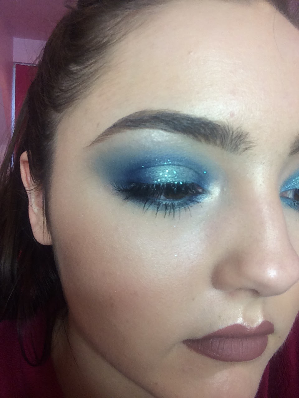
I am happy with how this eye look came out because the eyes look very bold and dramatic; however I don't think I want the eye makeup for this advert to be so intense and dark as I want it to be very bright and summery. I also think the blue glitter will be too much for this look because I want it to look very effortless and possibly day appropriate for Mac's customers to relate to. The look is going to be just a headshot so the eye shadow look will be very clear, so I don't think the glitter would look very clean and summery looking. I will therefore not apply any glitter to my final eye look.

Look 2 (Chosen)
10. I first blended the lightest blue eye shadow from the Sleek Ultra Mattes V1 Palette into the crease as a transition colour with the Zoeva Luxe Soft Crease Brush. 
11. I next added the Bare Minerals Shimmer Eyeshadow in Azure on the eye lid with the Urban Decay Flat Brush sprayed with Mac Fix+. 
12. I then blended Max Factor Wild Shadow Pot in Sapphire Rage into the crease and on the outer third of the eye lid and inner third. I did this with the Zoeva Luxe Petite Crease Brush for precision. 
13. I applied Max Factpr Wild Shadow Pot in Sapphire Rage to the inner and outer third of the lower lash line with the Zoeva Pencil Brush. 
14. I applied the Bare Minerals Shimmer Eyeshadow in Azure with the Zoeva Pencil Brush to the centre of the lower lash line and blended the colours together. 
15. I applied a coat of Rimmel 24 Hour Supercurler Mascara to the top and bottom eye lashes. 
16. I added the Ardell Demi Wispies to the upper lash line with Duo Lash Glue. 
17. I applied the colour Sassy from the theBalm Nude Tude Eyeshadow Palette to the inner corner and on the brow bone with the Zoeva Pencil Brush. 

I much prefer this eye makeup look to the previous because the two blue eye shadow blend into each other seamlessly to create a bright, summery look. I think this looks more effortless than the look above and more youthful and I think the bright eye makeup will look gorgeous in contrast with my model's deep skin tone. I love how intense the Bare Minerals Eyeshadow looks when applied with a wet flat brush because the pigments are intensified and made more vibrant and metallic looking. I am happy I added an eye shadow primer so that the eye shadow stays exactly where I put it and doesn't melt and crease under the warm studio lights. I like that the skin isn't dewy looking all over because that can sometimes be unflattering so I added powder to any areas I wanted to reduce the shine, like under the eyes and the side of the nose so I only highlighter the high points of the face. I also didn't want all the skin to have a dewy finish because I wanted the metallic eye shadows to stand out and I thought the sheen of the skin would take some emphasis off the sheen on the eyes. I will give my model a matte nude lip, so I will take a selection of nude colours and try them on when I get to the shoot to find the perfect colour. I want to warm up the crease slightly to make it blend it with the skin more seamlessly and to make the look more bronzy, so I will add a warm transition shade into the crease instead of the light blue. 

Sunday, 10 April 2016

Advert 2 Makeup & Hair Inspiration & Designs

Makeup Inspiration

I wanted this advert to incorporate at least one of the popular 2016 spring/summer makeup trends, which include blue eye makeup, dewy skin, red lips and metallic colours, to make the advert very on trend and current. I want this advert to advertise a range of new blue eye shadows for summer 2016. Blue eye makeup is one of the biggest 2016 spring/summer trends so I wanted to give the Mac customers a whole range of new blue eye shadows with different finishes to play with!

AMAY, J., 2015. 10 Best Beauty Looks from the New York Fashion Week Spring 2016 Runways [viewed 10th April 2016]. 
Available from: http://www.thefashionspot.com/beauty/642177-nyfw-spring-2016-best-beauty-hair-makeup-nails/#/slide/3
Path McGrath created this beautiful blue smokey eye on the Diane Von Furstenberg models for 2016 Fashion Week. I love how bright and shimmering the blue were and how much they made the eyes stand out. It looks like a light wash of brown was blended through the crease as a transition colour and then a turquoise/green colour was blended all round the eyes and up into the crease. I slightly darker blue has then been blended along the upper lash line and slightly along the lower lash line. I really like how bright and summery this makeup look is with the vibrant, but light blue and turquoise colours. I like how dewy the skin looks because it gives a healthy glow. The skin also looks very natural, with not much heavy products used. The under eyes haven't been overly highlighted and the cheeks have been bronzed, giving a sun kissed, summer glow. The eye brows are very neatly shaped, but still natural looking with each individual hairs visible. The model could just be wearing lip balm on the lips because they look so natural but have a slightly sheen to them. I want this makeup look to be focused on the eyes so a nude or natural lip colour would work perfectly for my Mac advert. I really like this whole makeup looked and have definitely been inspired to create my own!

RANKIN, 2016. Beauty [viewed 10th April 2016]. 
Available from: http://rankin.co.uk/beauty/5815-106-049_f3/
I was also inspired by this makeup look in Rankin's beauty shoot. I like how dramatic and vibrant the blue smokey eye is and how even blue eyeliner has been used. When I first looked at this image I thought the eye lids were so shiny that the light was bouncing off them; however when I looked closely I realised that the 'reflection' was in fact a white line drawn over the eye shadow. I like this effect; however I think I will concentrate on creating a beautifully blended smokey eye that Mac would be proud to advertise. I do really like the slightly darker blue colours so I may use darker blues in the crease or around the lash line to add more definition to the eyes. I like that a deep burgundy has been used on the lips because it makes the look more seductive and dramatic looking; however I want all the focus to be on the eye makeup and I think the lips may take too much focus away from them. I want my model to look very summery; however I also want to show case the dark shades in the collection. A rosy blush has been used on the cheeks in this look which gives the model a more flushed and youthful look; however I want my model to look very sun kissed and glowy so I will focus more on using bronzer and highlighter to achieve that look. 

Face Chart 1
For this first look I was mostly inspired by Path McGrath's makeup look for the Diane Von Furstenberg models for 2016 Fashion Week. I love how the makeup look was very summery and bright, with no dark colours on the eyes of big fake eye lashes. I liked that the makeup looked very effortless as the skin looked very dewy and fresh so no powder was used which could make it look too heavy. I want my model to have very glowing skin because I think it gives dimension to the face and looks like she has a natural glow. I made the eye brows look very natural so I didn't add much product to them, only wear there are sparse areas. I didn't add any blush to this look, only bronzer, because I want my model to have a sun kissed glow, instead of a flushed look. I gave my model a peachy nude lip because I wanted to continue the warm, neutral tones throughout the face so that the bright coloured eye would steal all the focus. I wanted to add some green, turquoise tones in the eye shadow because I wanted it to look very summery and almost represent the turquoise ocean colours. I really like this whole look; however I think I want the eyes to be slightly more dramatic and intricate as it will be all about the eye makeup, and my model has a very dark skin tone so I don't think this lighter eye would be very flattering. 

Face Chart 2
CHUNG, G., 2015. Kim Kardashian Uses Over $1,200 Worth of Beauty Products: See the Complete List of Makeup [viewed 10th April 2016]. 
Available from: http://www.celebuzz.com/2015-08-14/kim-kardashian-makeup-beauty-products-master-list-tutorial/
I was inspired by this blue smokey eye on Kim Kardashian by her makeup artist Mario Dedivanovic for this face chart. I liked how the royal blue stood out dramatically against her darker skin tone and how they are both such warm toned colours. Her eyes have been tight lined with a black eye liner; however I wouldn't want to do this as I want the makeup look to still be summery, even if I do want it to be more dramatic. I like that the eye makeup isn't particularly complicated looking because it looks like the same colour has been blended all round her eyes and blended out in the crease. I also like that dramatic eye lashes have been used; however I didn't include dramatic eye lashes in my face chart as I didn't want the eye lashes to hide too much of the eye shadow. I gave my model a harsh contour with a much darker brown eye shadow; however I will need to be careful with what colour brown I use as I don't want the cheeks to look muddy. I didn't want to add blush to this look because I wanted all the colour to be on the eyes and I wanted her to look very warm and sun kissed. I want the skin to look dewy and glowing because I think it looks healthy and flattering. I gave my model a peachy nude colour lip because I wanted to continue the warm tones all over the face, but I didn't want the lips to be pink as I wanted all the colours on the eyes. 

Face Chart 3 (Chosen Look)
This is my chosen makeup look! I took inspiration from Kim Kardashian's eye makeup with the beautiful royal blue colour all round the eyes; however I was also inspired by the makeup look in Rankin's beauty shoot with the spot light eye look. I wanted the eyes to really stand out against the otherwise neutral tones on the face and I wanted the eyes to have dimension and blends of different colours. I was inspired to create this spot light blue makeup look with a darker royal blue on the inner and outer thirds of the eye lids and also on the inner and outer thirds of the lower lash line. I then want to add a metallic or shimmery lighter blue colour to go on the middle third of the eye lid and lower lash line to create a highlight in the middle of the eye. I would then lightly blend the darker blue precisely into the crease and then blend it out softly with the lighter blue. I may add a blue eye liner in the water line to make the look more smokey; however I don't want the eye to look too dark as I still want it to look summery. I will add some feathery fake eye lashes as I want the lashes to look long and wispy, but I don't want them to cover too much of the detailed eye shadow. I will add mascara on the upper and lower lashes to make them very black and defined. I want the eye brows to be natural looking, but defined because I want them to frame the bright eye; however I don't want them to look too dark or heavy. I want the face to be very bronzed looking so I will just use bronzer in the contours of the face to contour the face slightly and add warmth. I will then add a golden highlight to give my model a beautiful sun kissed glow. I don't want to add any blush or a pink toned highlight because I want all the face to be very neutral and bronzed so the eye stands out. I will give my model a natural looking nude colour, so it will be close to the skin tone but slightly darker, to again not take any attention away from the eyes but still add definition. I am so excited to try this look out; however I need to invest in the right eye shadow colours first! 

Hair Inspiration

The background of the image is going to be black and so is the model's hair so the hair is hardly going to be visible. However I do want to make sure I keep the hair off the face so that is doesn't distract from the makeup look or cast any unsightly shadows across the face. I want the look to be very pretty and feminine, but still glamorous and neat. 

Hair Chart 1
MARCH, B., 2015. Spring/Summer 2016 hair and makeup trends [viewed 1st February 2016].
Available from: 
http://www.cosmopolitan.co.uk/beauty-hair/beauty-trends/g4142/spring-summer-2016-hair-makeup-trends/?slide=11

I found this image and liked how glossy and sleek the hair looked. I think the shine of the hair would complement the dewy finish on the skin and the metallic eye shadow on the model as the same glossy texture would tie everything together and accentuate them. I also like that this hairstyle would keep all the hair off the face to stop the hair distracting from the makeup or casting any shadows across the face. However I think the hair looks too sleek and not feminine enough as I want the image to look very girly and relaxed, instead of being very slick and sophisticated looking. 

Hair Chart 2
MARCH, B., 2015. Spring/Summer 2016 hair and makeup trends [viewed 1st February 2016].
Available from: 
http://www.cosmopolitan.co.uk/beauty-hair/beauty-trends/g4142/spring-summer-2016-hair-makeup-trends/?slide=23

I was inspired by this hair look because all the hair has been tied off her face, but it still looks very girly and feminine. I like that there are two dutch braids running along the front of her hair because it adds a pretty detail to the look and I think the braids would catch the light to accentuate the twisting of the hair. The hair has been loosely curled at the back which I also think would catch the light in my image to show off the curls. My model has very shiny hair already; however I would still add a shine spray to accentuate this if I were to do this hairstyle. I think this hair style would look pretty; however I think it may look too complicated, when I want all the attention to be on the makeup look. I will therefore find a hair style that keeps the flowing hair, but it more simple.

Hair Chart 3
ANDERSON, C., 2014. Top 100 Curly Hairstyles [viewed 10th April 2016]. 
Available from: http://www.herinterest.com/top-100-curly-hairstyles-2014/

I was inspired by the beautiful loose curls in the image above because it looks very fun and girly, but still glossy and healthy. I think the curls would look really pretty in my photoshoot as they would catch the light in some places to emphasise the curls. However I don't want there to be any hair on her face so I will experiment with a wind machine to blow it all back. I like that when the hair is being blown off the face, the hair line will be completely clean, unlike if there were any plaits running along it or fringe, making it look very neat and clean. I think these pretty curls will compliment my blue smokey eye look perfectly to create a fun and girly result. 

Friday, 8 April 2016

Advert 2 Research, Ideas & Makeup Inspiration

My Wash & Dry advert included all the model's body and some props, so I wanted my next advert to be very simple and clean looking. I want it to just be a headshot so that the makeup is really clear  and there are no distractions. My Wash & Dry advert was for a collection; whereas I want this advert to advertise a specific product or product range. I used a model with pale skin in my previous advert so to show that Mac is suitable for any skin tone I will be using a dark skin model for this advert. I wanted this advert to showcase my less dramatic makeup look because it will be more of a close-up so you will be able to see the makeup more clearly; whereas I made the makeup more dramatic in my Wash & Dry advert because the model was so far away from the camera and I still wanted the makeup to be shown. 

Advert Inspiration
TEMPTALIA, 2014. MAC Prep + Prime CC Colour Correct Collection for Spring 2014 [viewed 8th April 2016].
Available from: http://www.temptalia.com/mac-prep-prime-cc-colour-correct-collection-spring-2014

I was inspired by Mac's Prep+Primer Colour Correct Advert because the makeup looks very simplistic and the colour scheme has been kept very small. I like that each model is wearing very similar makeup, but in different colours because it makes the advert look very clean and sophisticated. I also like that the background of the advert is in the same colour palette as the makeup looks because it almost creates a monochrome effect. The Colour Correct products that were brought out were aimed to make your skin look glowing and flawless in a natural way which is why the model's look so naturally beautiful, with no obvious skin makeup. Many Mac cosmetics adverts and editorials have very dramatic makeup looks and even if they are not dramatic on the eyes, the skin is still heavily made up. I therefore like this more natural approach to the skin makeup. I like the simple layout with one main image being used and then a small amount of text being shown at the top, in the middle. The only text that has been used in the company logo and the name of the name collection of products and I like how this make the image the main focus. In some cosmetics adverts an image of the product is put on the advert which I think can made the advert look too crowded, and they put a lot of text all about the image and quotes from magazines etc. which I definitely think makes the advert look too busy and sometimes messy. However I like how clean and simple this advert is as it is clear what the product is and showcasing how to use it in a beautiful portrait shot.

TIMMONS, L. MAC Cosmetics [viewed 8th April 2016]. 
Available from: http://lauratimmons.blogspot.co.uk/2011/10/mac-cosmetics.html
I was inspired by this image because of the small colour scheme and that the same colour has been used for the background as it has for the makeup look. I like that a silky material has been used in the background because it add a luxurious, rich feel to the advert, making it look more high end. The model's have slightly more dramatic makeup on than in the advert above, with brown and black smokey eyes and a darker contour. I like that two models of different ethnicity have been used as it shows the viewer that the product is suitable for any skin colour; however I think that just using one model can make a more striking image and therefore grab more people's attention. I don't think it is a very flattering angle for the model with them looking up so dramatically at the camera so I will use a less strenuous angle in my advert. There is more writing on this advert than there usually is on Mac adverts and I don't particularly like it. It includes the Mac logo and the name of the new collection/products, but then it also includes a description of the product. This is a very common tactic by many other cosmetics companies; however it is not very common of Mac to do this. I think that the writing makes the advert look more tacky because it looks slightly messy; whereas I don't expect Mac to have to pitch their products to their customers. I won't be including a lot of text in my advert because I want it to look very sophisticated and high end. I like that the colour of the text is white because it stands out against the darker background and adds a clean touch to the advert; whereas if the text was black or coloured I don't think it would have looked as professional.

CHRISTA, 2016. MAC Cosmetics Mineralize Skinfinish Natural for Spring 2016 [viewed 8th April 2016]. 
Available from: http://www.perilouslypale.com/2016/03/32290.html
I was so excited when I found this advert by Mac for their Mineralize Skinfinish! I was concerned that having a blue background with blue eye makeup was not going to work because if I didn't get the right shade of blue it would look naff and amateur. However I was re-inspired when I found this beautiful image with a black background. My model is going to be dark skinned and I love how this model's skin tone softly stands out from the pitch black background. I like that the blue eye shadow would be the only coloured aspect in the image because it would make it stand out so much more than if it was fighting against a blue background. I like that the model isn't wearing a top because I think introducing clothing into the image would distract too much attention away from the makeup. I like how the model is positioned with her shoulder brought up towards her face because it acts as a leading line towards the face, drawing the viewers eye to the makeup, but also because I think it is slimming for the model and adds another aspect to the image, rather than just a head shot. I really like that the model's skin looks very dewy and fresh because it gives a healthy glow and it's a popular 2016 spring/summer trend. I really like the lighting set up in this image because not all of the model is lit up. I like that there is a slanted strip of light across the model to highlight the mode's face and shoulder because it adds dimension to the image and keeps it from looking too flat. I am not sure how I would create this look, either using barn doors on my lights in the studio or taking some of the colour out in post production, but I would be really excited to test it out! I like that there is only a small amount of text, with the company brand name and the name of the collection because it keeps the image looking clear of unwanted writing and makes it all about the image. I like that the text is white because it stands out clearly against the black background and accentuates the model's highlights.

Monday, 4 April 2016

Editorial Hair Design

I wanted to keep the hair design very simple as I didn't want to take much attention away from the makeup look as it is already quite busy; however I still wanted to have a tribal influence in the design.  When people think of tribes they automatically think of African tribes so I wanted to take inspiration from some African hairstyles for my shoot.

Hair Design 1
PAVITT, N., 2016. Namibia Kaokoland [viewed 4th April 2016]. 
Available from: http://www.gettyimages.co.uk/detail/photo/namibia-kaokoland-a-
himba-youth-with-his-high-res-stock-photography/126559627
The image above shows an African man with a long plait down the middle of his head. I like the simplicity of this look and it inspired me to do a dutch braid running all down the the middle of the head and then going into a regular plait down the back. I would make this braid look slightly messy and as big as I could to give the hair some messy looking volume. I like that braids are a popular 2016 spring/summer trend as it will keep the editorial looking very current. I think this design would look very effective if my model wasn't wearing a the headdress; however I think a lot of the detail would be lost behind the headdress and you would only be able to see the plait running down her neck or over her shoulder.


Hair Design 2
SHERWIN, N., 2014. Cleaning African Hair Afro-Diva Style [viewed 4th April 2016]. 
Available from: http://www.ecodiva.co.za/cleaning-african-hair-afro-diva-style/
When I think of African hair I automatically think of a big afro style. I like how fun and messy they can look with lots of volume and texture. My model has naturally curly hair so this hair style would work perfectly if I did some back combing and added some volumizing products. I think this hair would look really fun surrounding the headdress because only the rim of the hair would be showing, almost creation a halo effect. However I am concerned that this big hair look will distract from the rest of the design, making it look too busy and therefore messy.


Hair Design 3
BLACKHAIROMG, 2015. 11 Secrets - How To Make Your Hair Grow Faster & Longer Now! [viewed 4th April 2016]. 
Available from: http://www.shorthaircutsforblackwomen.com/
how-to-make-your-hair-grow-faster-longer/
This is my chosen hair design. I love that I can use my model's natural curly hair type to create this voluminous bun hair style. This hair style is very popular amongst African women and so I like that my design would have some African influence. I liked that the hair style above would be seen all around the headdress, but I thought it would be too over powering, so I decided on a hairstyle that would be seen above the headdress in a slightly more subtle way. I like that the sides of the hair are going to be sleek and smooth looking because it will give a clean and neat look, keeping it simple around the busy makeup look. I also like how this hair style would almost carry on the headdress upwards as the Indonesian tribes usually wear big head accessories so this height would reflect that. To create this hair look I would have to back comb the hair and add volumizing products to give the hair extra texture and body. I would then create a very messy bun shape with a hair elastic and lots of hair grips. I am excited to try out this hair design with the completed look!

Practicing My Editorial Makeup Look

Feather Headpiece

Equipment:
-Coloured feather from Pullingers
-Evo-Stik Serious Glue
-Plastic mask from Pullingers
-Paint brush
-Black Acrylic Paint

Step by step:
1. I first picked all the orange, red and yellow feather out of the bag and split them evenly down the middle, in their individual colours, so I would have an even amount of feather on both sides. 
2. I then painted all the other feathers black using black acrylic paint and a paint brush. I made sure I coated these thoroughly so no colour was showing through. I brushed the feathers backwards slightly with the brush to make them look more naturally messy as I thought they looked too fake. 
3. I cut the bottom half of the mask so that just the section above the eye brows were showing. 
4. I applied my first layer of feathers along the mask using the Evo-Stik Serious Glue, making sure they were even on both sides. I then put a block of wood over the top to press down the feathers whilst they dried. 
5. After the first layer had dried I applied the second layer of feather, filling in any gaps and applying the next layer slightly further down than the last. I used the same drying technique as before. 
6. I applied the final layer of feathers, even further down to create a layered effect. I made sure that I didn't place two feathers of the same colour next to each other as I wanted them to look randomly arranged. 
7. After all the layers were dry, (I left it over night to set properly) I cut the ends of the feathers off in a neat line to be positioned along the eye brows. 
I am really happy with how the feather headpiece came out! I like that the feathers look like they are positioned randomly, but that they are also symmetrical because my tribal makeup look is symmetrical so I wanted it to reflect that. I considered not including black feathers in my feather headpiece; however I think it would have looked too bright and too fake looking; whereas the black darkens it slightly and the messiness of the feathers makes it look more natural. I am not sure about the bottom of the feather headpiece because it looks slightly uneven and messy, which is not the polished look I think Mac would want to show case. I will therefore test it out with my makeup look to see if I want to change it. 

Makeup Look

Equipment:
-Clean & Clear Moisturiser
-Nivea Lip Balm
-Nivea Replenishing Post Shave Balm
-L'Oreal True Match Foundation in 3.W and 1.W
-Nars Illuminator in Copacabana
-Real Techniques Buffing Brush
-Maybelline Eraser Eye Concealer in Light
-Real Techniques Setting Brush
-disposable mascara wand
-Rimmel Stay Matte Powder in Translucent
-Urban Decay Naked Basics Palette
-Illamasqua Angled Brush
-Tape
-Supra colour in red, orange and yellow and white
-Red Mac LipMix
-Silk Pro Lip Brush
-Style Master Concealer brush
-DaVinci paint brush in 10
-Illamasqua Gel Eyeliner in Infinity
-Mac 210 Eyeliner Brush
-DaVinci Paint Brush in 4
-DaVinci paint brush in 24
-Supra colour in black (hands)
-Double sided sticky tape
-Black eye liner
-Duo lash glue
-Fake eye lashes
-Baby oil
-Mascara

-Eyelash curlers

Step by step and designing:
1. I first applied Clean & Clear Moisturiser all over the face to hydrate the skin. 
2. I then applied some Nivea Lip Balm over the lips to hydrate them too.
3. I applied some Nivea Replenishing Post Shave Balm all over the face to help the makeup stick to the face and last longer. 
4. I mixed L'Oreal True Match Foundations in colours 3.W and 1.W to match the model's skin tone and then added the Nars Illuminator to give the skin a dewy finish. 
5. I applied this mixture all over the face with the Real Techniques Buffing Brush to create a flawless and even base. 
6. I applied some Maybelline Eraser Eye Concealer in Light under the eyes and on the high points of the face to give the face some dimension and to conceal and imperfections. I blended that in with the same RT Buffing Brush. 
7. I set the concealer under the eyes with the Rimmel Stay Matte Powder in Translucent and the Real Techniques Setting Brush to avoid any creasing. 
8. I brushed through the brow hairs with a disposable mascara wand to brush them all in the same direction and filled them in with the shade Faint in the Urban Decay Naked Basics Palette. I used the Illamasqua Angled Brush to do this. 
9. I applied some tape across the face so that the eye brows were completely covered, making it as straight as possible, and then started painting some red supra colour along this line with Pointed Lip brush by Silk Pro. I made sure I was very careful when doing this because at this point I thought this line would be visible; however this is unnecessary for the finished look. 
10. I used a fluffy concealer brush by Style Master to blend the red supra colour further down the face to just under the eyes.
11. I used the same fluffy concealer brush to apply some orange supra colour just underneath the red colour to blend it out and I then carried it down to the middle of the nose.
12. Using the same brush, I applied some yellow supra colour just beneath the orange to blend the orange out and I continued to blend this orange to just under the nose. I made sure that all of these colours were blended seamlessly into each other.
13. I took the DaVinci Paint Brush in 10 and applied a line, the same width as the brush, from the cupids bow down the the chin. I didn't want to make this line complete to I left out sections the brush didn't naturally apply product.
14. I applied some Illamasqua Gel Eyeliner in Infinity along the water line with the Mac 210 Eyeliner Brush.
15. I used the DaVinci Paint Brush in 4 and white supra colour to draw lines down the cheeks in the pattern shown below, with the line closest to the eye higher up and shorter than the line further out. Using the back of the brush I applied one dot on the top of each line and then two dots below the two outside lines.
16. I used the DaVinci Paint brush in 4 on its side and drew smaller lines in the middle of the white lines with black supra colour, focusing mostly on the top and brushing down. I added smaller black dots in the middle of the white dots.
17. I decided to paint the model's hand that would be grabbing the black hand because I wanted it to be obvious that it belonged to the model. I tested out a couple of different designs, shown below. I think my favourite design is the one on the left because it includes the colours from the face, but it doesn't take too much attention away from the face; which I think the white and black details do in the other design. (I test out more designs for the hands however this one turns out to be my favourite.)
18. I felt like the model's body looked too empty as it was left completely bare so I decided to add a some supra colour that reflected the warm colouring of the face and hand design. I used tape again to wrap round the neck and then painted on the ombre effect starting with the red at the top. I initially didn't want to make it too large because I didn't want to take any focus away from the face and I liked that it looked like a chocker.
19. I painted the hand, that was going to represent society in my editorial, with the DaVinci paint brush in 24 and black acrylic paint. I made sure to get in every wrinkle and in-between every finger so there was no skin colour showing.
20. When I applied the headdress onto the model I wasn't happy with how it looked. I didn't like how uneven the bottom of the feathers looked against the very sharp and precise red line of paint because it looked messy. I stuck the headdress with the just the feathers on with double sided sticky tape to the forehead so that I could see what it looked like without someone holding it.
21. I applied some fake eye lashes with duo lash glue. 
22. Possibly add baby oil to the body to add a dewy finish if necessary.


I felt like I wanted the bottom of the headdress to have a very sharp and clean edge. I thought of cutting the feathers again, making sure that I cut them in a perfect line, however then I thought it would be better to add a strip of black material along the bottom. This black material would hold the feathers together and would also give a clean line, which was exactly what I wanted. I first held it against my head and showed a thin strip of my skin because I wanted to show that I had made the red paint stop in a perfect straight line; however it just looked like it was a mistake that the headdress wasn't meeting with the red. When I moved the headdress down to meet the red colour it looked too far down because it was covering the eyes slightly. This meant that I had to extend the red paint upwards slightly so that the headdress would meet the red paint but that it would be at a flattering height, just along the eyebrows.

Chosen Headdress Design.
23. When I tested out incorporating the hand into the makeup look I found that the red around the neck almost disappeared and you could only see the red part and not the blending into the yellow. I therefore blended the red, orange and yellow further down the neck to make it more visible under the hand positioning and so that the chest didn't look too bare.


I am happy with how the makeup look turned out because all the colours are very traditionally tribe colours and the colour scheme has been kept small to avoid it from looking too messy. This is not the lighting I will be using in my shoot; however I will be using a black background so Iw anted to see how it worked with one. I love how beautifully blended the ombre affects are because you can't see where one colour stops and the next begins. I like that the supra colours give a dewy finish because it will give the face more dimension, make the model look more healthy and it is a popular 2016 spring/summer trend. I am happy that I used fake eye lashes because I felt the eyes were looking slightly drowned out by the surrounding bright colours and patterns, so the dramatic fake eye lashes give them more definition and drama; exaggerated fake eye lashes are also a 2016 spring/summer trend. I really like the white and black patterns on her face because there incorporate traditional Indonesian shapes and they add fun details round the face. I like that the red/yellow colour have been brought onto the chest because otherwise I think this area would look too bare; however I will need to be careful that I blend the supra colour all the way round the neck and chest so it look never ending and seamless.

I am really happy with how the headdress turned out because they add another Indonesian tribal aspect to the look. When I first got the feathers they looked too perfect and fake looking so I ruffled them up slightly so make them look a touch more natural. I also made the feathers look slightly more dishevelled when painting them with black acrylic because I didn't want the paint to make them look even more fake. I like that all the feathers are positioned randomly but that each side is symmetrical because it reflects the symmetrical makeup look and the Indonesian tribes always seem to keep the makeup look the same on both sides. I am really happy with the band around the feather headdress because it gives the perfect straight line against the red skin paint and it holds the feathers together. I tested a matte black headband and a shiny one and I think I prefer the shiny one because it reflects the dewy skin and the shiny effect on the black feathers and black hand. I think the matte headband looks too flat and it is too thick, making it take too much focus. I want to add more black feather around the edge and along the top of the headdress to make it more dramatic, cover any unwanted skin showing through and will blend it into the dark hair more seamlessly.

I really liked how the hands looked covered completely in black paint because you could see all the details of the hand, from the wrinkles to the nails, which you wouldn't get from wearing black gloves. I found that the acrylic paint started to crack and flake off which I didn't like; however I did like the slightly glossy finish so I decided to use supra colour in my final image. I used black acrylic paint because, firstly my black supra colour was running out, but secondly because I knew it would dry and therefore not transfer onto the model. I will have to be a lot more careful when positioning both the models to make sure the black supra colour didn't get all over the main model's chest. I didn't practice the hair in this practice because I wanted to make sure was happy with the makeup look first; however I am planning on keeping the hair looking fairly basic as I don't want the over all look to be too fussy.

I am not completely happy with the hand positioning because I think the tribal model's hand looks too big against the smaller black hand. I may not include the model's coloured hand in the image and just show that the model is rising above any negativity bringing her down, as I think there is too much going on and it look slightly messy, with no obvious focal point. I may use two black hands, with one in the same position as above and the other coming over her shoulder to make it look like they are trying to surround her. I will experiment more with this when I do the editorial shoot.