Monday, 25 April 2016

Project Evaluation

What was the project theme and what did you think of it?
In this project we had to choose a makeup brand we wanted to work with and then create two editorial images for a magazine spread, two advertisement images (day & night), and then two catwalk looks. All these images had to be inspired by the 2016 Spring/Summer trends and by your chosen brand, as well as your own inspiration. I was really excited by this because I want to go into beauty makeup or work with magazines which made these images perfect for my portfolio. Beauty images are my favourite type of images to create because I enjoy making my model's look beautiful, instead of creating characters which I have done more previously. I was so excited I got to choose my own brand because I didn't want to restrict myself with a brand that would maybe be more targeted at more mature women. I chose MAC because it is one of my favourite brands and I own many of their products; I also like that they are very diverse because it would mean I wouldn't be too restricted.

What part of the project did you enjoy the most/found most interesting 
The part I enjoyed the most in this project was being able to create such a range of beautiful images with my favourite brand as inspiration. My favourite part was seeing all my research and design ideas coming together in the photo shoots because I got to see my visions come to life. I found looking into the 2016 Spring/Summer trends very interesting because I had never done it before and I didn't really know they existed in the Fashion Weeks; however I will definitely be more aware of the new trends so I can constantly incorporate them into my work to keep my work looking up to date. 

What new techniques have you experienced?
I learned so much in my photography lessons this unit, for example, I learned all about coloured gels and how to use them. I had previously wanted to learn how to use these because I think they can completely change the look and mood of an image, so when I was confident with them I incorporated them into one of my images. I also learned about what lenses to use when doing close-up, headshot and mid length photography and what differences they made. I think the main thing I learned makeup wise in this unit would be that less can sometimes be more! I used to apply more foundation than I needed to with a very dense brush; however I've now learned that you can apply a thinner layer of foundation with a less dense brush and then apply concealer to any imperfections still showing through. I much prefer how the skin looks now because it looks so much fresher, youthful and natural. I learned what products to apply to the hair to get different hair textures and hairstyles, for example, you can apply a sea salt spray to give the hair more texture or you can apply a voluminizing mousse to give the hair more lift. I learned many new hair styling techniques, for example, braiding, finger waves and beach hair. Before coming to this university I wasn't confident with hair as I had never really done it before; however after all the practical hair sessions I am getting more and more confident with my skills. I learned how to do makeup on male and more mature models through looking into YouTube videos by makeup artist Lisa Eldridge and practising the different techniques she uses. 

What technique would you like to develop further?
I would like to develop and improve my PhotoShop editing skills because I sometimes feel I can't get the skin on the model to look exactly how I want it. I have taught myself frequency retouching and the use of the Clone Tool; however I would definitely benefit from a skin retouching session in IT. I would also like to develop my eye shadow skills, for example learning cut creases and editorial eye looks, to expand my skills for my future makeup looks. I would also like to learn how to do makeup on male and mature models as I have found out through my research that you have to change certain things to ensure the makeup suits the model. This would mean that we would be capable of doing makeup on a variety of models. 

Which areas/professionals/artists did you research through this project? How have they influenced your work?
I looked into many different makeup artists, fashion designers and photographers to help inspire me for my own photo shoots and makeup and hair designs. However the photographer I think I took most inspiration from would be Rankin because he is so experimental with his angles, lighting and makeup looks within his images. I was particularly inspired by the lighting set ups he used because I thought this would be able to change the whole mood of the image. I also looked into Jamie Nelson who inspired me to use coloured gels in my Wash & Dry advert. 

The two designers I chose for for catwalk looks were Jonathan Saunders and Gareth Pugh. I looked into both these designers, found their inspiration for their 2016 Spring/Summer collections and then designed a makeup and hair look for these collections. I was inspired by the light, summery colours in Jonathan Saunders' collection, but also the oriental patterns, to create a fresh, oriental inspired makeup look. I looked into asian makeup trends to create a makeup look that reflected the asian/oriental traditions. I was inspired by the coins used along the side of Gareth Pugh's catwalk show and the coins embroidered onto the clothing; I was also inspired by the fact Pugh was trying to reflect the night life of Soho. I therefore create a mask made of the same 1p coins, with one half sprayed black and the other sprayed gold, to reflect the rich and poor aspects of Soho Gareth Pugh portrayed through his collection. 

Mucia Pieroni inspired my Jonathan Saunders' catwalk makeup look because the skin was so fresh and healthy looking and the overall makeup look was very summery and light. Another example of a makeup artist that inspired me for one of my makeup looks is Pat McGrath. I was inspired by her 2016 Spring/Summer look for Diane Von Furstenburg's collection, with the beautiful turquoise blue smokey eye and fresh dewy skin. I was inspired by this for my Mineralize Skinfinish advert to create the metallic blue smokey eye and very highlighted skin with nude lips. However the makeup artist that had the biggest impact on me for this project would have to be Mirijana Vasoic because she taught me many new techniques that I will continue to use throughout my makeup career, for example, she emphasised the importance of using on little product on the skin and a light hand and fluffy brush to give an air brushed, but still natural finish. I also looked at images of makeup looks that weren't by famous makeup artists as inspiration because I didn't want any of my makeup looks to be recognisable as I wanted them to look very unique. I looked into Lisa Eldridge when doing makeup on mature skin to learn the techniques she used and what products she recommended; this really helped me because when I first appled makeup on my mature model I really didn't like that makeup as t looked too heavy, whereas after adopting her techniques I thought the makeup looked a lot more flattering.  

Which technique did you enjoy the most?
I enjoyed learning how to create beautiful, glowing skin because the base makeup is so important for the rest of the makeup look to look polished. I always find myself wanting to incorporate this skin finish into my looks because it gives the model such a healthy, youthful glow. We were taught to mix an illuminator into our foundation, apply a thin, even layer over the skin and then apply a cream highlighter to any of the high points of the face. Dewy skin was a popular predicted 2016 Spring/Summer trend so it was perfect to use in our makeup looks. 

What do you feel is the most successful part of your project and why? 
One of the most successful parts of my project would have to be my time management. At the beginning of the project I created targets that I had to meet, for example how many shoots I had to complete in a time limit. I found this so helpful to measure how well I was doing time wise to see if I was falling behind or if I was on schedule. I found that I planned all my shoots with plenty of time, meaning I wasn't panicked at any point that I was running out of time. I was very dedicated to this project and so put a lot of time and effort into it to create final outcomes I was really proud of. This meant that I felt very on top of my work and confident that I would finish in time. 

Did you encounter any problems in your project? How did you learn from them and how did they affect your final work?
The biggest problem I encountered in my project was understanding how to use coloured gels to create my Wash & Dry advert. I found it really difficult to get the right colour on the model and the background, with the correct exposure and no unwanted shadows. I did a test shoot when I realised that I hadn't done enough research into using the coloured gels so I made sure I was more confident and had done lots more research before my final image and I was so happy with the results! This taught me to always be prepared when going into the studio and to have a practice shoot if I wasn't confident with the lighting, which in this case I am very happy I did! 

Another problem I encountered was finding time slots where my model was free, I was free and the studios weren't booked. I had to juggle some other commitments around at points to make sure my model was happy with the time slot and I had enough time to do the makeup, hair and shoot. I learned that I had to book the studios and plan what time to do the shoots far in advance so that I wouldn't have a problem with running out of time and studio slots. I live an hour away but wanted to use some model's I knew from home so I asked a college with a photography studio if I was able to use their studios because then my model wouldn't have to travel all the way to Southampton. This taught me to not limit myself with what the university offers and to use other collage's or universities' facilities if the location works better.

I struggled to work out how to edit my Wash & Dry advert because I wanted to slim down the model in a natural way. I therefore research some YouTube videos that covered these areas to teach me how to do it. I was so happy with how easy the techniques were once you understood them and I think the results look very natural and seamless. I research PhotoShop videos for many of my editing queries in this project and I found them useful so I will definitely continue to do this for my future projects. 

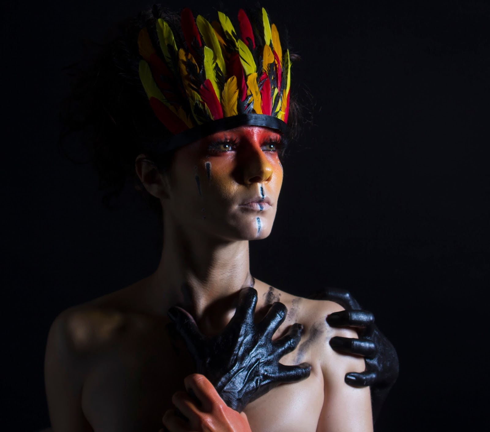
Another problem I encountered was the coin mask not staying on the face properly. The mask was very heavy because it was covered in 1p coins which made it difficult to secure the mask onto the face without it falling. I initially wanted to secure it by gluing string to the back of the mask; however this fell instantly. I then tried tying elastic through holes I made on either side of the mask; however this still wasn't strong enough to hold it. I then tried to duct tape the edges to the tights on the head; however this still didn't make it hold and it was difficult to keep it out the view of the camera. I therefore made the model hold the mask with her hand so I had to apply makeup all over her hand to match sure the skin matched the rest of the body and face. I really like how this turned out because I think it looks edgy with the model holing the mask; however I learned from this how important it was to practice applying the props to the model before the shoot. 

What would you do differently given the chance to complete the project again?
I am really happy with how this project went and the outcomes that I created; however if I were to do it again I would make sure to practice using the props before bringing them onto set. I explained above that I couldn't work out a way to secure the coin mask to the model's face without her holding it so I would definitely do this differently in my next project to ensure I am completely prepared before showing up to the shoot. If I were to do this project again I would also make sure I did more research in books from the library to use a wider range of resources to improve my knowledge. 

Sunday, 24 April 2016

Brand Evaluation

Mac's identity is all about self-expression, individuality and creativity through makeup and self-presentation. It is all about being exactly who you want to be and not hiding behind stereotypes or what people expect you to be like. Mac is also all about being confident and free within yourself and your makeup skills. Mac was originally launched because of the limited colours at the time and the co-founders wanted to create products that makeup artists could use to create vibrant and colourful looks for photography. All the celebrities they use are very creative and are looked up to because of their confidence to start new movements and create their own identity. 

The Mac logo is very distinctive and recognisable. It is very simplistic, with very clean and sharp edges, making it look very professional. The use of only black and white also gives a professional and up market look because it doesn't look fussy or tacky in any way. The logo doesn't include any images of makeup or any other figures, but it instead just includes the company name. It has a very distinctive font used that is used every time the logo is used for consistency, making it instantly recognisable. There are two dots between the letters to show that the letters are initials for Makeup Art Cosmetics. It could be argued that the two dots look like eyes, which could be interpreted as beauty being in the eye of the beholder.

The products that Mac create and bring out are because of the demand from professional makeup artists, which are Mac's ultimate target audience; however they now also cater for the general public too. The majority of their consumers are female and they are generally either women who have a family and have launched their careers or college students in their teens. The consumers are also usually confident, creative and savvy and they like to spend money on themselves. Mac is a high end brand, but it is not at a very high price point, such as Chanel or Tom Ford etc. so it is more attainable by the general public, even if it is a treat. Mac uses demographic information which informs them that their more concentrated target audience is women between the ages of 18 - 49.

I like how I wasn’t restricted by my chosen brand to the kind of makeup looks I could create because MAC is such a diverse brand. For both my catwalk looks I chose designers that MAC had already created a look for because I wanted to make sure MAC would have done the makeup for my chosen designers. However I didn’t want to just adapt Mac’s makeup looks, I wanted to completely change them to what I would have done with the inspiration from the designers’ collections. I took most of my inspiration from the designers and the 2016 Spring/Summer trends; however I showcased Mac’s more natural and youthful side in Jonathan Saunders’ look and the more grungy, dramatic side in Gareth Pugh’s look.

I researched previous Mac collection adverts so that I could make mine as appropriate for Mac as possible. I found that they used very similar looking models throughout their adverts; they were very slim, perfect skin, youthful, with doll-like features, including plump lips, big eyes and petite noses. I also did research into the kind of makeup they used to find they typically had very dewy skin, glossy lips, heavy contouring and natural eye brows, with different eye makeup in each. I am happy that I gave my models makeup looks that followed what Mac tended to do and then I incorporated different 2016 Spring/Summer trends and my own inspiration to create my own looks. I am so happy with both my models for the adverts because they are beautiful, youthful girls, with doll-like features. I did both my adverts in a studio because I found that Mac always had very fake, plastic looking backgrounds. I included bright coloured inflatables in my Wash & Dry adverts to reflect the fantasy world Mac create for their collection adverts and then a plain black background for my Mineralize Skinfinish advert as many of Mac’s adverts have clean, block colours for the background to put all the focus on the makeup looks. Mac edits their adverts to make their models look flawless and sometimes even plastic looking, as if they are dolls. I made sure I developed my editing skills to make my models look as perfect as their, including frequency retouching and even liquefying to make the model look slimmer. I included Mac's logo into my adverts and the name of the collection to keep the text minimal and clean looking. 

I wanted to focus on portraying Mac’s identity of being very creative and self-expressive in my editorial images. I therefore chose to portray the message of never letting others restrain you from looking and being who you want to be. I did this by using tribal-inspired makeup and contrasting images to represent how the first model feels she is being engulfed by society and then the next image representing how the model is breaking free. In the second image I really wanted to represent Mac’s strength and confidence to look exactly how you want to look and I think my model portrayed this well with her powerful stance and bold makeup. I still used models I felt were appropriate for Mac, so they were both youthful and doll-like looking. I didn’t edit these images as much as the adverts because I wanted the models to look more realistic and relatable. 

Saturday, 23 April 2016

Analysing Editorial 2


Makeup
I am so happy with how bright and vibrant the makeup turned out with all the oranges, yellows and reds. I am didn't want to highlight too brightly under the eyes because I wanted the eye shadows to look warm against the skin tone and I am happy with how flawless the skin looks. I didn't want to make the skin look too dewy because I wanted the matte texture of the face to contrast with the shiny texture of the hands as I thought using the same finish would make the hands and the face seem too uniform. I really like how all the coloured blended so seamlessly on the eyes as there are no joining lines and it looks so effortless. I like that the vibrant orange on the inner part of the eye and outer part of the lower lash line balance each other out and make the eye look bigger. I am happy that I did such a smoked out and exaggerated eye look because it stands out even against the dark lighting, which I think a softer eye look would have got swallowed up in. I like that I didn't use mascara on the eyes because it gives her a more youthful and bright eyed look. I also think the black mascara on the eyes would have stood out too much as it would have been brought out by the surrounding black hands, making the eyes look too dark. I am happy that I gave her natural looking eye brows because I didn't want them to take too much focus or make the makeup look more severe or dramatic. I like that I didn't give the lips a sharp outline because I think the softer line compliments the blended out eye. I chose an orange/red for the lip colour because I didn't want it to be a definite bright colour, but I still wanted to incorporate some of the warm tones included in the eyes. I like that this is a colour that is commonly worn by the public because I want it to look like she is having to conform to what society want her to look like. I love how pitch black the hands look because they completely blend in with the background, as if they are coming out of nowhere. I like that the hands are so glossy because the fingers are only visible against the black background where the light reflects off them; I used black acrylic paint to do this. I love this because only certain parts of the hands are showing which makes it difficult to work out who's hand is who's and where each hand is coming from. 

Lighting
I think the lighting is what makes this image work! I used a soft box because I wanted the lighting to be harsh; however I still wanted the lighting to be flattering on the skin. I felt that if I used a spill kill or beauty dish, the lighting would have been too harsh and unflattering on the skin. I first positioned the soft box to the right side of the model and level with the model; however I felt this created shadows cast across the face on the lower part of the face, but it left the forehead looking bare. I therefore moved the soft box higher up and angled it down so that it would catch the fingers on the forehead to cast shadow across the forehead. I really like how the finger shadows almost make it look like there are even more hands trying to grab and engulf the model and I think they add a sinister look. I like that I positioned the light on only one side of her because then the other half is in complete darkness, making the image look mysterious and sombre. I didn't want exactly half the face to be in darkness because I did't think there'd be enough detail in the image so I asked my model to face the light slightly and lift her head up so the opposite eye and some of the cheek bone caught some of the light too to give the face more shape and to add more detail. I positioned the model far away from the background and made sure none of the light was shining onto the background because I wanted it completely black so that the shadows and black fingers would blend into it perfectly. 

Lighting Set Up


PhotoShop
My model's skin was clear and smooth; however I had to use the Clone Tool to remove any flaked off black acrylic paint on the face and she had lots of black dots on her chin which I removed very carefully on the chin. I didn't want to use the technique of frequency separation because I wanted the image to look more raw and real, instead of the over edited look Mac usually go for in their adverts. There were some parts of the hands that weren't completely black, where their normal skin colour was showing through, so I used the Clone Tool again to make those areas black or blend then into the fingers. I brightened the image slightly and increased the saturation and contrast because I wanted the orange colours on her eyes to look very vibrant against the dark black. I am really happy with how flawless, but realistic the skin looks because I didn't want my editorial images to have the same fake, doll-like look of their adverts. I found a Mac logo that did not have a background so I copied it into PhotoShop, changed the text colour to white, and then pasted it onto my editorial image. I positioned the logo in the bottom, right corner and made it quite small so it didn't take too much attention way from the image. I considered making the Mac logo orange to reflect the orange makeup look; however I wanted both logos on my editorials to look the same and I felt white worked the best with both of them as it is such a neutral, clean colour. 

Model Choice/Positioning
I am very happy with my choice of model because she looks very youthful, with full cheeks and plump skin, and she had fair hair, making her eye brows less dark and intense. I didn't want my model to make any exaggerated facial expressions because Mac cosmetics tend to give their model's a dazed and empty look as they are usually positioned as dolls. I also didn't want my model to make eye contact with the camera because I thought this would draw too much attention to the eyes, instead of the overall makeup and message. I asked my model to tilt her head back slightly, as if she was being pulled backwards and she had her mouth slightly open as it happened naturally as she lent her head backwards and I wanted her to look natural. I wanted her eyes to be looking straight in front of her because I wanted the light to catch them and I wanted them to be looking slightly up as if she is looking for help. I asked her to very subtly slant her eye brows to make them go up in the middle to give her a sad and hurting look.  I am really happy with the natural and slightly expressive face my model pulled and how youthful she looks in the image. I like how the black hands surrounding her face are positioned in random directions because I didn't want them to look too uniform and forced. My face model used her two hands to put on her chin, I then used two more back hands on the right side of the face and then one more hand on the top of her head. I love how it isn't clear who's hands belong to who because it means you have to really look at the image to analyse and interpret it yourself.

Thursday, 21 April 2016

Analysing Editorial 1


Makeup/Hair
I am really happy with how the makeup turned out because the colours look very vibrant and the black hands make a bold statement. I really like how the red, orange and yellow colours blend into each other so seamlessly because there are no joining lines to distract the eye. I was concerned that the Supra colour on the skin would pick up all her imperfections on the skin; however I found that easy to solve in PhotoShop to make the skin look more flawless, but still dewy. I made sure to add some body oil to the chest and neck to give the face and body a continuous dewy finish which I like as it makes all the skin look as one, instead of having a dewy face and a matte body which would make the face look like a mask. I like how plump and youthful the skin looks with the dewy finish. Dewy /glowing skin is also a popular 2016 spring/summer trend so the advert looks more up to date. I am really happy I chose to add big bold eyelashes to the eyes and black in the waterline because the eyes really stand out against the colourful makeup, making her look very powerful and strong. I like that I added the white and black stripes to the face across the lips and on the cheeks because it added a fun detail to the makeup look and made it more tribal themed as I was inspired by the Indonesian Tribal makeup. You can see the eye brows slightly from underneath the feather crown so I am happy I didn't fill them in because I think they would have made the look more messy as only a small amount of eye brow is showing. I am so happy with how the feather crown came out because I was concerned it would look too pristine and tacky looking. However I ruffled up the feathers slightly and I think this helped give it a more natural look. I wanted the feathers to be very perfect bright colours because Mac often include very fake and almost cartoon-like props in their editorials so I wanted to reflect this with the block coloured feathers. I am happy I chose to use black ribbon for the bottom of the feather crown because it reflects the shiny black hands and dewy skin; I think it would have looked too flat if it was matte. I love how black and shiny the hands are because they look so sinister and evil looking. I like that I asked my model and the model with the black hands to actually pull and push on each other because you can really see the strain in the hands with the bones and veins looking prominent. I love that you can see the veins and bones in the black hands because they look so much more creepy, like old witch hands. I like that all the hands are completely covered in black because it gives a seamless look. I asked my model with the black hands to make some claw marks on the model which I think look very effect as it makes it look like the black hands have been clawing away at the model's chest to stay attached; it also gives the image movement as you can see where the hands have been. I like the strong contrast between the black hands and the bright colours on the model's hands because it makes them both stand out and I like that the colouring on the hand reflects the colouring on the face because it makes it clear who the hand belongs to and it ties the image together. The hair isn't very visible in this image because of the harsh lighting; however I am happy that all the hair was taken off the face and off the feather crown because it give the face a clean look and doesn't create any unwanted shadows across the face.

Lighting/Background/Model Positioning
I love how dark and dramatic this lighting set up looks! I decided to use a soft box to the right of the model so that the light caught only half of her face and body and casted a dark shadow over the rest of it. I positioned this slightly in front of the model so the light would lightly touch the opposite shoulder; however I wanted it to be a clear contrast. I initially tried to use a spill kill light head because I wanted harsh lighting; however this light was very unflattering on the model's skin as it picked all her imperfections. I therefore used a soft box because it would create softer lighting, but still have the dramatic shadows. I didn't want all the detail of the left side of the face to get lost so I positioned a white poly board to the left of the model to bounce some of the light from the soft box back onto the model. I really like how this reflected the light so that some of the detailing in her neck and shoulder because it gives the model more definition. I love how the harsh light emphasises things like her collar bones, shoulders and the details in the hands because it makes the model look slimmer and it gives a lot of depth to the image. I decided I wanted the background to be completely black because I wanted the black hands to look as though they are coming out of nowhere and that they could suddenly creep up on you without you realising. I like the mystery having a black background has because you have no idea what is lurking in the background.


Editing/Text
My model's imperfections were intensified because of the dewy skin and dramatic side lighting so I had to use the Clone Tool a lot in PhotoShop to remove any unwanted imperfections to smooth the skin and make it look more perfect. I also used the technique called Frequency Separation where on one layer you only edit the texture of the image and then the other on effects the colouring. I therefore tried to even the skin tone out in certain areas such as the neck and under the eyes. I then smoothed out the texture of certain areas on the texture layer with the Clone Tool such as the neck, and all over the face. I didn't want the skin to look too fake, even though I wanted it to look as perfect as possible because I think over edited image can look very unprofessional and tacky. I darkened the feather crown slightly because I thought the feather looked too bright and vibrant against the more soft colours on the face and I found that this made the makeup look muted which I didn't want. I found that when I darkened the feathers the makeup stood out more meaning the feathers didn't take so much focus, but instead complimented the makeup. I found a Mac logo that had no background with a high resolution on the internet so I first made the text white and then pasted it onto the image. I didn't want the text to be too big because I wanted the image to be the main focus of the over editorial; however I still wanted to include the logo to make it clear what brand the editorial was. I positioned this in the bottom corner of the image so that it didn't distract from the image as much as possible.

Wednesday, 20 April 2016

Practising the Editorial 2 Makeup Look

Equipment:
-Johnson's Baby Lotion
-Nivea Men Post Shave Balm
-Bourjois Healthy Mix Foundation in Light Beige
-L'Oreal True Match Foundation in Golden Ivory
-Real Techniques Contour Brush
-Maybelline Instant Anti-Age Concealer in Light
-Maybelline Stay Matte  Powder in Translucent
-Real Techniques Setting Brush
-Naked Urban Decay Basics Palette in Faint
-Illamasqua Angled Brush
-Urban Decay Primer Potion
-Zoeva 105 Fluffy Brush
-Rimmel Stay Matte Powder
-MAC 217 Brush
-Kryolan Blush Palette, Red Blush
-Sleek Ultra Matts V1 Palette, yellow and orange eye shadow
-Zoeva 231 Luxe Petite Crease Brush
-Zoeva 230 Pencil Brush
-Real Techniques Detail Brush
-Zoeva 127 Angled Brush
-L'Oreal True Match Powder in Honey Beige
-Sleek Blush in Life's a Peach
-Silk Pro Blush Brush
-Mary Luminizer
-TopShop lipstick in Infrared
-Rimmel Apocalips in Orange-Ology
-Mac lipstick in Sweet and Sour

Step by step:
1. I first applied Johnson's Baby Lotion all over the face to hydrate the skin.
2. I then applied Nivea Men Post Shave Balm all over the skin to act as a primer to make the makeup last longer and apply more smoothly.
3. I mixed Bourjois Healthy Mix Foundation in Light Beige and L'Oreal True Match Foundation in Golden Ivory to match the models skin colour, and to give a dewy finish.
4. I applied this all over the face with the Real Techniques Contour Brush to create a flawless base. I made sure to blend this down the neck and on to the ears.
5. I applied Maybelline Instant Anti-Age Concealer in Light with my fingers, under the eyes in a triangle shape, down the centre of the nose, on the Cupid's bow, on the chin, centre of the forehead and on any imperfections. 
6. I then took the Maybelline Stay Matte Powder in Translucent, to set any areas with concealer and any areas I want to be matte, for example, under the eyes and the sides of the nose; I did this with the Real Techniques Setting Brush. 
7. I then filled in the eyebrows with the Naked Urban Decay Basics Palette in Faint, and the Illamasqua Angled Brush. 
8. I next applied the Urban Decay Primer Potion, all over both the eyelids with my finger to stop the eyeshadow from creasing. 
9. I went over this with Zoeva 105 Fluffy Brush and the Rimmel Stay Matte Powder, to set the primer. 
10. I took a MAC 217 Brush, with the Red Blush from the Kryolan Blush Palette, into the corner of the eye and into the eyebrow making sure it was blended seamlessly.

11. I took the yellow eyeshadow from the Sleek Ultra Matts V1 Palette and applied that to my eyelids and through the crease with my MAC 217 brush. 
12. I then took the orange eyeshadow from the Sleek Ultra Matts V1 Palette, and placed it more precisely into the crease with the Zoeva 231 Luxe Petite Crease Brush. 
13. I then took my Zoeva 230 Pencil Brush with the red blush colour and blended it along my lower lash line.
14. I blended this further down with my Mac 217 brush and the orange eye shadow.
15. I brought the yellow eye shadow into a point in the inner corner with the Real Techniques Detail Brush to elongate the eyes.
16. I blended some orange either side of the red eye shadow in the inner part of the eye to blend it out further with a Mac 217 brush.

17. I took the Zoeva 127 Angled Brush, and the L'Oreal True Match Powder in Honey Beige and applied this under the cheek bones, around the forehead and lightly either side of the nose to bronze the face and add dimension. 
18. I then took the Sleek Blush in Life's a Peach with the Silk Pro Blush Brush, and applied this to the apples of my cheeks and blended it backwards.
19. I them applied the Mary Luminizer, with the Real Techniques Setting Brush to the top of the cheek bones, centre of the nose and Cupid's bow. I also applied this to the centre of the eyelids and inner corners of the eyes.

20. I finally applied a mixture of TopShop lipstick in Infrared, Rimmel Apocalips in Orange-Ology and dabbed these all on the lips.

21. I applied some Mac lipstick in Sweet and Sour over the top to mute the colour slightly as I thought it was too intense.

I am so happy with how this look turned out! I love how seamlessly all the warm eye shadows blend into each other, with no joining lines. I like how I blended the red and orange into the inner part of the eye and into the eye brow because it makes the look more editorial and avant-garde looking. I like how the yellow eye shadow on the eye lids brightens up the eyes against the darker oranges and reds. I really like how the inner corner comes to a point with the yellow eye shadow because I think it gives the eye look more structure and it creates a more bright eyed, youthful look. I initially wasn't going to add the orange over the red in the inner part; however I felt the red looked too cool and slightly pink so I felt the orange would warm it up. I also added orange into the crease to give the eye more dimension and to warm up the eye look. I was hesitant not to add mascara but I am really happy I didn't because I think the black would have been too harsh against the soft, smoked out eye shadows. My model has lighter eye lashes than me so her eyes will look even brighter which is the youthful look I am after. My model has thinner eye brows then me so they won't look as prominent which I like because I think my eye brows look too heavy with the look. I am happy with how light the contouring looks because I still want my model to look plump and youthful to give an innocent look. I like the peach blush on the cheeks because it brings out the warm orange tones in the eye makeup. I wanted the eyes to be the main focus; however I didn't want to give my model a nude lip because I think it would look too obvious and unbalanced. I first made a bright orange lip colour but I thought it was too strong and make the eyes not look as intense, so I added a nude colour on top to mute the colour. I really like the end lip colour because it is a very similar colour to the cheeks which brings the look together. I am so excited to try this makeup look on my model and do the shoot!

Guest Lecturer: Cat Parnell

Wedding Make-Up and Hair

Tips
-Make a schedule of when you do each persons' makeup and hair and give it to them before you turn up so everyone knows when they are having their makeup/hair done so you don't waste time.
-Start with the bridesmaids first and do the bride last so that the makeup look the more fresh.
-Constantly put images up on FaceBook and Instagram of practicing hair and makeup looks so your name is constantly being seen and so you have a variety of looks for your clients to research and reference.
-She suggested charging £100 for a trial bride makeup and hair.
-Don't charge petrol money within 10 miles, however she suggested charging 45p per mile over that.
-Go to wedding faires to gain contacts and get your name around. This is also good for inspiration.
-Find out who is sponsoring wedding shows and exchange cards with them.
-Give local venues your makeup card and get to know them, as they may suggest you as a makeup artist to their customers if you're in the area.
-Do face charts of the makeup with a list of all the products so you know exactly what's products you used for on the day.
-Take a non refundable deposit so that if they cancel you don't loose all the money.
-Charge the non refundable full amount of money 28 days before the event to make the bookings more secure.
-Make a list of terms and conditions so you can cover your back if something goes wrong or people pull out.

How to: Curly Chignon Style

Equipment:
-Curling tongs
-Sea salt spray
-Hair spray
-Tail comb
-Hair pins
-Hair grips
-Hair elastics

Step by step:
1. Curl the whole head in medium sized sections to get loose curls. Back comb each section underneath slightly to give the hair some lift. Spray the root before you back comb it to make it hold for longer.
2. Back comb the crown of the head the most to get the most lift there.
3. Put the hair in the person's natural parting and back comb the front section going outwards.
4. Section the front part of the hair the you want in front of the quiff on top of the head and clip it out the way.
6. Back comb the hair that you want to collect together to make the quiff, but leave the top layer of this section to smooth on top so there are no knots shown.
7. Take a section from both temples to about half way down the neck, twist it and push it forwards into a quiff. 
8. Leaving the two front side sections free, put the hair from the quiff and a bit more into a small ponytail at the back of the hair into an elastic. Clip this up for now.
9. Put the rest of the bottom section into a ponytail with a elastic, then let both ponytails down, the top one should have less hair. 
10. Take small sections from the ponytails, back comb them, then twist them and curl them and pin them upwards to the bottom, and around, the quiff section. Curl sections of the hair again if needed to give it a curlier look. Position all the hair to give a pretty, messy chignon look.
11. Back comb the side sections and then bring them back and pin them on top of the back curled section, leaving the curls free for a messy look. Keep the side sections quite loose, almost in a swoop motion. Leave sections down at the front to frame the face.

Below is Cat Parnell's Work:

Sunday, 17 April 2016

Analysing Advert 2 Shoot

Equipment:
-Johnson's Baby Lotion
-Mac Studio Fix Foundations in NC45 and NC50
-Nars Illuminator in Copacabana
-Real Techniques Contour Brush
-Pro LA Girl Concealer in Fawn
-Rimmel Stay Matte Powder in Transparent
-Real Techniques Setting Brush
-Rimmel London Eyebrow Pencil in Black Brown
-theBlam Bronzer in Bahama Mama
-Zoeva Luxe Sheer Cheek Brush
-Makeup Forever Pro Sculpting Duo in Golden
-Urban Decay Primer Potion
-Zoeva Luxe Soft Crease Brush
-Bare Minerals Shimmer Eyeshadow in Azure
-Urban Decay Flat Brush
-Mac Fix+
-Max Factor Wild Shadow Pot in Sapphire Rage
-Zoeva Luxe Petite Crease Brush
-Zoeva Pencil Brush
-Rimmel 24 Hour Supercurler Mascara
-Duo Lash Glue
-Ardell Demi Wispies
-the theBalm Nude Tude Eyeshadow Palette

Step by step:
1. I first applied Johnson's Baby Lotion to the skin to hydrate the skin. 
2. I mixed the Mac Studio Fix Foundations in NC45 and NC50 to match the model's skin tone. I then added some Nars Illuminator in Copacabana to the foundation mix and applied this all over the face and down the neck with the Real Techniques Contour Brush. 
3. I next applied the Pro LA Girl Concealer in Fawn under the eyes in a triangle shape, in the centre of the forehead, down the nose, on the cupids bow and on the chin to highlight and conceal those areas. I applied this on any imperfections too with my fingers. 
4. I powdered under the eyes with the Rimmel Stay Matte Powder in Transparent and the Real Techniques Setting Brush on any other areas I want to be matte, like either side of the nose. 
5. I applied the Rimmel London Eyebrow Pencil in Black Brown to the eye brows by first lining the top of the eyebrows and then the bottom to create the shape I wanted; I then filled them in. 
6. I lightly contoured the cheek bones with theBlam Bronzer in Bahama Mama with the Zoeva Luxe Sheer Cheek Brush under the cheek bones, on the temples and either side of the nose. 
7. I applied the Makeup Forever Pro Sculpting Duo in Golden to the tops of the cheek bones, down the nose, on the cupids bow and lightly on the forehead. I did this with the Real Techniques Setting Brush. 
8. I applied some Urban Decay Primer Potion to the eye lids to prevent the eye shadow from creasing. 
9. I powdered over the top of the primer with Rimmel Stay Matte Powder in Transparent and the Real Techniques Setting Brush so that the powder eye shadows blend more seamlessly on top. 
10. I first blended the theBalm Bronzer in Bahama Mama into the crease as a transition colour and to warm the blue look up with the Zoeva Luxe Soft Crease Brush. 
11. I next added the Bare Minerals Shimmer Eyeshadow in Azure on the eye lid with the Urban Decay Flat Brush sprayed with Mac Fix+. 
12. I then blended Max Factor Wild Shadow Pot in Sapphire Rage into the crease and on the outer third of the eye lid and inner third. I did this with the Zoeva Luxe Petite Crease Brush for precision. 
13. I applied Max Factor Wild Shadow Pot in Sapphire Rage to the inner and outer third of the lower lash line with the Zoeva Pencil Brush. 
14. I applied the Bare Minerals Shimmer Eyeshadow in Azure with the Zoeva Pencil Brush to the centre of the lower lash line and blended the colours together. 
15. I applied a coat of Rimmel 24 Hour Supercurler Mascara to the top and bottom eye lashes. 
16. I added the Ardell Demi Wispies to the upper lash line with Duo Lash Glue. 
17. I applied the colour Sassy from the theBalm Nude Tude Eyeshadow Palette to the inner corner and on the brow bone with the Zoeva Pencil Brush. 

Makeup/Hair
I am so happy with how the makeup came out! I used a mixture of a cream highlight and a golden powder highlight and I love how dewy that made the skin look (SS16 trend), especially on her cupid's bow and tip of the nose! I really like how the skin on the body and face both have the same texture and dewiness because makes her look very complete and not as though she is wearing a mask of makeup just on her face. I used a shimmery body oil on the body to create the dewy look and added the powder highlight on top on the shoulders to intensify the glow. I am really happy I chose a matte lip because it contrasts with the glowing skin and metallic eyes; I think if the lips were glossy as well, they would have taken the attention away from the eyes and made them not as metallic looking. I am also happy that I chose this nude (Mac Taupe) because it is similar to the skin tone, but slightly more pink, so it is flattering but doesn't add any distracting colour. I like how the eye brows came out because they look very sharp and clean, but not too dark or dramatic, so they still look natural and don't pull too much focus. I think I could have used a bit of blush on her cheeks a similar colour to the lips to give the cheeks some colour; however I am still happy with how bronzed the cheeks look. I struggled to find a contour colour dark enough for her skin because all the contour colours I have looked too ashy, so I ended up using a dark brown eye shadow to contour her cheeks, nose and forehead. I am so happy with how the eyes came out because I think the combination of rich, warm blues compliment each other so beautifully. I love how big the eyes look with the darker blue on the inner and outer parts of the eye and the brighter turquoise in the middle because it created a spot light effect round her eyes, making them look very round and doll-like. I love how the metallic colours (SS16 trend) glow in this image against the flawless dewy skin because they are all such warm, rich shades. I used very natural looking fake eye lashes because I didn't want the eyes to look too dark and I didn't want the eye lashes to cover the blue around the eyes. 
I am happy with how the hair turned out because the hair looked so glossy and healthy. I curled the hair with curling tongs then put the hair in a middle parting as this was her natural parting and we both agreed it suited her better than a side parting. I ran my fingers through the curls to break them up and make them look more relaxed and bouncy. I really like how some of the curls catch the light to show how shiny they were and because it framed her face slightly. I love how the wind machine blew the curls backwards so that the hair was completely out of the face because the hair frames the face and there is no hair on the face distracting from the makeup. 

Lighting/Backdrop
I had a lot of trouble with the lighting, not because I didn't know where I wanted them positioned or what power to put them on, but because they weren't being very responsive to the censor. However once this was sorted I was really happy with how the lighting worked with the model. I used a soft box to the right of the model and slightly in front to achieve the shadow down the left side of her. I didn't want the light to be completely on the side because then it would create an unflattering shadow next to her nose. I like that the light catches her cheek bone on the left side because it gives her face shape, instead of completely blacking that side out. I used a reflector on the left side of her face to bounce some of the light back in to fill in any blacked out areas; however I didn't so much in this image because I liked having that black space there as it added mystery to the image. I used a soft box for the main light because I didn't want the light to be too harsh, like if I had used a beauty dish or a spill kill for example. I wanted the lighting to be very flattering on the skin and I liked how soft the light was from the soft box. I made sure that the lighting was far enough away from the backdrop so that it was completely black as I wanted it to look as clean and block colour as possible. 
Lighting Set Up

Model/Camera Set Up
The model I used is on the slightly larger size so I had to be clever with the angels I shot from. I knew that if I shot an image front on, then it would make her chest and arms look wide, so I took the shot with her shoulder in the foreground and then I cropped anything below the shoulder. I really like that she is looking back at the camera over her shoulder because it is very slimming as the only part of her body showing is the tip of the shoulder and the lighting almost cut the body size in half where there is a shadow. I also like that the shoulder covers any neck rolls so that it is just the face that is the focus. I think the should acts as a leading line towards the face, directing the eye to the model's makeup. My model is so naturally beautiful and she knew how to work her face for the camera so after I showed her an image of what I wanted, it wasn't an issue. I used a Canon camera; however I wasn't able to use a macro lens for this shoot as I was not using the university studios, meaning I had to use the lens the camera came with. I prefer to use a macro lens because you don't have to worry about the zooming in distorting the image and it means the camera is specifically designed to work at that distance; however I am still happy with the quality and focus on my image. 

PhotoShop
I used PhotoShop to improve the look of her skin using the technique called Frequency Separation to smooth out any uneven skin tone and to remove any imperfections. I found this the most difficult on her shoulder because I didn't want to lose the highlights created on her forehead from the highlighter; however I wanted to smooth away all the little bumps; I had to make a compromise by not making the skin look as perfect. I found a Mac logo with a high resolution and no background and added that onto my advert so that the Mac logo was perfect. I had to change this logo to white from black so that it looked bright against the black background. I also added more text from the font selections in PhotoShop and added the text 'Mineralise Skinfinish' as this is what the advert is advertising and this is how Mac cosmetics sets out their text on their adverts. I wasn't completely happy with the lighting because I wanted it to look more as though just a strip of light was being cast across her so I created a black layer beneath the main image and used the Eraser Tool to remove some of the image where I wanted the light to block it out. I am really happy with how natural this looks and I also think it is flattering on the model as it slims her down. 

FINAL IMAGE


Makeup Inspiration for Editorial 2

This makeup look is going to be a lot more understated than my other editorial look to represent how she has been forced to conform to society. I want the same colour scheme to be used for this look to compliment the other editorial look, meaning I will be using the warm colours red, orange and yellow primarily.
Editorial Image 1
My first editorial image is my biggest inspiration makeup wise because I want both the makeup looks to compliment each other; I will therefore use the same warm colour scheme. I don't want to include a war theme to this makeup look because I want the model to be being dragged into conforming with society's idea of what she should be looking like. Whereas I wanted the model in my first editorial to be wearing war paint to represent her going to war with society and breaking free from their constraints. I love how the red has blended beautifully into the orange and then into the yellow because it looks so seamless, so I think I will create a soft blended look to reflect this. I want this look to be a lot more natural and simple than my first look because I want it to show the model has already conformed to society, whereas the first editorial is trying to break free from it.

LIVINGLY, 2010. Couture Spring 2010 - Valentino [viewed 17th April 2016]. 
Available from: http://www.livingly.com/runway/Couture+Spring
+2010/Valentino/Backstage/Xjnv1Q05X7X
I really like this makeup look because of the very smoked out lower lash line. I like that the blended out lower lash line reflects how the first editorial look had colour in an ombre effect all down her face because it will make them look more connected. I want the look to be similar to what people expect people to wear on their face because I want the image to represent how she is conforming to society; however I still want it to have an interesting and unique look as it is for an editorial spread. I really like how the eye shadow on the lid has been blended right up to her eye brows as it makes it look more smoked out and editorial looking. I don't want to use any dark colours on my model because I think the hands surrounding her and the shadows will be very dark and I want the makeup to stand out against that darkness. I will incorporate red, orange and yellow eye shadow in the look and I think these colours would work well in a very smoked out look like this as they blend into each other so seamlessly. I don't like that the model has bleached out eye brows because I want my model to look as though she is conforming to what society says, meaning I want her eye brows to look more natural.

Face Chart 1

For this face chart I was inspired by the very smoked out lash line and how the eye shadow went up to her eye brow in the image above. I decided to blend orange on the eye lid and into the crease; however I want this to look very light as if it is just a tint of orange because I want the main focus to be on the lower lash line. I want to blend this orange colour into the inner part of the eye brow to give it a more edgy look, but I want the blending to look seamless. I made the inner corner a yellow colour with the point of the tear duct white to make the eyes look very bright; however this may make the model look too awake and positive which isn't the emotion I want the model to be giving. Instead I think I will either not colour the inner corner or make it slightly darker to give the model a more sombre look. I applied red along the lower lash line and then blended it down into orange to give a very smoked out look. I like that this almost pulls her eye downwards, making her look tired and more sad. I like how this also reflects the ombre from red to yellow used in the first editorial look as it makes them more connected. I gave my model very dewy skin as this is a big SS16 trend and I wanted the model to look youthful; however I am concerned this will make the overall image look too shiny as the black hands will be shiny too. I therefore think I want the model's face to be more matte to contrast with the shiny hands and to make her look more depressed and drained. I gave the model a matte nude lip because I wanted the eyes to be the main focus and I like that the nude lip doesn't add any warm colours to the look, giving her a slightly gaunt and ill look. To accentuate the gaunt and tired look I will contour her cheek bones with a grey toned bronzer to make her cheeks look more sunken in. 


FASHIONGONEROGUE, 2013. Kamille Poses for Liv Friis-Larsen [viewed 17th April 2016]. 
Available from: http://www.fashiongonerogue.com/kamille-poses-for-liv-friis-larsen/
I was drawn to this look because the yellow round the eyes gives the model a very innocent and vulnerable look. I like how only one colour has been used on the eyes because it gives a simplistic and fresh look. I don't want my model to have dark colours on her eye because I want her makeup to contrast with the black hands surrounding her so I think this yellow look would would well to add a pop of bright colour to the image. I am concerned that this look would not work on my model as she is blonde so the yellow may be unflattering against her hair so maybe either an orange or a red colour added to this would be more flattering. I like how fresh and youthful the skin look with very light contouring and blush and then a dewy finish. I don't want my model to have very defined cheek bones or strong blush because I want her to look very soft and vulnerable so I think intense cheek bones would give too much of a confident and powerful look. I like that you can see the model's bare shoulders because it, again, adds to her vulnerable look, as if she has got nothing to cover her or protect her from the constraints of society. I like that the model isn't wearing any mascara because it keeps the eyes looking bright and awake, without the black of the mascara weighing them down. 

Face Chart 2

In this face chart I wanted the makeup to be a lot softer and youthful looking. I was inspired by the light eye makeup above to create the yellow eye look; however I added a bit of orange into the crease and on the outer half of the lower lash line to give the eye more definition. I would achieve this by first applying the yellow eye shadow all over the eye lids, along the lower lash line and up to the eye brows to give a bright wash of yellow. I then would go in with the orange and very lightly apply it through the crease and outer lower lash line so that the colour wasn't too intense. I didn't want the eyes to be very dark as I wanted the model to look youthful and innocent to represent how easily lead she could be by society. I didn't add any mascara to the eyes to keep them looking fresh and awake and I like that my model's eye lashes will blend in with the eye shadow as they are blonde. I added the tiniest bit of bronzer to the cheekbones to give the face some soft definition and I added a peachy blush to compliment with orange tones on the eyes. I will add some cream highlighter to the high points of her face to give a youthful glow, but I don't want it to be too intense as the black hands will also be shiny looking and I don't want there to be too much shine. I will give the model a nude lip so that the eyes are the makeup focus and I don't want her lips to look very bold as I think that will make the makeup look more dramatic and sexual looking, when I want the model to look more vulnerable and weak. 

YOUNG, M., 2014. Fiery Fruity Beauty Editorials [viewed 17th April 2016]. 
Available from: http://www.trendhunter.com/trends/uce-magazine-burned-earth
I love how warm and glowy this makeup looks, with the sunset tones, because it looks to sexy and enticing. I love how red has been used on the eyes, but in a soft way because the rich colours are still there but they are very blended out to create a smoked out effect. I like how the red has been blended up to the inner part of the eye brow, instead of the more commonly positioning crease colour, because it it adds a more editorial look and makes it look more smokey. I like that the red is then balance out on the lower lash line and how it is smoked out to give a softer look. I think I will blend this red even further down on her lower lash line to reflect the ombre red colour in the first editorial look and also because it will bring her eyes down to make them look more tired and sombre. I like how yellow has been positioned in the inner corner in a triangle shape because it look very precise and elongates her eyes to a sexy cat eye shape. I like that this yellow hasn't been blended too far because I don't want it to look messy as this image needs to represent how the model has been restricted by society as to what is acceptable or not. I also like that yellow has been put on the lid because it brightens up the eye look to save it from looking too dull and mysterious. I like that only a bit of mascara has been used because it puts all the focus on the eye shadow and keeps the eyes looking bright. The model has bleached eye brows which I think looks fun in this shoot; however I want my model to have natural looking eye brows to show she has been constrained by society. I like the dewy skin because it looks very youthful; however I don't want the skin to look too shiny as I want the shiny black hands to almost take focus away from the face so I want them to be the shiniest. I like that the lips are orange and not nude in this look because I think it balances out the look; however I don't want my model's lips to be as glossy because I think it makes the lips stand out too much and look too plump and luscious. However this has inspired me to try and slightly orange toned lip to compliment the warm sunset tones, without making the lines really sharp and attention grabbing.

Face Chart 3 (Chosen Design)

This is my favourite face chart because it incorporates all over the sunset colours the first editorial does, it makes the model's features stand out, but not so much that the model looks confident and powerful. I decided to first blend yellow eye shadow on the lid and into the crease of the eye as a base colour and to brighten the eye look. I then blended red into the inner part of the crease and up to the eye brow to give an editorial smokey look. I then blended some red eye shadow along the lower lash line to balance out the red on the eye lids and to give a smokey look. I blended the red eye shadow quite far down and then blended it out with orange because I wanted to reflect the ombre effect in the first editorial look and I wanted the eyes to look drawn down and tried to reflect how drained she feels from being constrained. I was inspired to not add any mascara to the eye lashes by the second inspiration image I looked at because I wanted the eyes to look very bright and I liked that her blonde eye lashes would blend in to the yellow eye shadow slightly to give a soft look. I also like how much this would contrast with the very bold, black eye lashes of the first editorial model to show how much more confident and powerful the first model feels after breaking free from the constraints of society. I contoured the cheek bones very lightly to give a soft, youthful look and then added some peach toned blush to the cheeks to compliment the sunset tones of the eyes. I decided I wanted to set the face with powder and then add highlight only wear I wanted it to that I could control the shine and so the face didn't look too wet against the shiny black hands. I will fill the eye brows in very lightly with eye shadow to make them look soft and natural as to make them look as 'normal' as possible. I then decided to dab some pale orange lipstick all over the lips and then add a slightly darker orange on top to give a soft orange lip look with no harsh lines or intense colours. I am really happy with how this look on the face chart so I can't want to test it out on my model!

Hair Look for Editorial 2

The hair isn't going to be very prominent in the final editorial image so I am not too worried about a very precise design; however I it will depend on how much of the hair is shown depending on how much of the hair comes on the face. My model's hair is blonde so it will show up more against the black background and will get caught by the light more than dark hair would, so I think I want to keep the hair off the face to keep it looking very neat and to put all the focus on the makeup look.

Hair Chart 1
MARCH, B., 2015. Spring/Summer 2016 hair and makeup trends [viewed 17th April 2016].
Available from: 
http://www.cosmopolitan.co.uk/beauty-hair/beauty-trends/g4142/spring-summer-2016-hair-makeup-trends/?slide=39

I was first inspired by the House of Holland for fashion week because the hair looked very natural and loose, which I thought made the model's look very laid back. I think this would would with my concept because I don't want my model to have her hair styled in an interesting and unique way because she is representing people conforming to society so I thought leaving the model's hair down and natural would show this effectively. However I think this may make the look slightly messy if the hair is just loose over the face because it will catch the light and cast unwanted shadows over the face. Also I don't want the hair to be particularly visible because it will distract from the makeup and I want the makeup to look very clean and neat to contrast with the black hands. I will therefore look into hairstyle that would take the hair off the face.


Hair Chart 2
MARCH, B., 2015. Spring/Summer 2016 hair and makeup trends [viewed 17th April 2016].
Available from: 
http://www.cosmopolitan.co.uk/beauty-hair/beauty-trends/g4142/spring-summer-2016-hair-makeup-trends/?slide=9

I wanted the hair completely off the face so that the face was clear of any distractions and so there would be no unsightly shadows on the face. I thought this hair style above would work well because the hair is in a tight, high ponytail, which would pull the face taught to make it look like someone was pulling at it so she couldn't break loose. I like that this would leave room for the black hand to be positioned over the face as the hair would lie flat, and I like that there would be no stray hairs that would get picked up by the lighting, making the image look messy. However I am concerned that the tight hair would look too severe and give the model too much of a strong and sexy look, rather than a more relaxed look. I will therefore chose a hair style where the hair is pulled off the face, but where the hair isn't being pulled so tightly.


Hair Chart 3
MARCH, B., 2015. Spring/Summer 2016 hair and makeup trends [viewed 17th April 2016].
Available from: 
http://www.cosmopolitan.co.uk/beauty-hair/beauty-trends/g4142/spring-summer-2016-hair-makeup-trends/?slide=14

I was inspired by this look because all the hair has been scraped off the face backwards. I like this because I think it will make the image look neat and the makeup show up more prominently. I won't be able to add a quiff to this style because I want some black hands to be coming from over her head and I also think a quiff would be too alternative for someone who is being constrained by society to look a certain way. I like that this hairstyle is very sleek but that the hair is also down because it adds a relaxed feel about the look. I will add gel to the hair to give it a wet look, which is a SS16 trend, to give the hair a slightly glossy finish and to keep the hair in place.